Project Brief
Set exercise 1
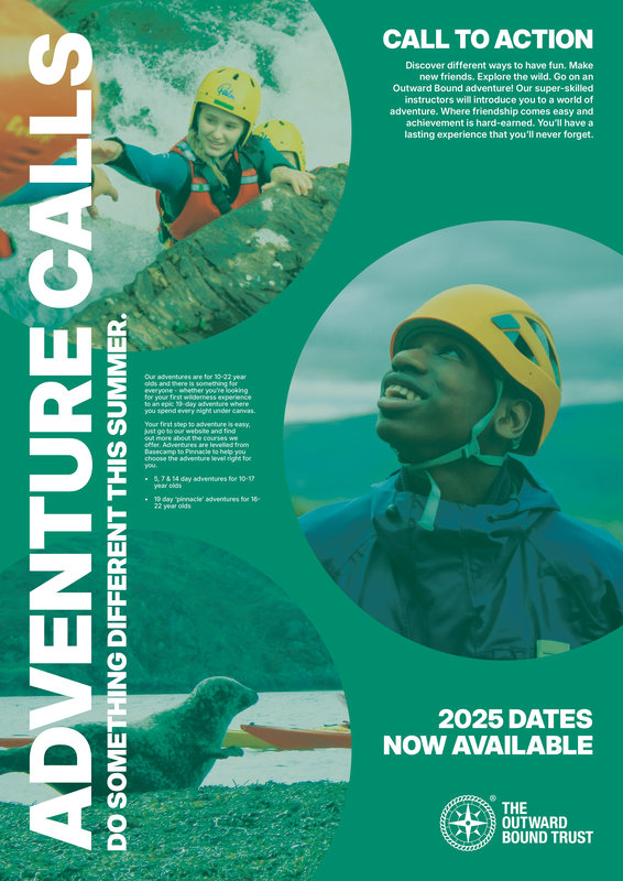
Exploiting the principles of alignment and hierarchy and the assets provided, create a poster for Outward Bound adventures.
• You must use all of the copy
• You must use the logo
• You must use at least three of the images
• You can create more than one ‘final’ poster
• You must use Illustrator to compose your final poster/s, though you can use Photoshop to colourise or overlay the images.
• You can introduce colour and/or texture in the type, images, background, etc.
• You can manipulate the type (e.g. tracking, leading, outlines, inlines, etc.)
Research
Graphic design books
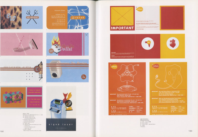
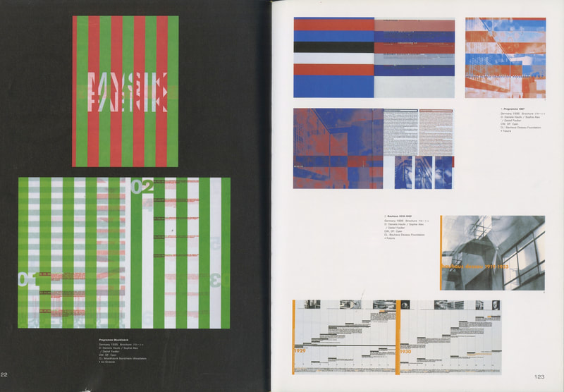
Graphis Posters 85 by Buchdruck AG
|
|
|
|
|
|
|
|
|
The Layout Look Book by Max Weber
|
|
|
|
|
|
|
|
How to use type by Lindsey Marshall & Lester Meachem

|

|
|
|
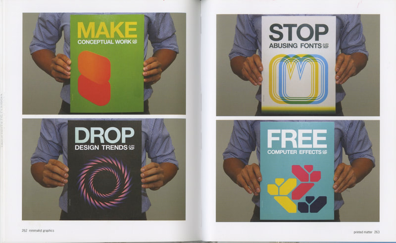
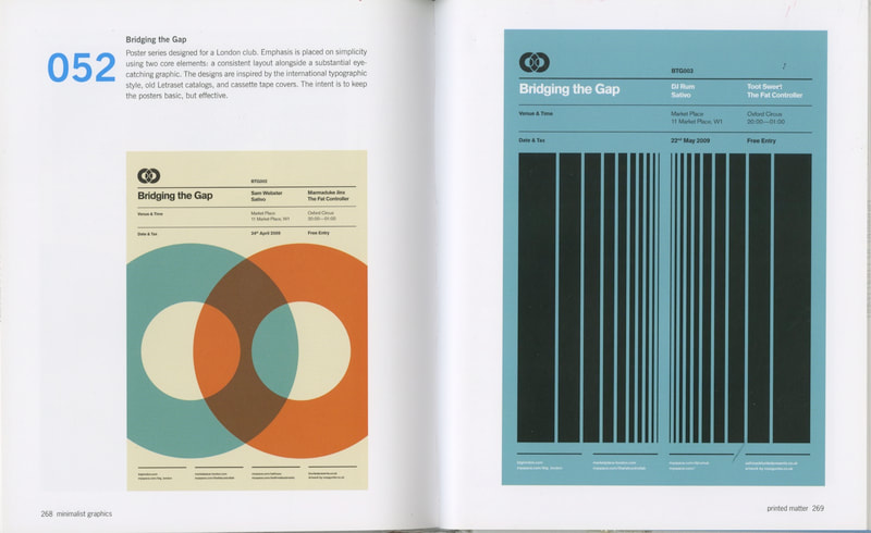
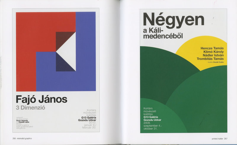
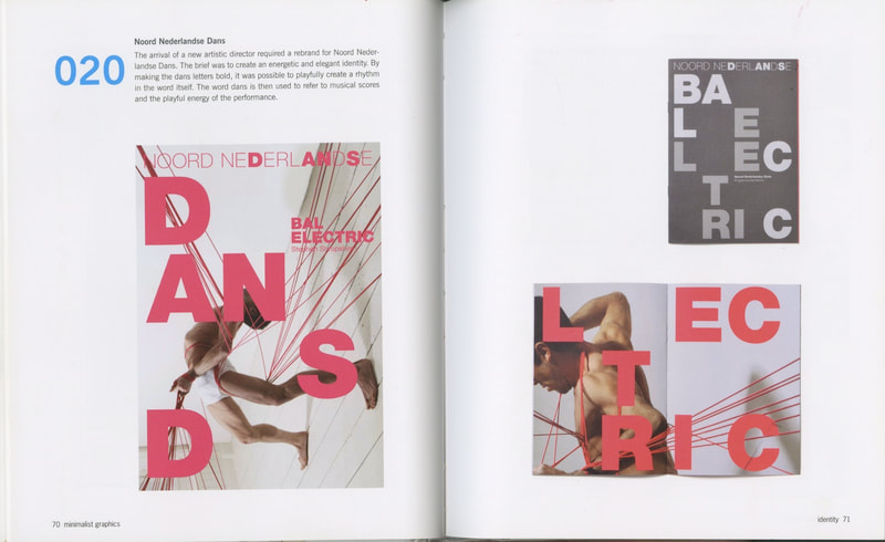
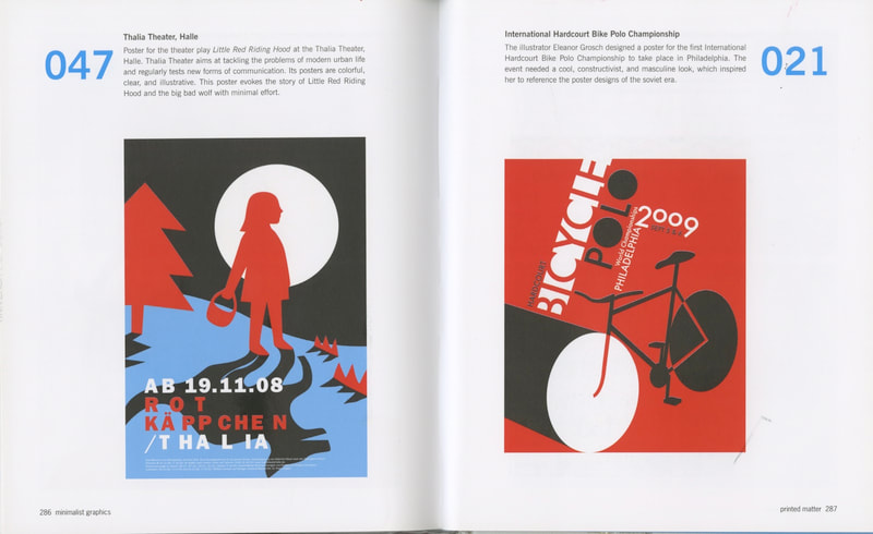
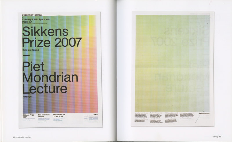
Mini ma list graphics by Julia Schonlau
|
|
|
|
|
|
Graphic Designers
Armin Hofmann (1920-2020)

Giselle, 1959
|
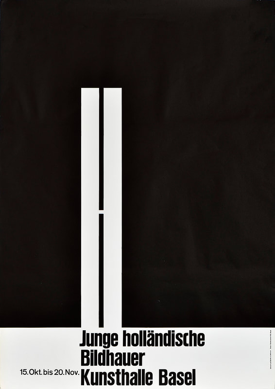
Junge Holländische Bildhauer, 1960
|
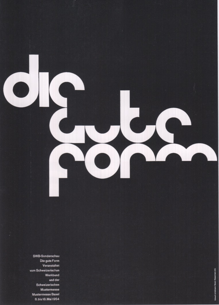
Good Design, 1954
|
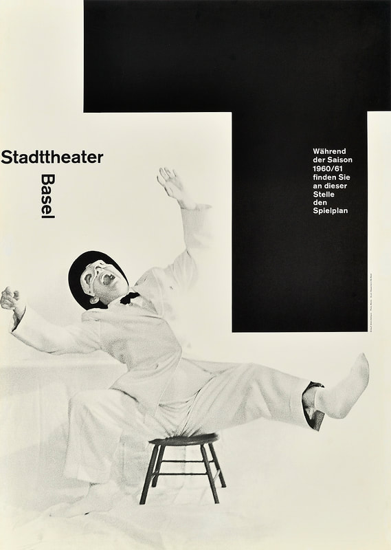
Stadt Theater Basel, 1960
|
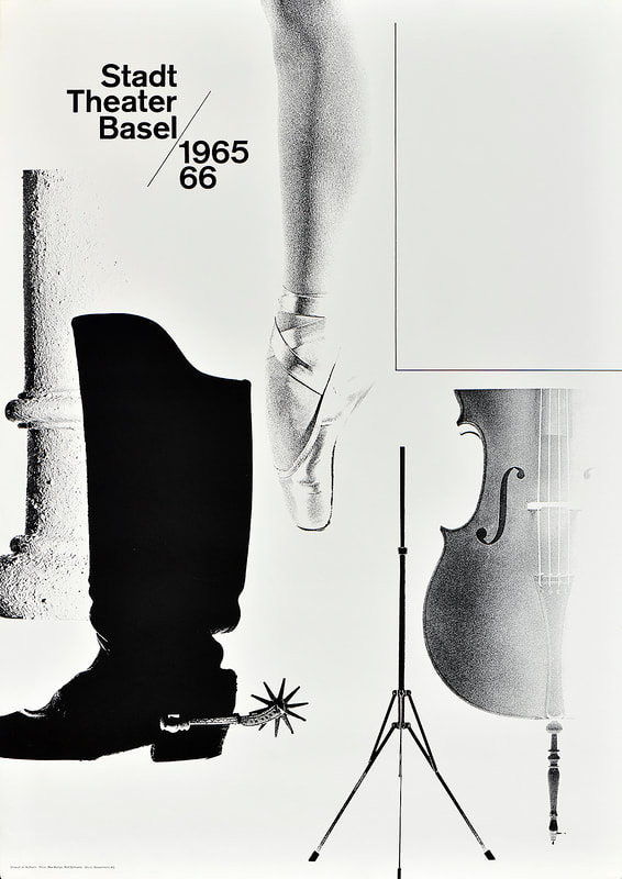
Stadt Theater Basel, 1965
|
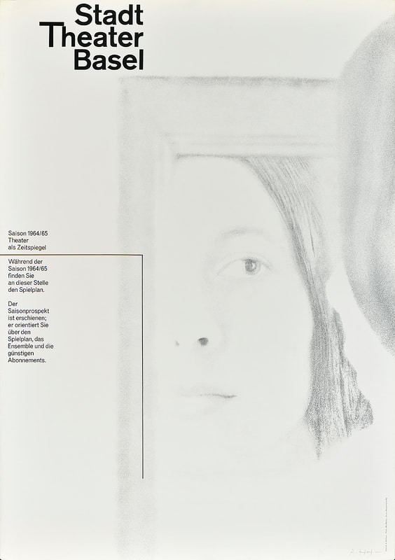
Stadt Theater Basel, 1964
|
Wim Crouwel (1928-2019)
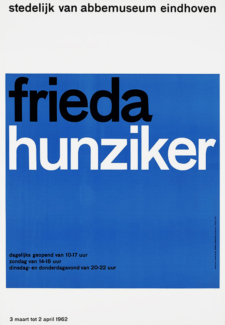
Frieda Hunziker, 1962
|
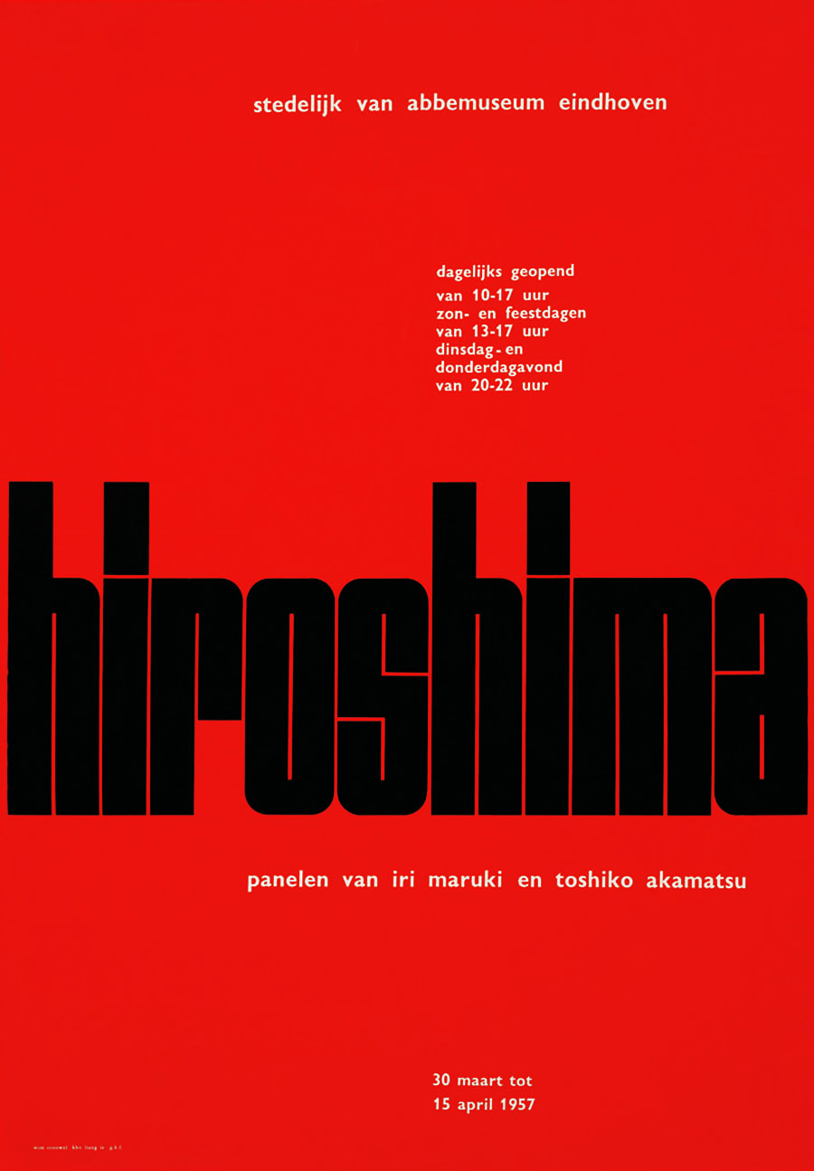
Hiroshima, 1957
|
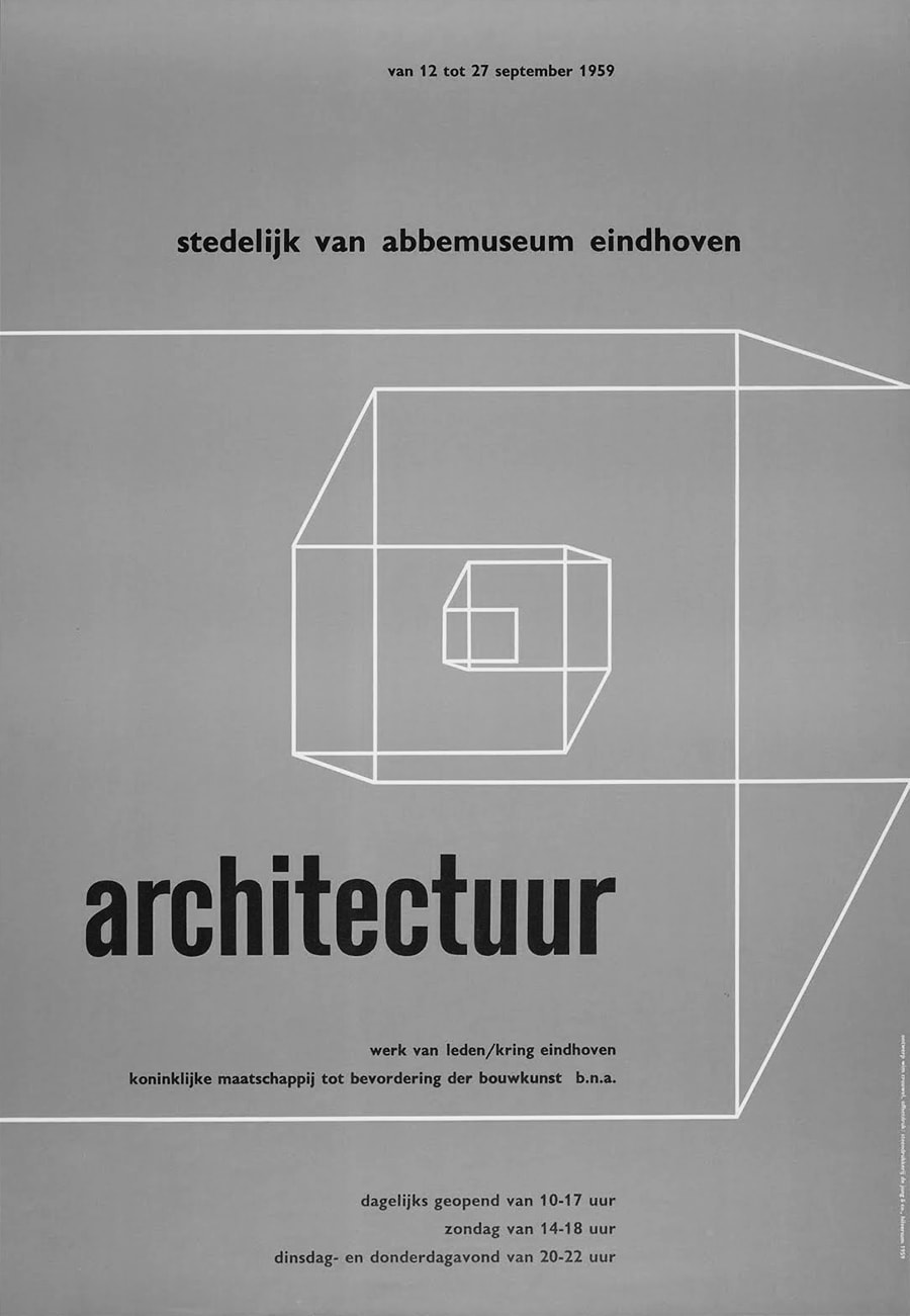
Architectuur, 1959
|
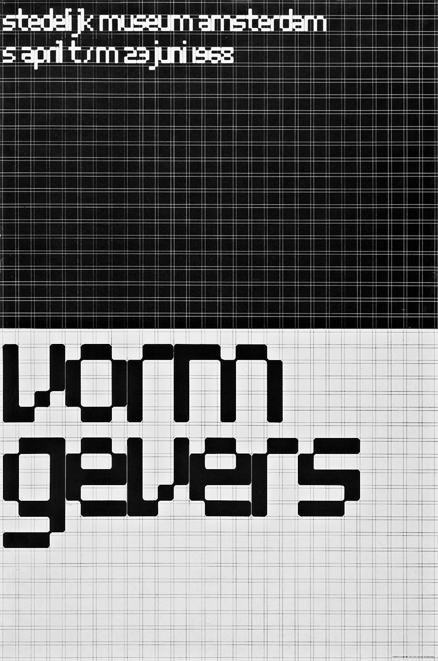
Vormgevers, 1967
|
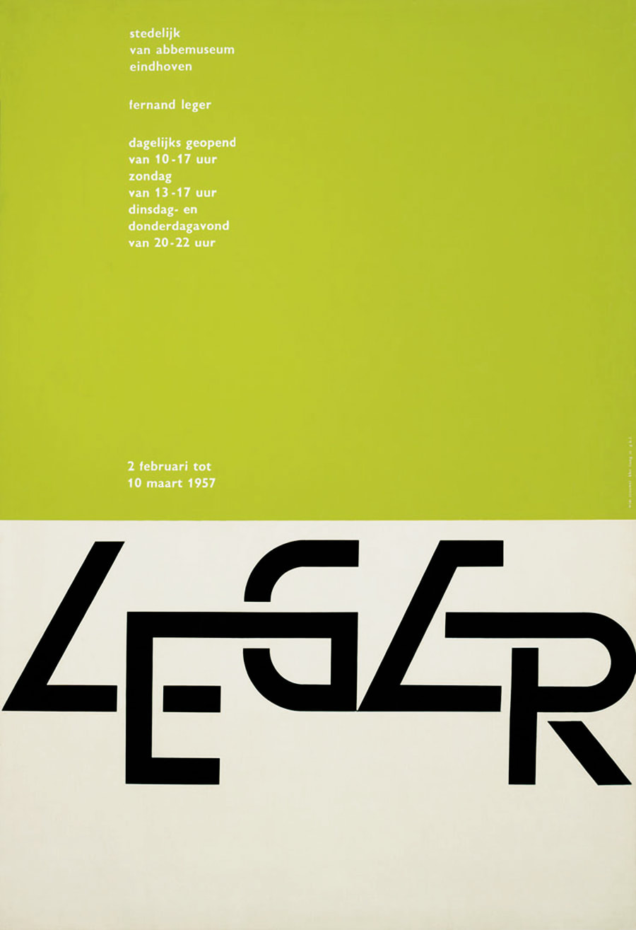
Fernand Leger, 1957
|
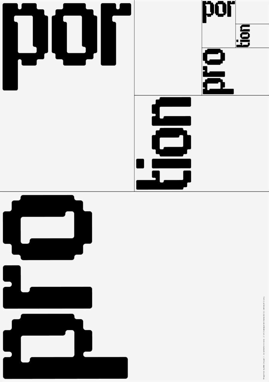
Proportion, 2006
|
Josef Müller-Brockmann (1914-1996)
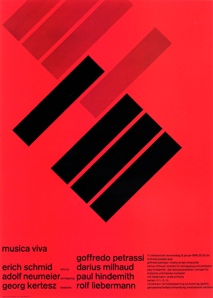
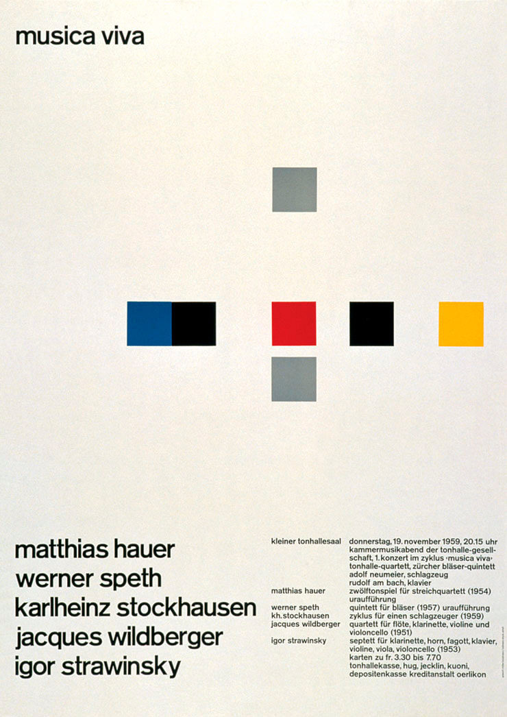
Musica Viva, 1959
|
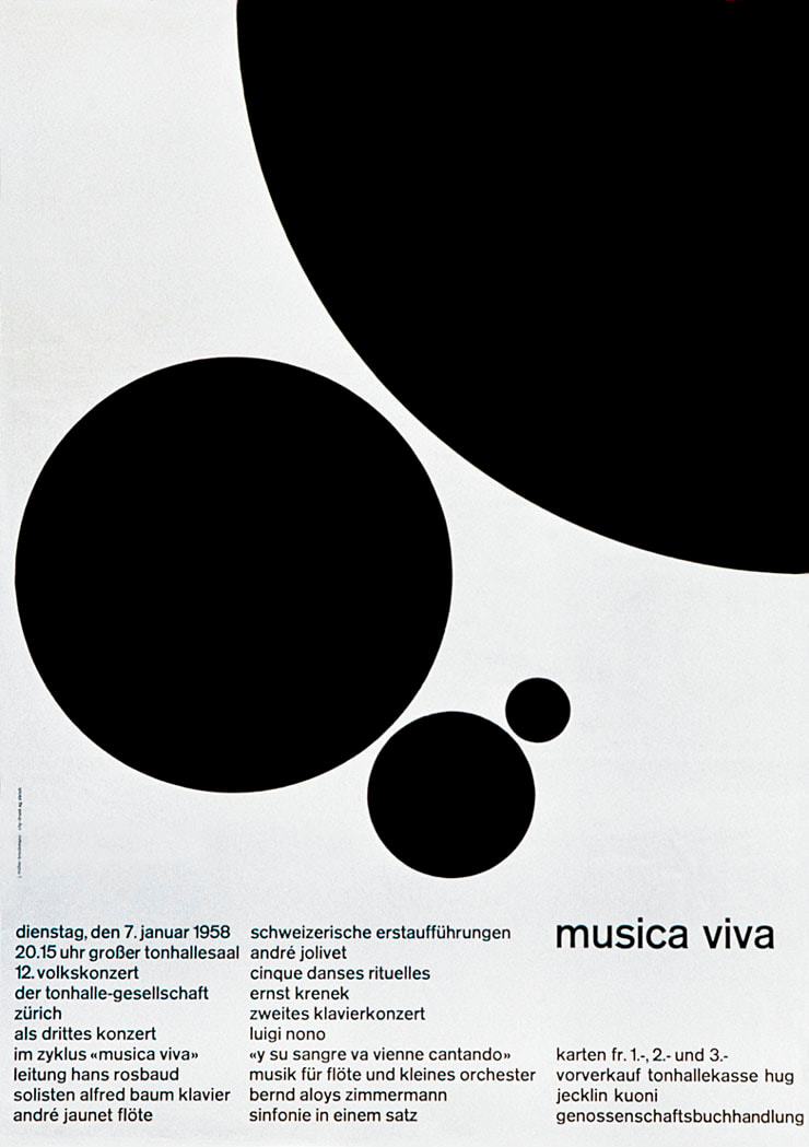
Musica Viva Schweizerische, 1958
|
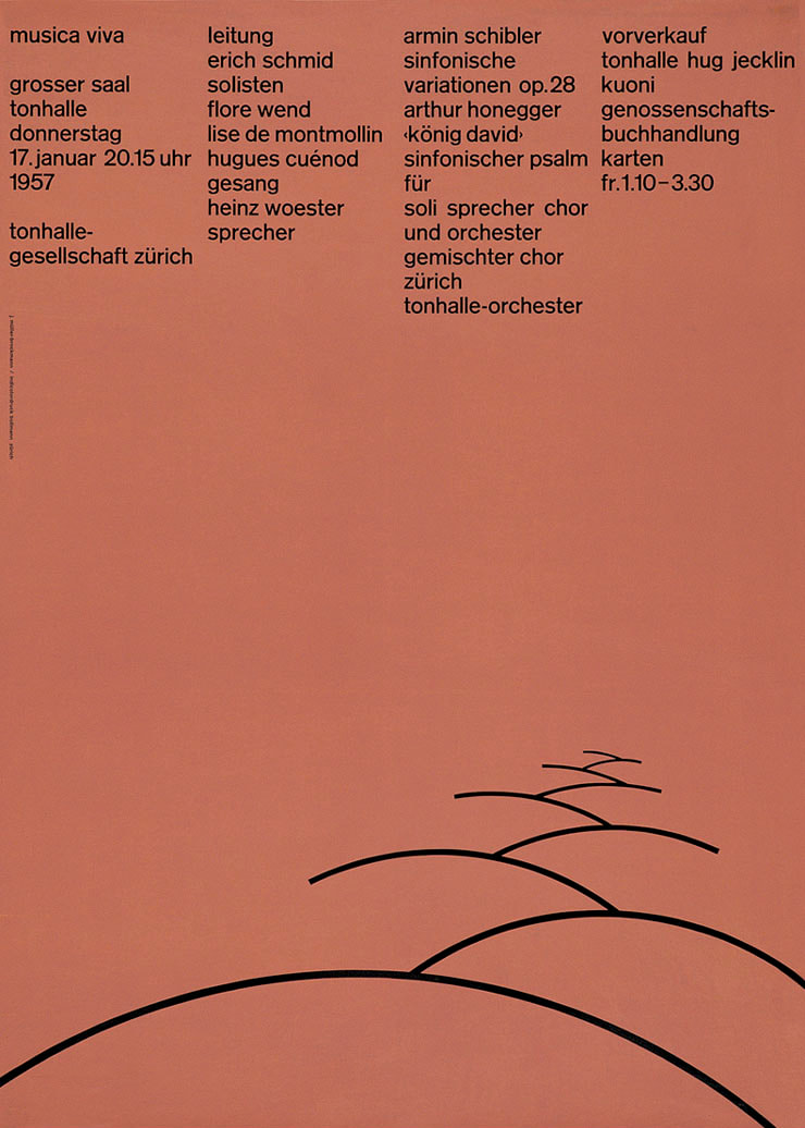
Musica Viva, 1957
|
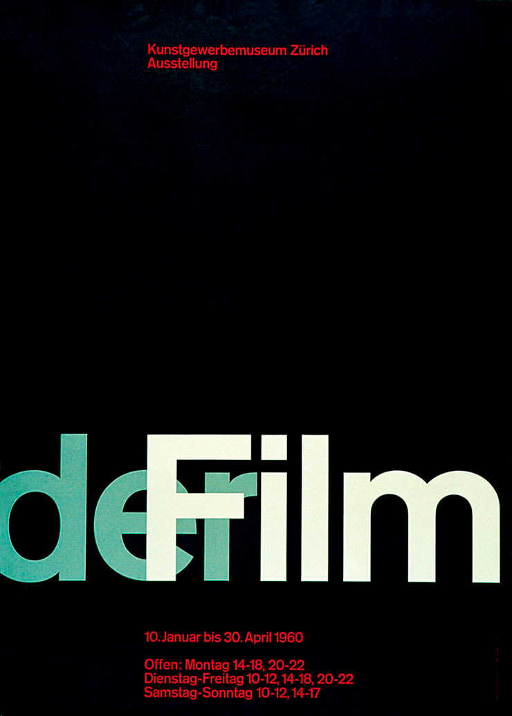
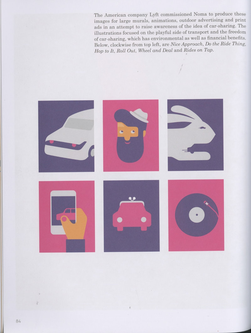
Der Film, 1960
|
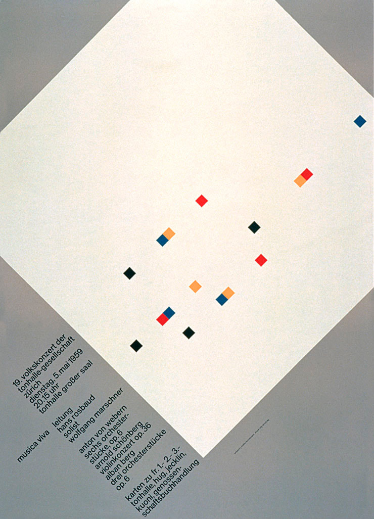
Musica Viva Rosbaud, 1959
|
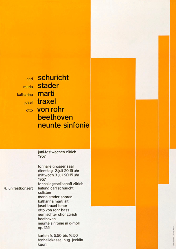
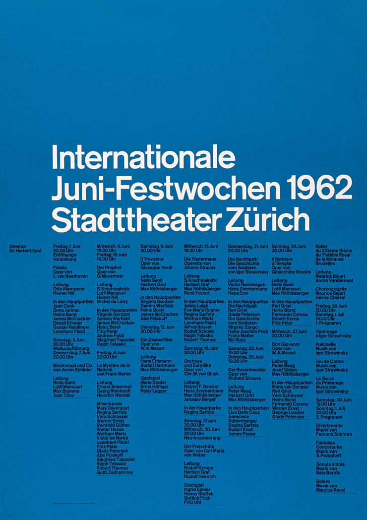
Juni-Festwochen Zürich, 1957
|
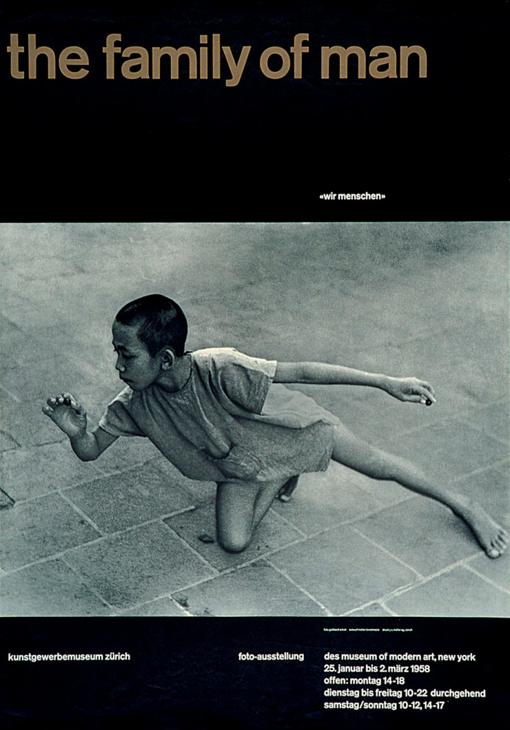
The family of man, 1957
|
Musica Viva Matthias Hauer, 1959
|
|
Neville Brody (b.1957)
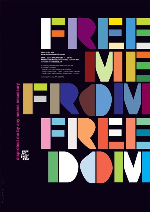
Free me from Freedom, 2006
|
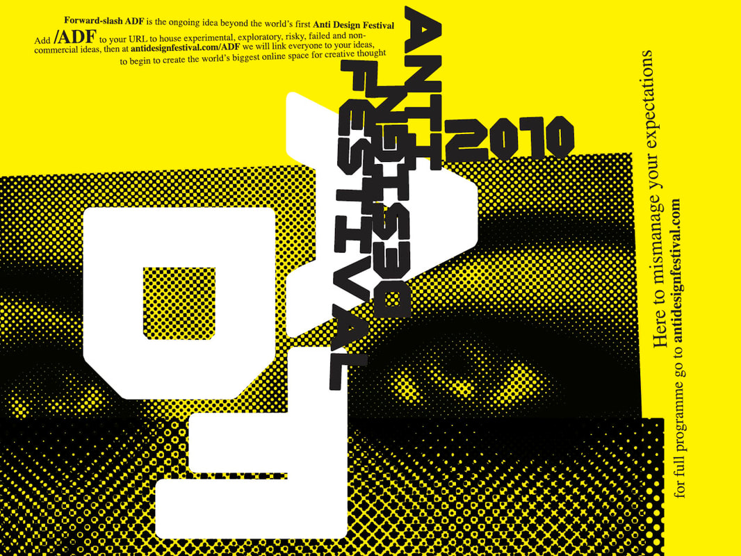
Anti-design festival, 2010
|
Social media
Studio collaborative research
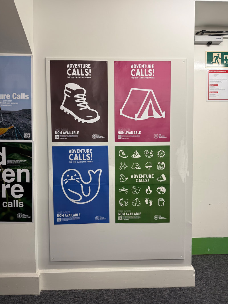
As a collective, we shared our research with each other, using a spare wall to display what we've discovered:

My own contribution (1st column) was a mix of both this project and GRAP5070s hierarchy and layout.
OUTWARD BOUND TRUST

Online content
LinkedIn:
|
|
|
|
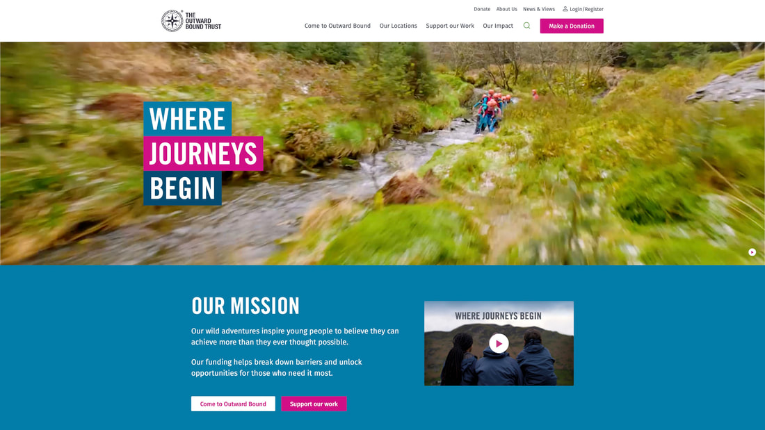
From looking at LinkedIn posts alone, it's immediately clear that Outward Bound Trust leans heavily into imagery and video content. They're very keen to show off their activities, and prioritise this over text heavy posts, which is understandable - Photos of activities will attract participation,
Instagram:
Instagram is similar to LinkedIn for content, however there seems to be more text-based posts. They still lean heavily on imagery however to promote. Something to consider when designing the poster (content over text).
Website:
|
|
|
|
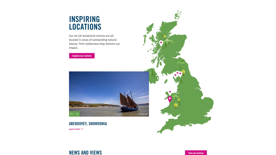
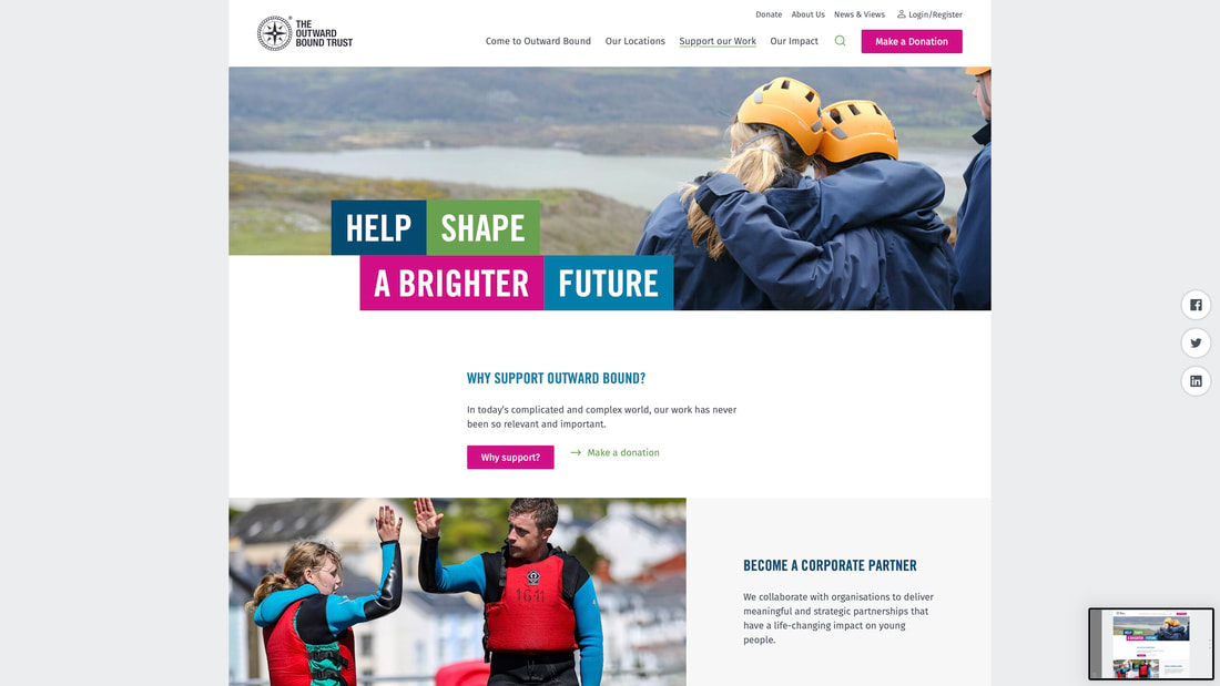
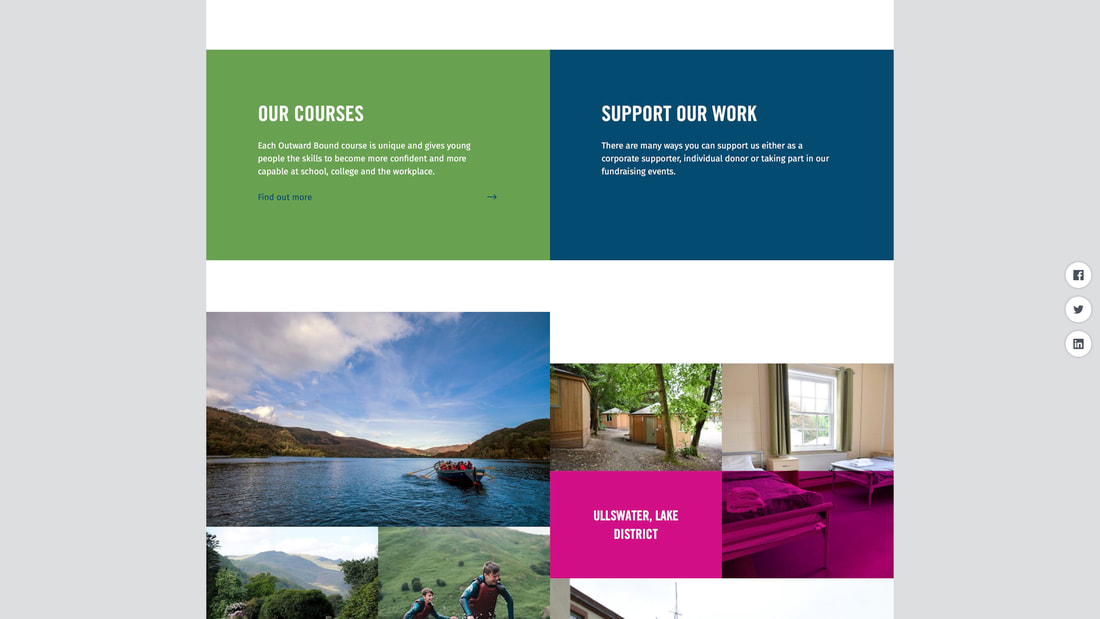
Like social media, their website promotes the cause through media content rather than text. The website however does show more of the branding in use, along with colour combinations and elements not seen in their social media posts.
INitial Layouts

|
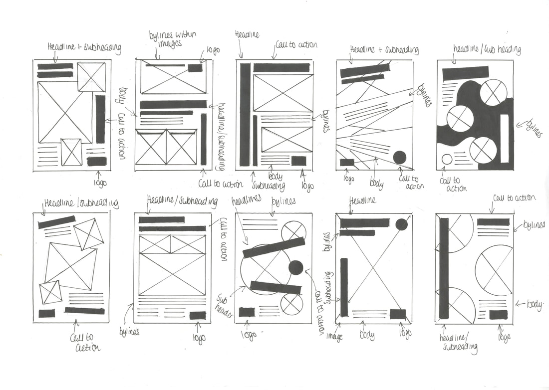
|
More research
Having created thumbnails of layouts and looking into Outward Bound, still didn't feel like I had really seen a style that I wanted to use at the development stage. I'm quite into learning the Swiss way of graphic design, but also just simplicity in design in general. Negative space in design is also something i'm interested in exploring.
Designers
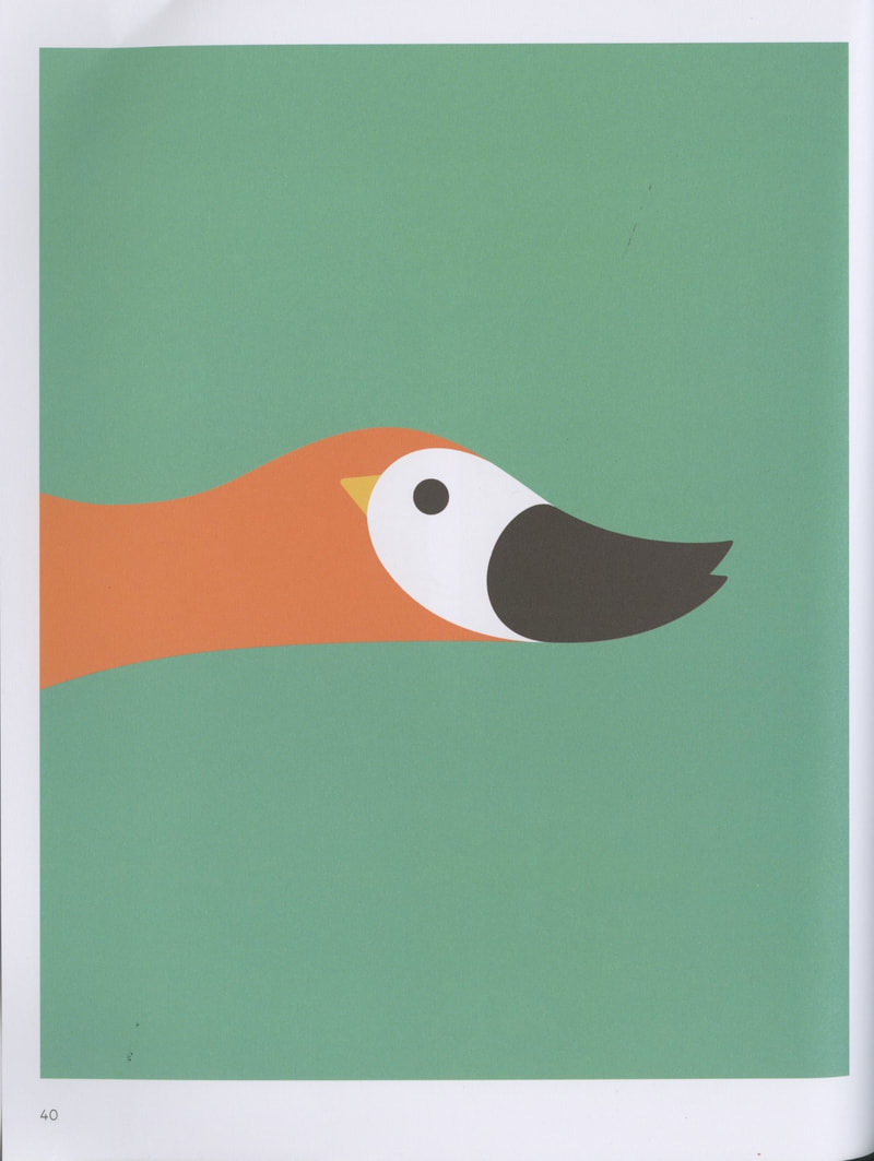
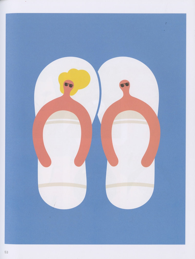
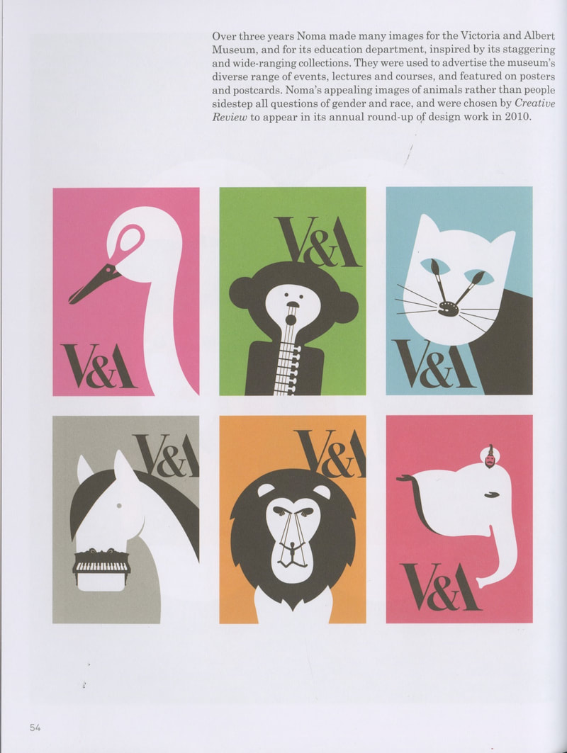
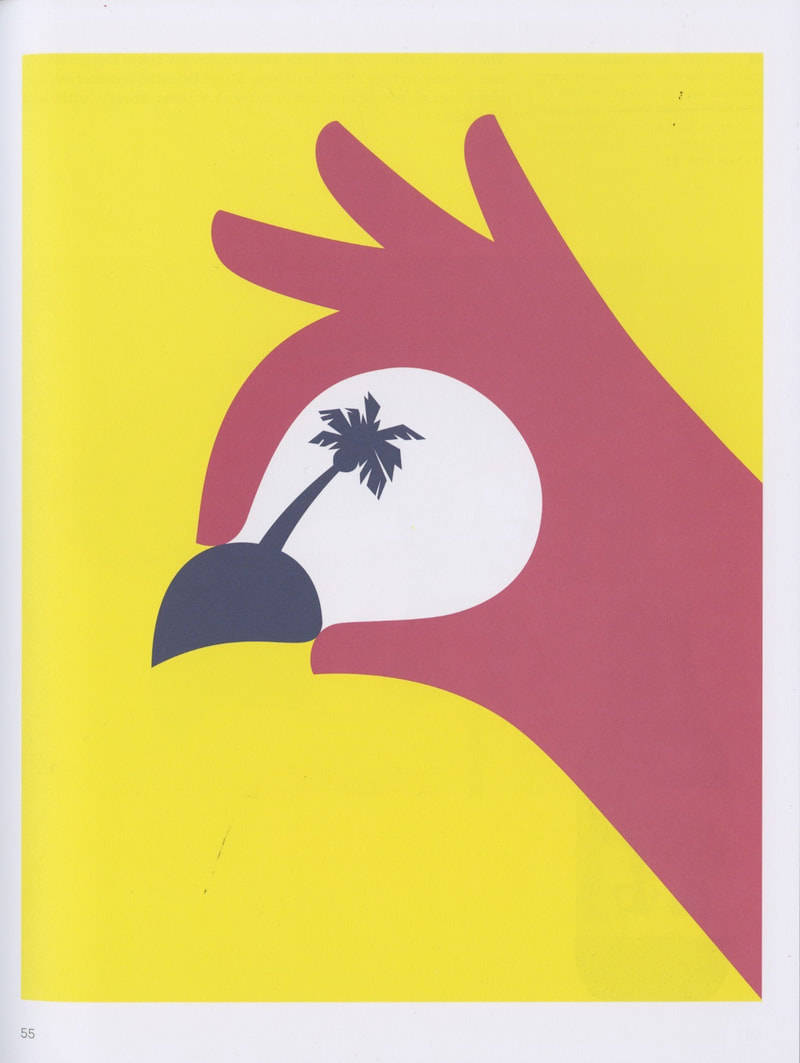
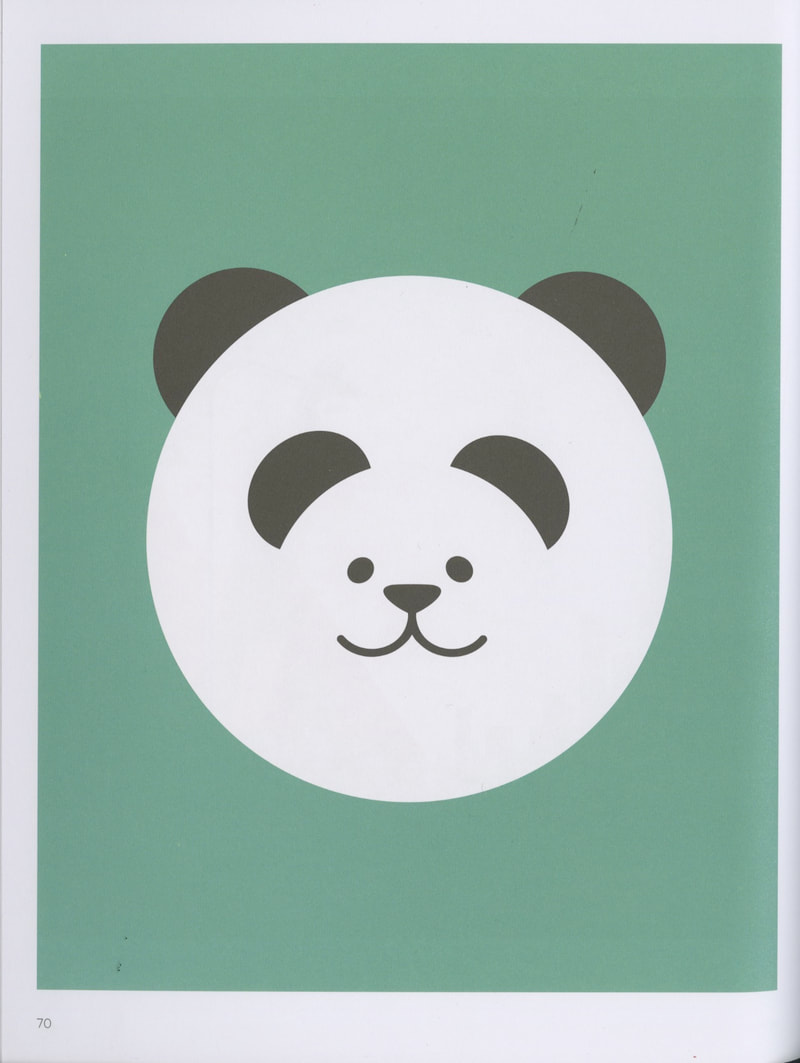
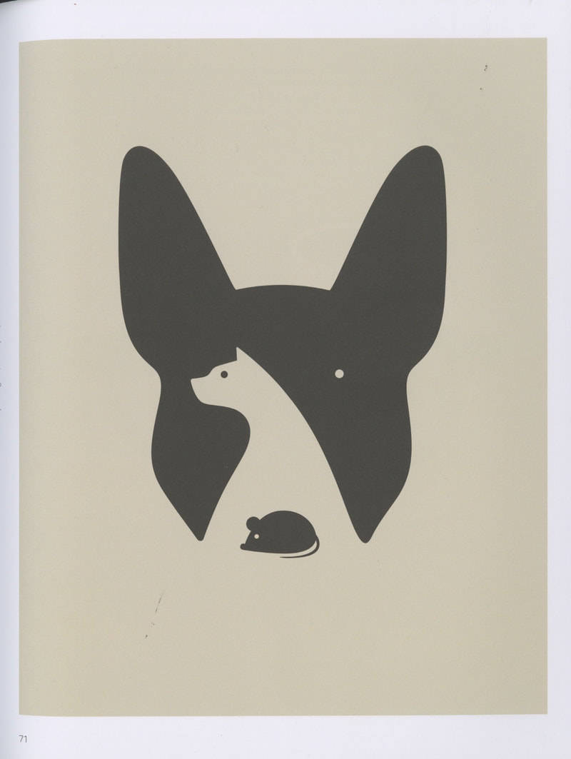
Noma Bar (b. 1973)
|
|
|
|
|
|
|
|
|
|
|
|
Peter Grundy (b. 1954)
|
|
|
Graphic design books
New typographic 2 by P I E Editorial
|
|
|
|
|
|
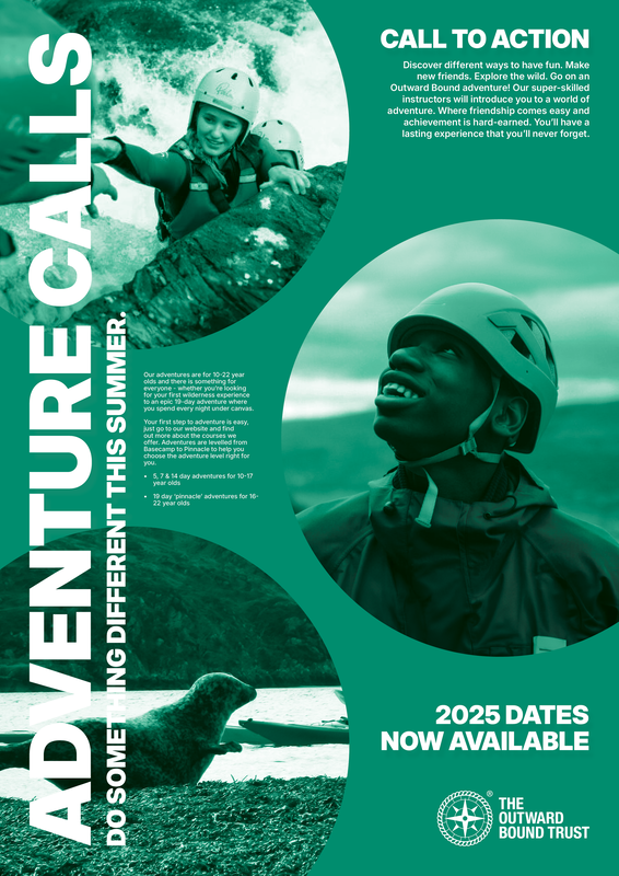
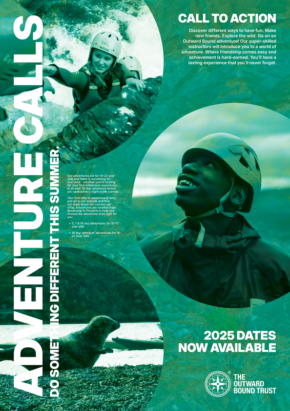
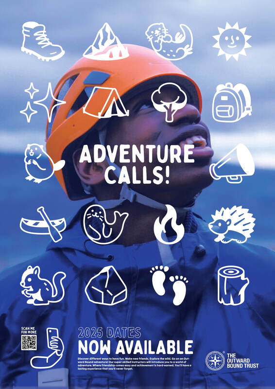
Development
Going forward, I'd like to develop a few different options of posters, using various different styles. Feel it's important to explore the 'corporate' look to understand fundamentals, but I would also like to create a range of playful posters, that may not fit the brief perfectly, but convey the message all the same.
Idea A
This idea is probably the most formed of the ideas drawn. It works perfectly to a grid, and text will align properly at places. Picked the typeface Inter to give it a sharp look.
Played around some more with different image blending options, to make the text more visible:
Hard light (75% opacity)
|
Luminosity (100% opacity) + drop shadow
|
Rock texture added + Hard light (100% opacity)
|
Final outcomes for this idea:
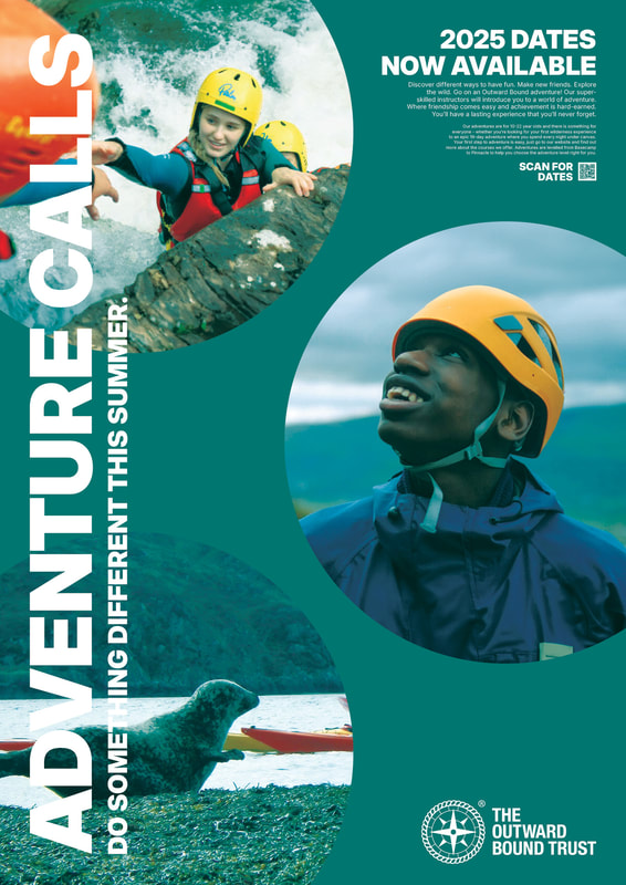
|

|
Still very corporate, but they tick the boxes for the brief.
Idea B
Not technically thumbnail idea 15, but it's the closest to its design. Want to do a poster in the style of Noma Bar. Somehow use negative space to incorporate the activities of Outward Bound.
Illustration ideas:
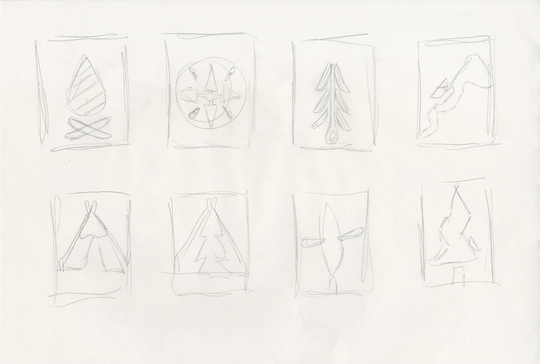
Illustration Development:
Used Affinity Designer for drawing the illustrations; Simpler drawings are much easier in designer vs illustrator. Will import them back into InDesign to play about with.
Output:
|
|

|

|
|
|
|
|
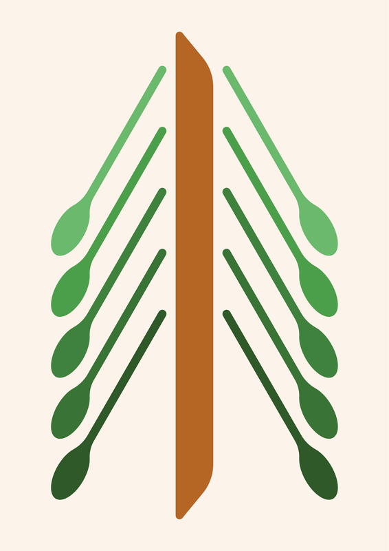
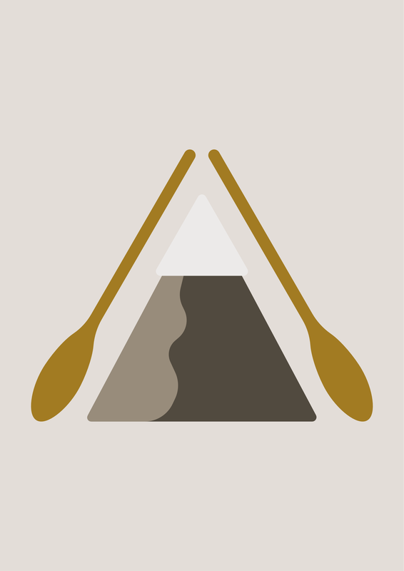
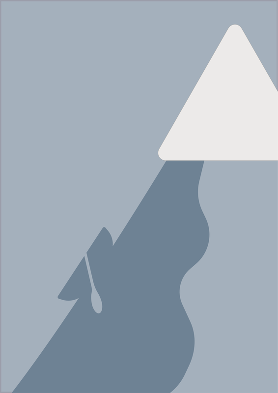
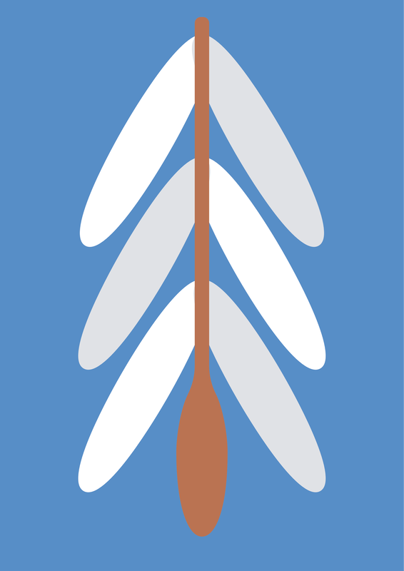
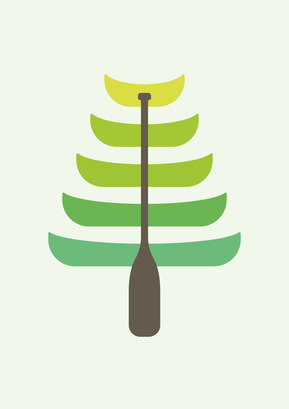
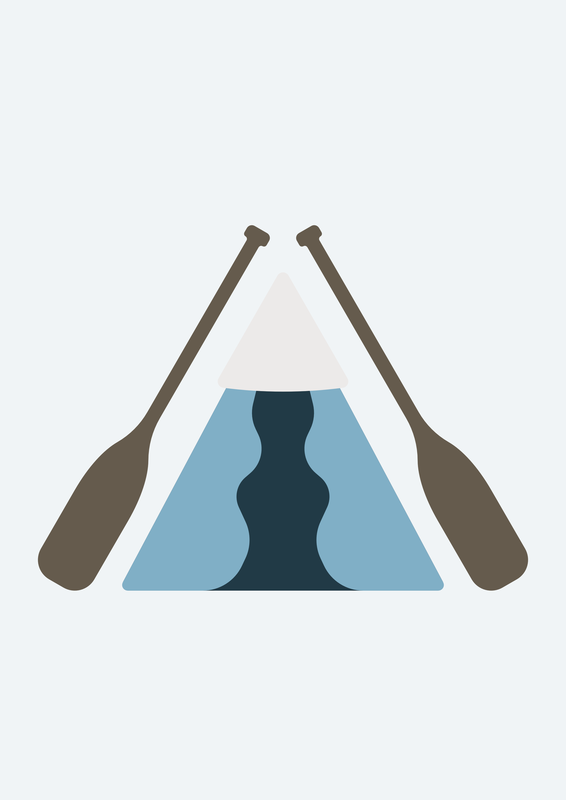
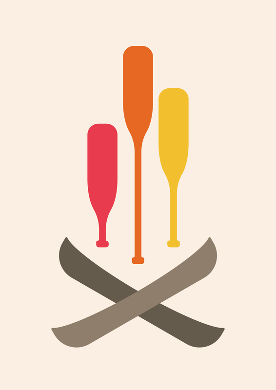
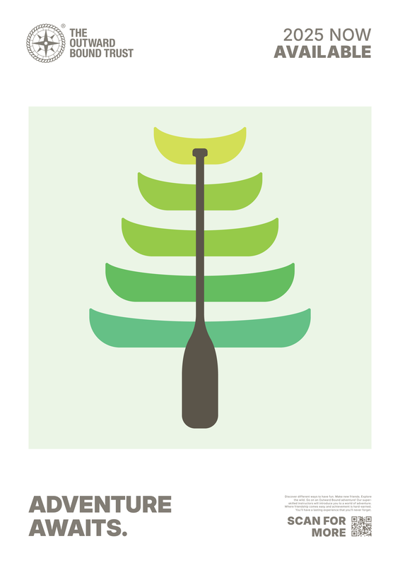
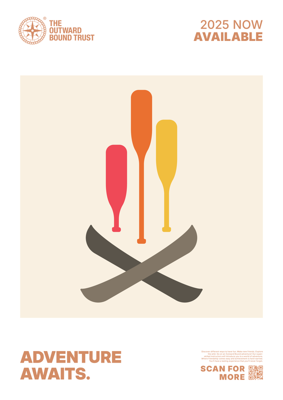
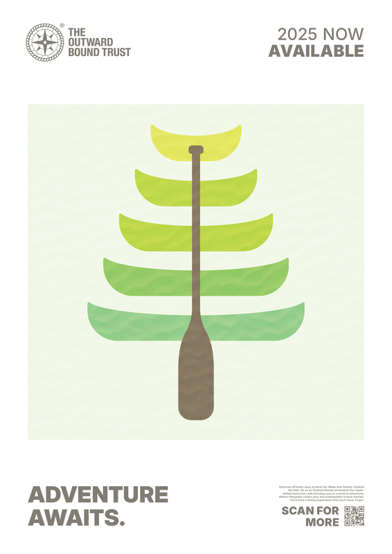
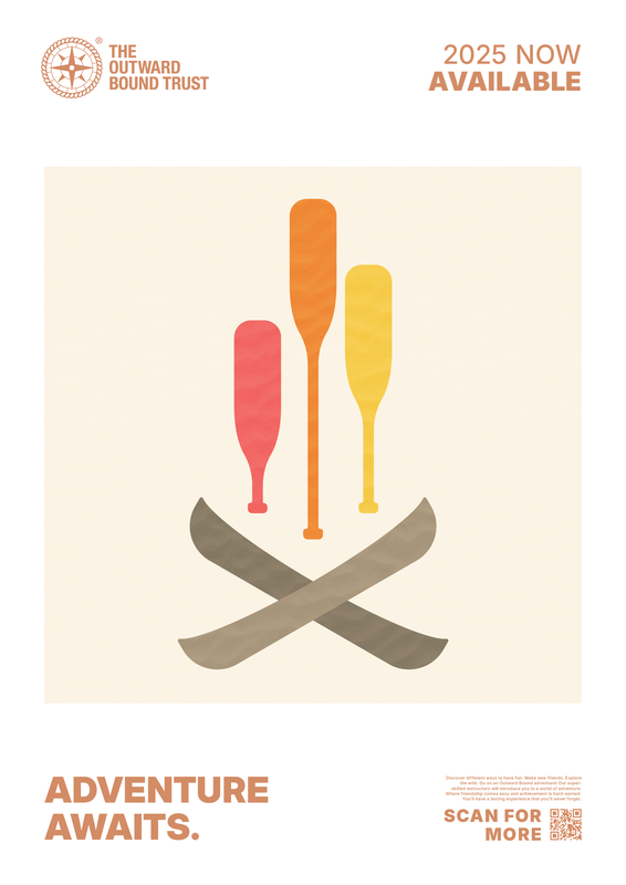
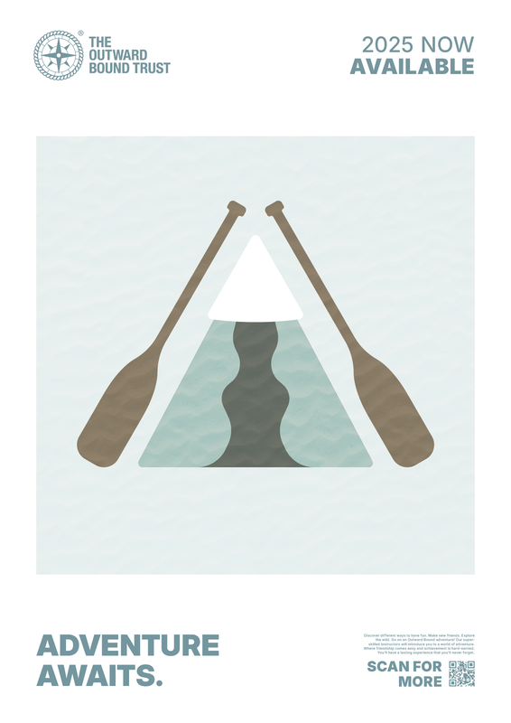
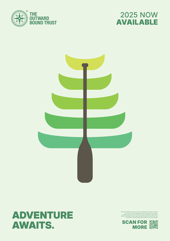
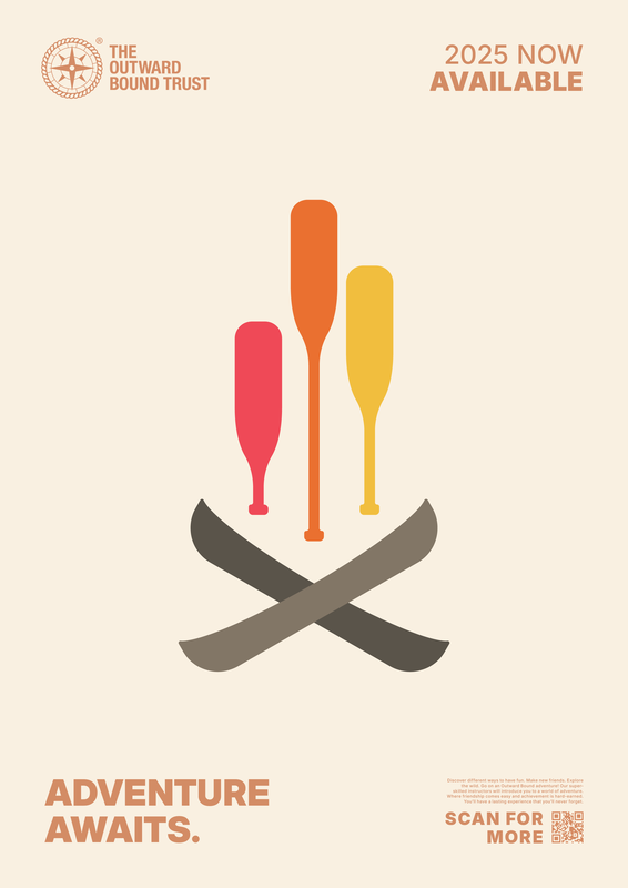
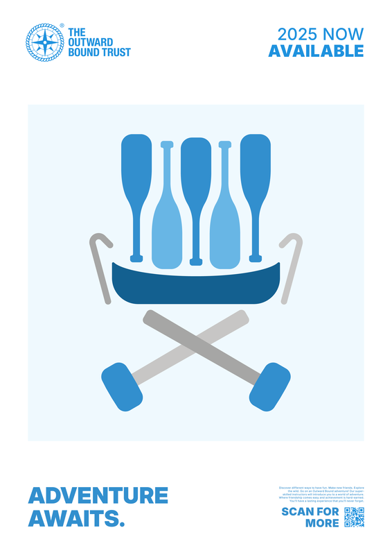
Probably the strongest with regards to using negative space effectively is the canoe on the mountain river illustration. Also quite like the canoes arranged as a fire, along with the canoe tree. Found negative space art quite difficult to execute.
Also noticed paddle looks like a spoon... didn't realise the bottom was more square than designed.
|
|
|
With the designs being so simple, wasn't quite sure how to convert these into a poster with all the text on. Dont think overlaying text on the image itself was a good idea. I seen a while ago posters for an exhibition in London, which could be quite effective:

|
It's very basic but very effective, as the content is front and centre over the text, contained within a square. The sans serif typeface used is no fuss, drawing even less attention to the content outside the image boundary.
Poster development:
Final outcomes for this idea:
|
|
|
Idea C
Leaning off the back of type and typography project, I want to try and create a typographic piece rather than full on poster.
For some reason it was proving difficult to make this work, so I decided to tried a different approach (and also a different app).
Still couldn't find a feasible way to implement this idea, so I abandoned it.
Idea D
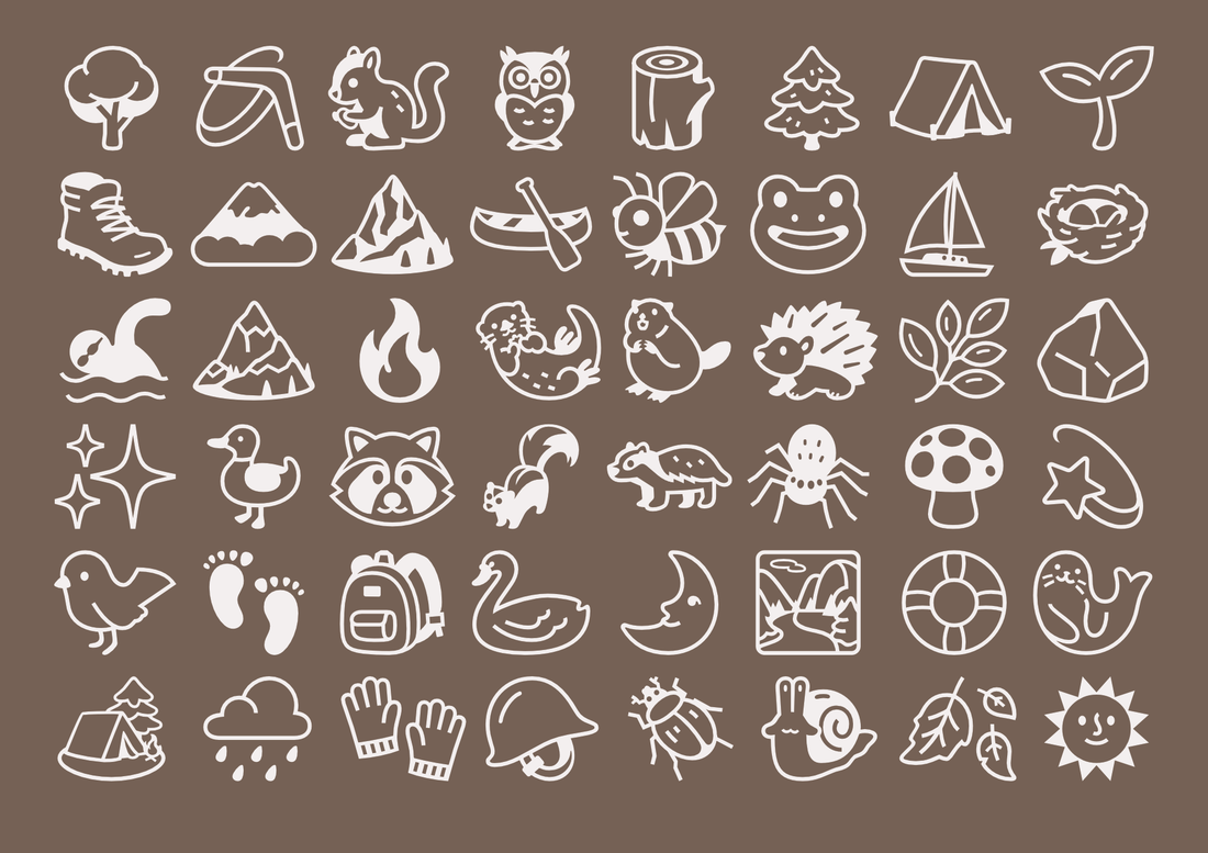
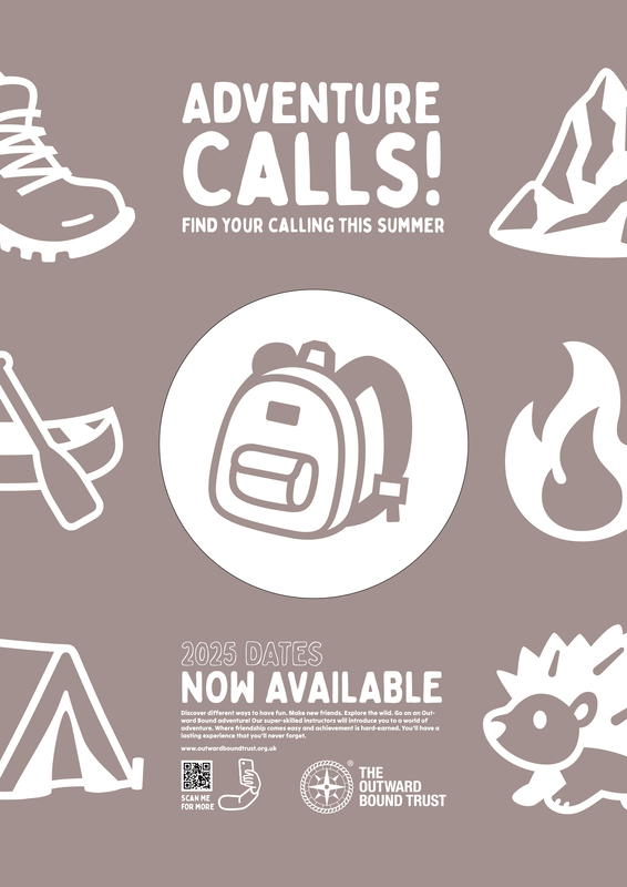
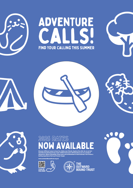
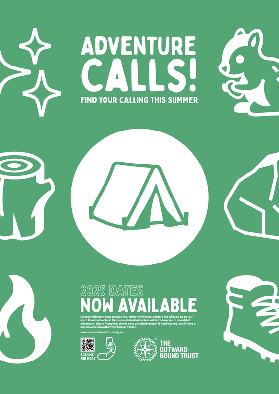
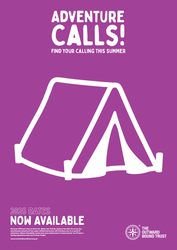
Whilst looking for fonts, I came across a typeface called Noto emoji, which has some of the cutest emoji drawings. Sparked an idea to try and create a poster using just icons and text, hopefully selling the best bit of Outward Bound (outdoors).
Selection of emojis from the typeface:

|
|
Development:
Edits/Versions:
No image manipulation applied
|
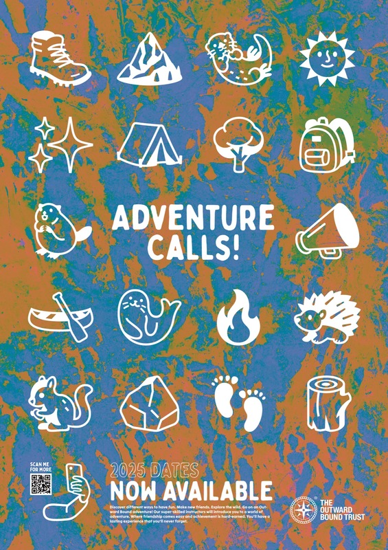
Hue blending applied to rock image background
|
Overly blending applied to image background
|
They all seem to work well, although the 3rd one is perhaps a little too busy on the eye. the bottom section still feels a bit imbalanced (above the logo is missing something). Also question whether there's too many icons. Want to try exploring a series of the same poster with just different icon layouts..
These look slightly better but they still feel a bit cluttered. The black barcode is also a bit jarring against a two tone composition.
|
|
|
Tried using just 1 icon vs many to see if it had more effect:
|
|
|
Think it looks better with just one icon vs many.
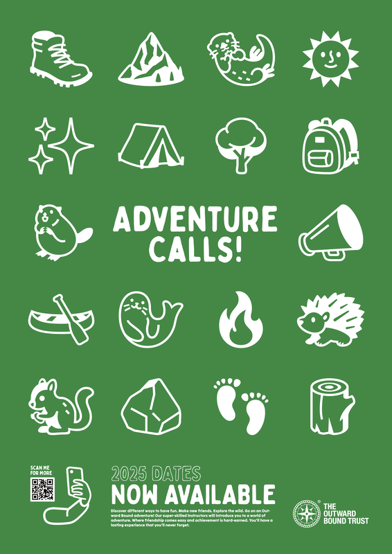
Final outcomes for this design:

|

|

|

|
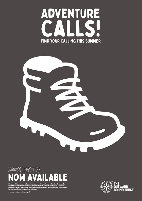
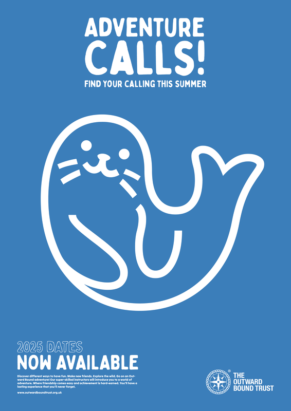
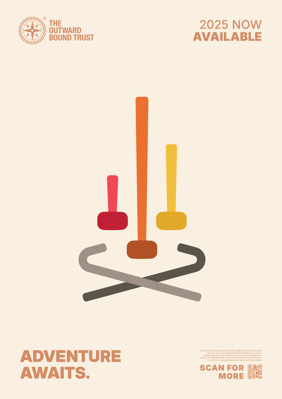
Added the website barcode and edited the colours slightly from the original. Also adjusted the icons slightly; the boot is angled with the heel upwards to make it appear as walking/hiking. Changed the seal to a slight angle so it's not square on. Was going to change the seal to a canoe or something related, but I find the seal makes the poster fun, so just left it as is.
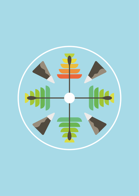
Also re-added one of the original designs back into the mix, to create a 4 piece set.
Also re-added one of the original designs back into the mix, to create a 4 piece set.
Feedback & Response
Feedback went really well. There was only a few points to consider:
Mixing up the illustration elements (particularly the use of paddles in every drawing)
Adding texture to the illustrations
Trying full bleed for the background rather than boxed
Mixing up the illustration elements (particularly the use of paddles in every drawing)
Adding texture to the illustrations
Trying full bleed for the background rather than boxed
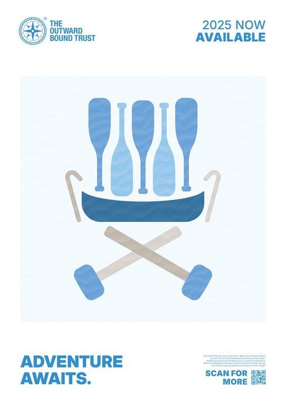
Adding texture
|
|
|
Used a wavey sand texture to add some depth to the images. Tried using wood and bark textures but they added far too much depth (even when toned down).
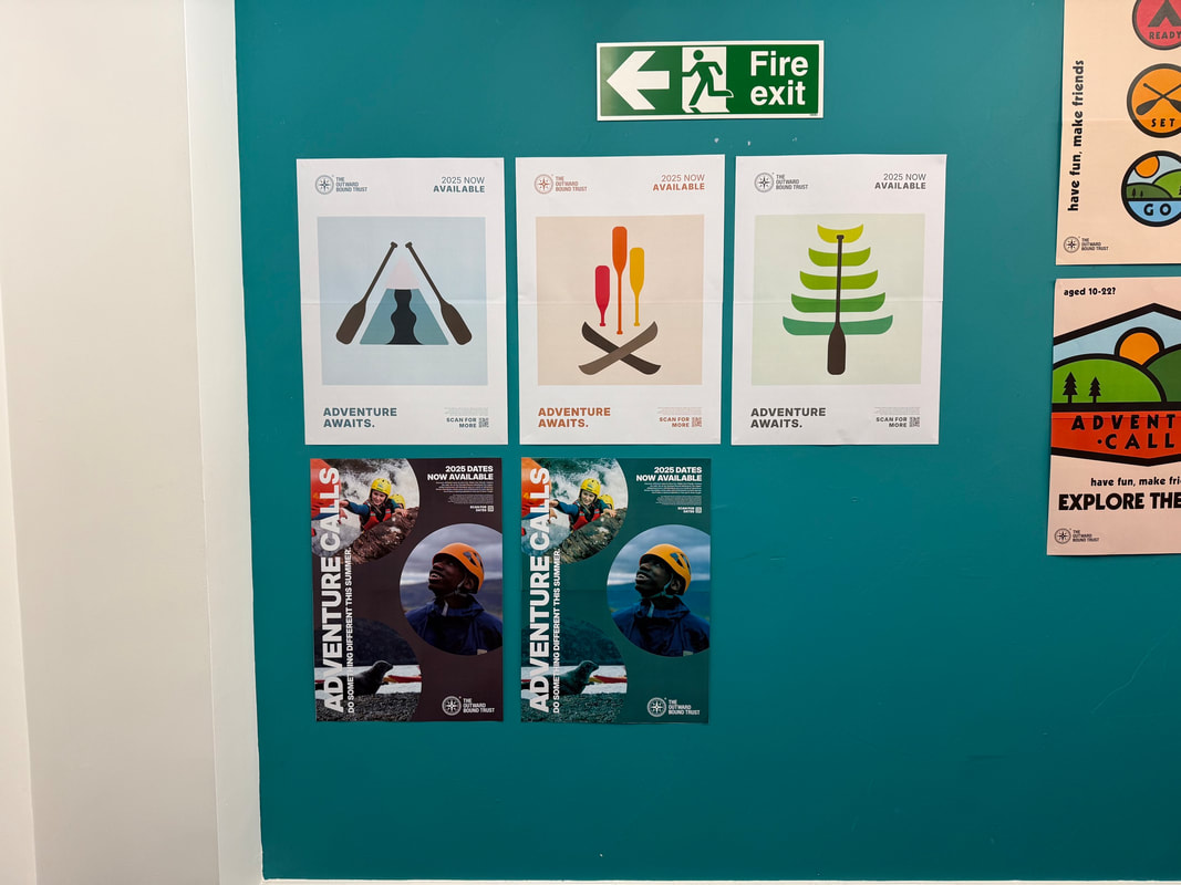
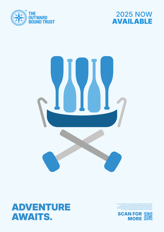
Full bleed backgrounds
|
|
|
here I've just expanded the square container to fill the full page. I feel that they would be ok if the 3rd poster's illustration was in similar proportions to the first two. when they're displayed next to each other like above, it makes the last one feel really uneven.
Adjusting illustrations
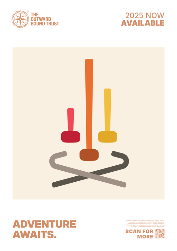
Originally put the peg as the flame and the mallet as the logs but the pegs werent thick enough to give effect, so swapped them around. They sit better with the pegs pointing upwards, as it looks like its containing the mallet flames.
|
Added to original layout:
|
Texture overly:
|
Full bleed:
|
It sort of works, although it's screaming a tad Communism with the hammer and peg (which in turn looks a bit like a sickle). aside from that, I wouldn't say it's any stronger than the paddle and canoe design of this one.
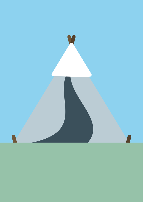
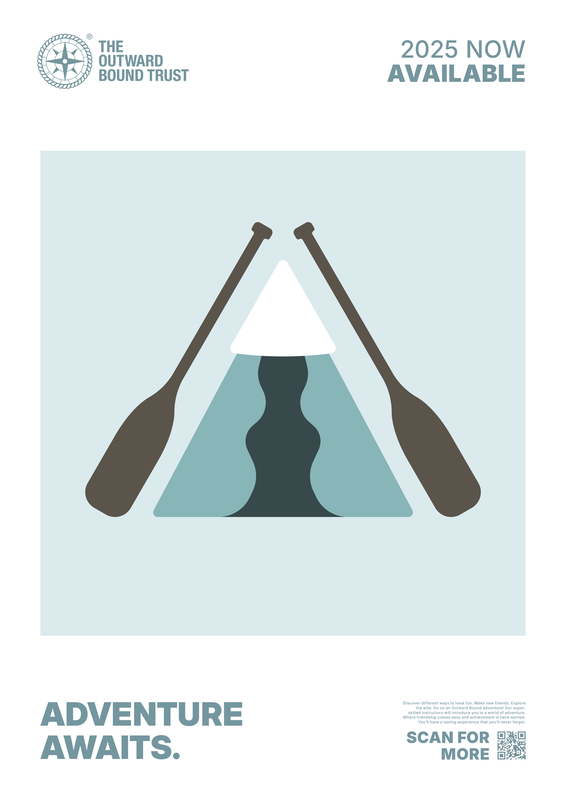
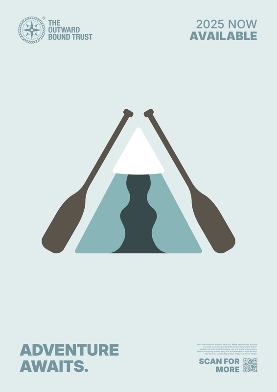
For the 3rd poster, I didn't feel that the paddles really had anything to do with the mountain come tent, so I thought about creating another camping accessory that fit in better with the chairs.
|
Added to original layout:
|
Texture overlay:
|
Full bleed:
|
Not completely sold that the chair design is any better than the mountain tent...
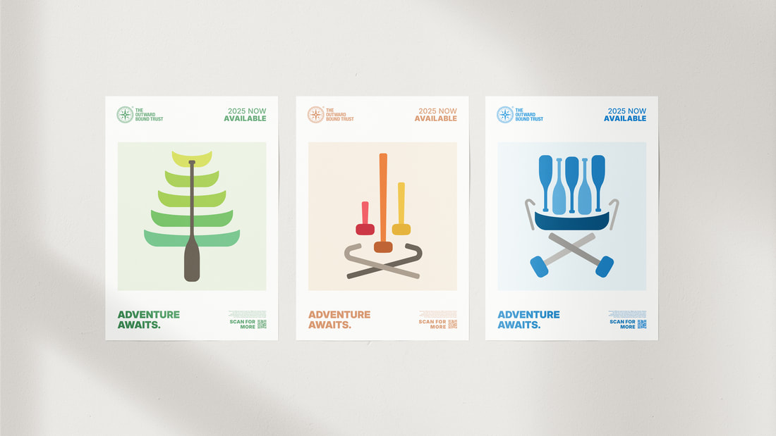
Final Outcome
Out of all the posters designed, I still feel that the canoe and paddle tree is still the most effective of all them all. Ive replaced the 2nd and 3rd posters with newer variants, however I still feel that the originals had merit to them still. Not sure about the chair poster, however colour wise it's a better fit.
Poster mockup: