Project Brief
Set exercise 2
Part A
Design a masthead and cover for your magazine, using your feature article as the main story you wish to promote. The cover should incorporate ‘tasters’ flagging up the content, an issue number/date and barcode.
Part B
The magazine is going to have a feature article on the theme of exposure. How you interpret this theme is completely up to you. You must research and find content, both text and images (or make your own appropriate imagery) to illustrate your interpretation of the theme. This research will also contribute to the final project of the module Digital Journalism, so the more information you can collect, the easier your job will be later on.
You are to produce two alternative sets of magazine pages (250mm height x 202mm width trimmed page size). Each of the sets of pages will explore the use of different grid systems. Each set will consist of two double-page spreads, giving you a ‘splash’ and a ‘turn’.
While the basic content remains the same for each set of spreads, what we want you to explore are the effects of using 4 column and 9 column structures:
Each number of columns will provide its own opportunities and restrictions; it is your task to explore the relationship between images, typographic elements and negative space; and how differing column structures affect the design of the page. You should also be exploring effective typographic styling for all the elements within your information hierarchy.
Research
With the two magazine projects being so similar, I've used the same research for both. There would be little point in trying to separate up different magazines, seen as they all apply to both.
Magazines
Vogue, 1965

|

|

|
Vogue, April 1986

|

|

|
Vogue, January 2024

|

|

|

|

|

|
Thought that vogue would have really interesting layout designs, but out of all the magazines looked at, it's probably the most rigid and repetitive. The more recent issue seems to achieve some layouts better; the layout above with the 1 centred text is different (it looks like it could be 5 columns in reality), and the pages with double spread images look good. The contrast between the years of publish show that it's gotten better as technology has advanced - the earliest issues look a bit busy and crowded.
Wired, September 2018

|

|

|

|

|
Wired magazine has some really interesting splash pages within the mix, and varies the layout of most pages across the magazine.They break the rules quite a bit, having text intrude into different columns in parts, which I suppose makes it a bit more interesting to look at.
Turps, Issue 26

|

|
Turps was slightly disappointing. I thought this would push different layouts across the magazine, but it's all very similar page-to-page. I do like the use of negative space on the text pages however.
BBC Wildlife, July 2022

|

|

|

|

|

|

|

|

|

|
BBC wildlife was the best magazine for layouts. It has a mix of both standard column layouts and splashes, of which create a lot of interest, as well as breaking up repetitive spreads of text.
Edge, July 2012

|

|

|

|

|

|

|

|

|
Wasn't expecting much from edge, but I found that they try to mix up their pages using a variety of different layouts. they also like to use different columns widths (smaller central column) to break up long body texts.
Adbusters, November/December 2005

|

|

|

|

|

|

|

|

|
Adbusters have a lot of hero images, making it appear more of a visual magazine. They have a few pages with some layouts, including double page spreads and varying column widths.
Magazine front covers:

|

|

|

|

|

|

|
Article content
Article topic
Tried to go with topics that may lean into design a bit better. They're all tech based as that's my keenest interest. They all hit different aspects of the theme exposure. For example, the animal crossing article exposes how a game managed to become a lifeline throughout the lockdowns for many, whereas the iPhone article highlights how stagnant tech has become recently, providing struggles for even the big tech businesses.
All of these articles were produced using chatGPT. pleasantly surprised how well written they are for AI, Whichever article is chosen, I will try to streamline the text and make it sound more human-written.
All of these articles were produced using chatGPT. pleasantly surprised how well written they are for AI, Whichever article is chosen, I will try to streamline the text and make it sound more human-written.
|
Animal Crossing: A cultural phenomenon throughout COVID19
|
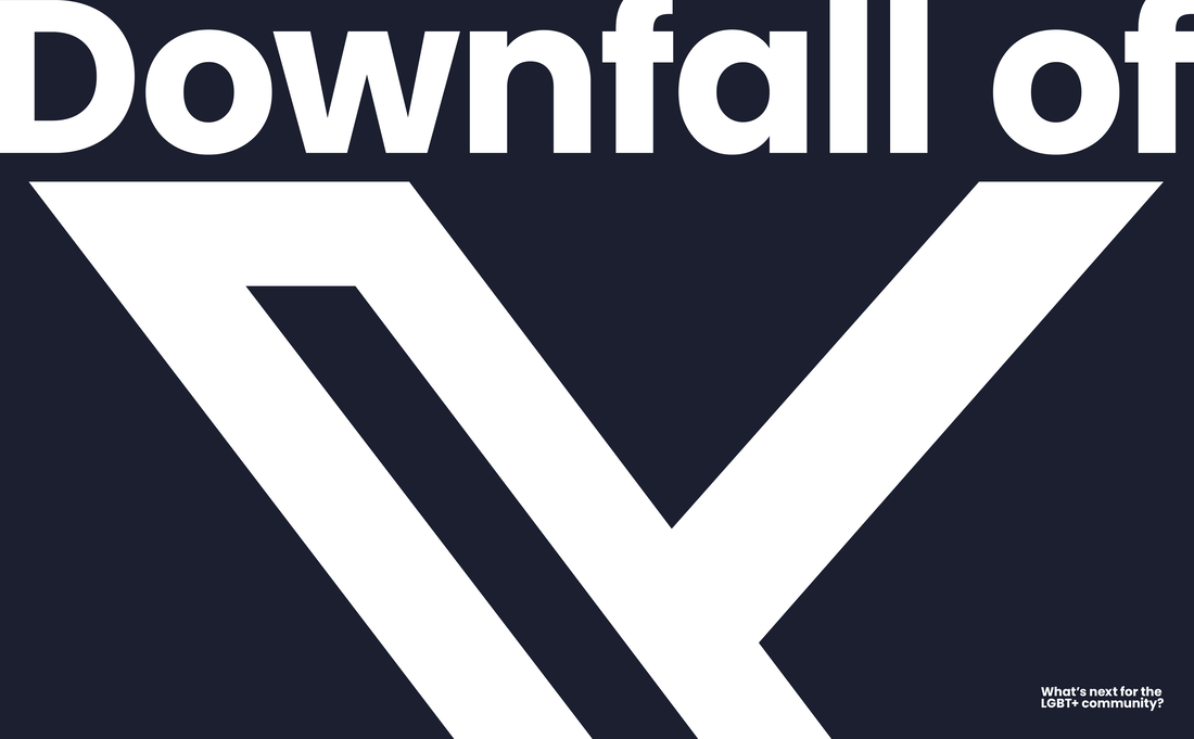
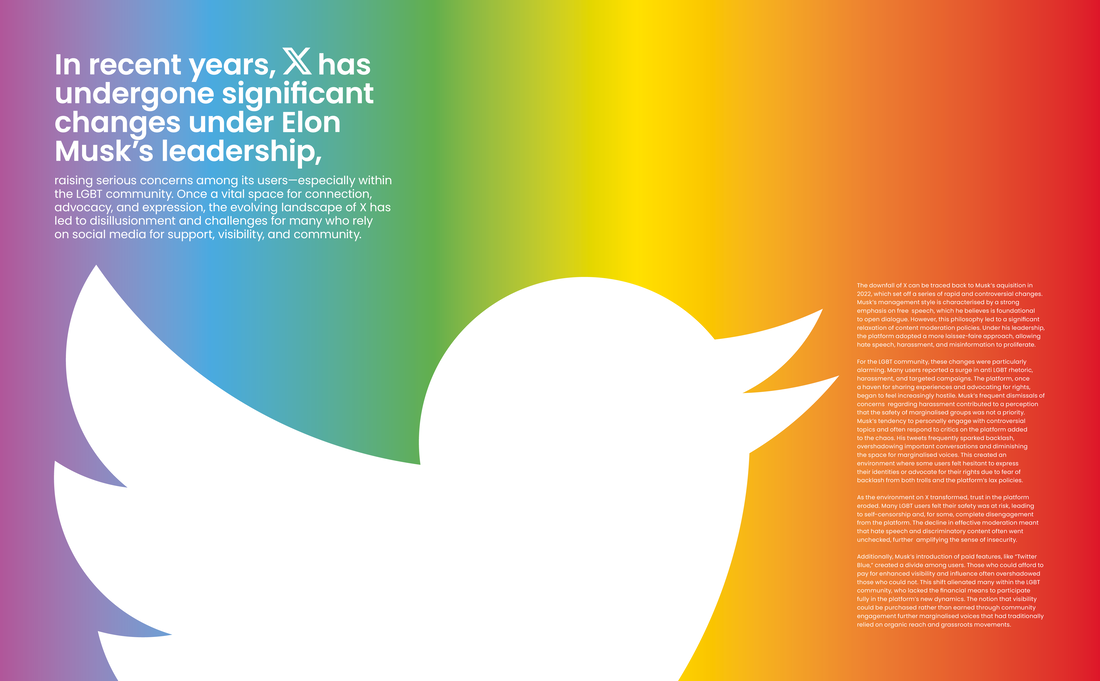
Downfall of X (twitter) and its effect on the LGBT community
|
|
The rise of TikTok and controversies
|
iPhone's Stagnation in the market
|
Not really sure which article would be best to go with at this point. the article itself isn't really that important to the design of the magazine however; ideally the layout should be usable across different contexts if it's good.
Content
Animal Crossing: A cultural phenomenon throughout COVID19:


Additionally, there's some good PR shots of the switch:
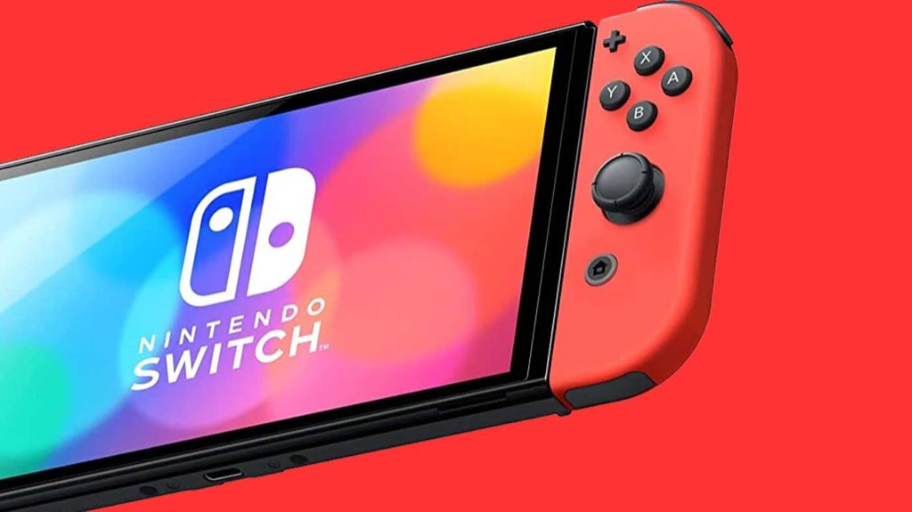


Out of all the articles, this one would be the easiest to source content for - a switch, the game and a camera would all that would be needed. Worry however that the content style might be quite hard to work with, especially seen as it's a specific artistic style.
Downfall of X (twitter) and its effect on the LGBT community


There could be an opportunity to illustrate something with this topic; looking at the images above gives some inspiration for this.
The rise of TikTok and controversies


There's a vast array of content regarding TikTok, it would just depend on which direction you end up taking. Above also presents the idea of using 3D modelling (2nd image) to use as content as a way to include my own spin on things.


This is also the only idea that would allow me to explore portrait photography and placement, something which is lacking in the rest of the articles.
iPhone's Stagnation in the market


There's plenty of shots of iPhones and related images, but I'm not exactly sure how you would portray stagnation, which could be a problem when it comes to the splash page.
After looking for content to use, it's clear that the choice of topic is between animal crossing and TikTok; I can see a clear path with those two.
THumbnails
4 Column Layouts:

The thumbnails lean heavier into full image splashes more than anything, but It would be to explore some text-only versions to see how they look.
9 Column Layouts:

I feel like more fun could be had using a 9 column layout vs 4; there seems to be more option to play with different alignments and having the ability to place certain elements out of line.
Thumbnails from 'Life on mars' project:

|

|
Included these thumbnails in addition to the ones for this project, as there's a few that are very relevant to both projects, in particular the turnpike layouts (a lot of them are 4 column layouts). Some of the splash designs could also work for this project too; for the most part they're different to the ones produced for this project.
more research
Novum, December 1991

|

|

|
Mslexia, September-December 2023

|

|

|
Screen International, January 2013

|

|

|
3D World, date

|

|

|

|

|

|

|

|

|
Magazine covers:

|

|

|
Recreating LAYOUTS
4 column layouts:
|
Thumbnail 1:

|
Thumbnail 2:

|
|
Thumbnail 3:

|
Thumbnail 4:

|
|
Thumbnail 5:

|
Thumbnail 6:

|
9 column layouts:
|
Thumbnail 1:

|
Thumbnail 2:

|
|
Thumbnail 3:

|
Thumbnail 4:

|
|
Thumbnail 5:

|
Thumbnail 6:

|
Not sure this really helped. Having done it for the Life on Mars project, it felt a bit repetitive doing it a second time. Feel i know enough now about laying elements out in InDesign.
Direction
Finding at this point hard to see a way forward. The content I've sourced isn't the best to work with, and AI isn't really helping. With a bit of tutor input, the best way forward is going to be creating my own content instead, harnessing my own style. article wise, X seems the best suited to create art for. Want to explore using flat design but also trying a bit of 3D design using blender.
Content take 2.
Started out this time tapping into my own style, aka flat and simplistic. Starting off using black and white as the base colours, with the rainbow of colours applied to one aspect of each design.
Flat vector design

|

|

|

|

|

|

|

|

|

|

|

|
Some of these look strong, especially the first, fourth and eleventh. They would very much need to be integrated into the page rather than boxed in a frame mind.

Didn't use illustrator to create these, as time was limited at this stage. Flat vector drawing feels a bit clunky in adobe vs affinity. Will import them into InDesign to use.
3D modelling
Wasn't really sure what to model in blender for this, so i started off with getting both the X and the twitter bird modelled, and then just played about with physics to see what could be achieved.
These would be very effective covers, but they wouldn't work as images within the magazine. May experiment with one used as a cover later on, however they don't mix too well with the flat designs.

|

|

|

|

|

|
Part a: Masthead
Looked at many typefaces to see which would be best:

|

|

|
Mastheads applied to example cover image:
Chosen masthead:

Went with Dunbar Text typeface for the masthead, as it's clean yet has a slight quirk to it (the G in particular). For all other type, will probably end up using Poppins, as it fits the art style really well, along with also working with photography based imagery (should I U-turn on the designs).
SPREAD Development
Design 1

Grid layout:

Design 2

Grid layout:

Design 3

Variations:

|

|
Grid layout:

Design 4

Variation:

Grid layout:

Design 5

Variations:

|

|
Grid layout:

Design 6

Grid layout:

Design 7

Grid layout:

Design 8

Grid layout:

Bonus design
Had fatigue from designing spread at this point, so went a bit off track by shining a rainbow through XOXO. fairly effective but not sure it really ties in.

Out of them all, the 1st design and the 1st variation of the 5th design feel really strong. The weakest are probably the ones with full bleed rainbow and rainbow contained within the Xs.
Turn Development
Design 1

|

|
Development:
Design 2

|

|
Development:
Design 3

|

|
Development:
Design 4
|

|
Development:
Out of the 4 designs, the second and third are probably the strongest. Only thing letting down the third option is the colour scheme; not sure it looks right for the type of magazine article (it's gives off gay stereotype rather than gay exposure).
They all could work together as pairs instead of their current pairings, so may explore mixing them up.
Cover Development
Design 1
|
Outcome:

|
Grid layout:

|
Design 2
|
Outcome:

|
Grid layout:

|
Design 3
|
Outcome:

|
Grid layout:

|
Design 4
|
Outcome:

|
Grid layout:

|
Design 5
|
Outcome:

|
Grid layout:

|
Design 6
|
Outcome:

|
Grid layout:

|
Design 7
|
Outcome:

|
Grid layout:

|
Design 8
|
Outcome:

|
Grid layout:

|
Variations:
Tried at this point adding the 3D renders of the X to the front cover using the layout below. It looks really effective, but i think the clean flat designs still pull in front.

|

|

|
All of these are quite effective, The first design however, felt stronger without all the text surrounding; something to be mindful about when refining the cover. Added a stroke to the letter I in margin also, but it's maybe complicating the masthead too much.
Pairings
(Options arranged vertically)
|
Option 1
|
Option 2
|
Bonus option
|
|
|
|
|
|
|
|
|
|
|
|
|
The first two options were decided by a face off with the group, until we narrowed all the options down to 2 alternatives. Some of the discarded options i felt still had protentional if harmonised, so I've put these as another option to also explore.
Final Development
Option 1
Development:
Finished pages:

|

|

|

|
Haven't done much to the cover bar scaling the barcode up. The spread also remains unchanged bar slight adjustment of text and X size.
Changed the last page to white instead of black, to break up the eye fatigue of staring at constant black when reading. Removed the soaring twitter bird on the 2nd turn page and replaced it with the falling bird in it's place to add a bit more negative space. The page is also off-white, though I'm not sure if this translates that well (you also cant tell when it's printed). Body text also upped to 8pt so it's readable.
Changed the last page to white instead of black, to break up the eye fatigue of staring at constant black when reading. Removed the soaring twitter bird on the 2nd turn page and replaced it with the falling bird in it's place to add a bit more negative space. The page is also off-white, though I'm not sure if this translates that well (you also cant tell when it's printed). Body text also upped to 8pt so it's readable.
Option 2
Development:
Finished pages:

|

|

|

|
Removed the hanging bars from the X on the front cover, so it floats instead. Rearranged the birds slightly for consistency. The spread remains unchanged, bar aligning the twitter birds with pieces of text (the heads are aligned with the top of the headers).
With the turns, moved away from full black pages, instead alternating between black and white. Works well, especially on the 2nd turn with the opposite twitter birds meeting in the middle. Body text upped too so it's readable.
With the turns, moved away from full black pages, instead alternating between black and white. Works well, especially on the 2nd turn with the opposite twitter birds meeting in the middle. Body text upped too so it's readable.
Option 3
Development:
Finished pages:

|

|

|

|
For the cover, it was really about making the imagery stand out better, so reduced the tagline considerably to give the image more prominence. For the spread, adding a sliding twitter bird makes it clearer as to what the original X is. Chose navy vs black as the main colour this time round, to break away from black.
For the turns, the 1st mostly just needed a colour change. Went with twitters iconic blue and navy to tone down the turn. Colour then returns on the second turn when talking about the future of the LGBTQ+ community on X.
For the turns, the 1st mostly just needed a colour change. Went with twitters iconic blue and navy to tone down the turn. Colour then returns on the second turn when talking about the future of the LGBTQ+ community on X.
Final OUTCOMES
Design A
Front cover:

|

|
Double spread:

Article pages:


Digital booklet:
Mockups:


|

|
Design B
Front cover:

|

|
Double spread:

Article pages:


Digital booklet:
Mockups:


|

|
Bonus: Design C
Front cover:

|

|
Double spread:

Article pages:


Digital booklet:
Mockups:


|

|
Feedback & Response
Revising the masthead
Aligning edges of letter G

Widening the R

Revised masthead:

Revised Covers using new masthead
|
Design A

|
Design B

|
Design C

|