RYATHO | University Website
  • Year 1
    • Introducing Visual Communication >
      • The Comic
      • Technical Skills
      • Drawing & Visualising
      • Colour, Composition & Narrative
      • IT Sessions
      • Workshops
    • Multi-Dimensional Graphic Design >
      • 2D
      • 3D
      • 4D
      • Set Exercise
      • Workshops
    • Other >
      • West Walls Brew Co
  • Year 2
    • The Designer's Toolkit >
      • Alignment & Hierarchy
      • Contrast & Negative Space
      • Balance & Colour
      • Hotfoot
    • Type & Typography >
      • Hierarchy & Layout
      • Magazine Layout Design
      • Responsive Digital Typography
    • Graphic Design Projects >
      • D&AD: Yahoo!
      • Museum Brand Identity
      • Information is Beautiful
      • West Walls Anniversary
    • The Critical Designer >
      • Research Blog
    • Other >
      • Uptown Gallery
  • Year 3
    • Independent Research Paper >
      • Research Blog
  • Ryatho.co.uk

The Critical Designer
​Research Blog

Week 5: Graphic Code of Comics task

27/2/2025

0 Comments

 
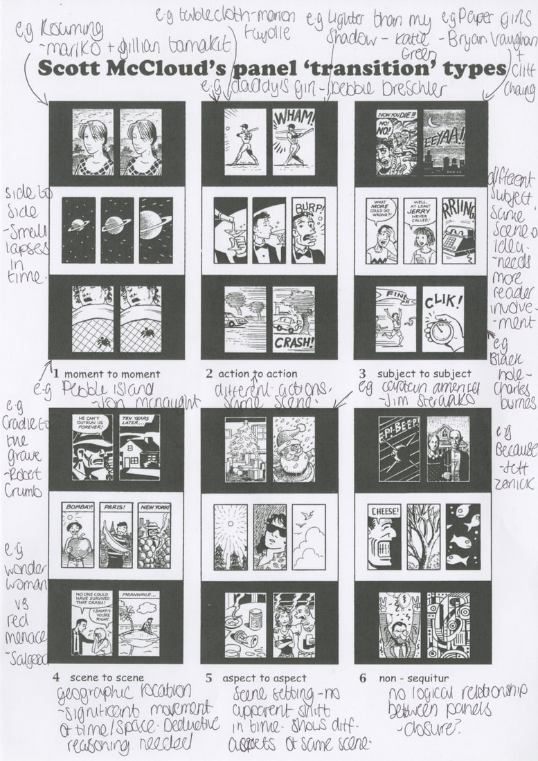
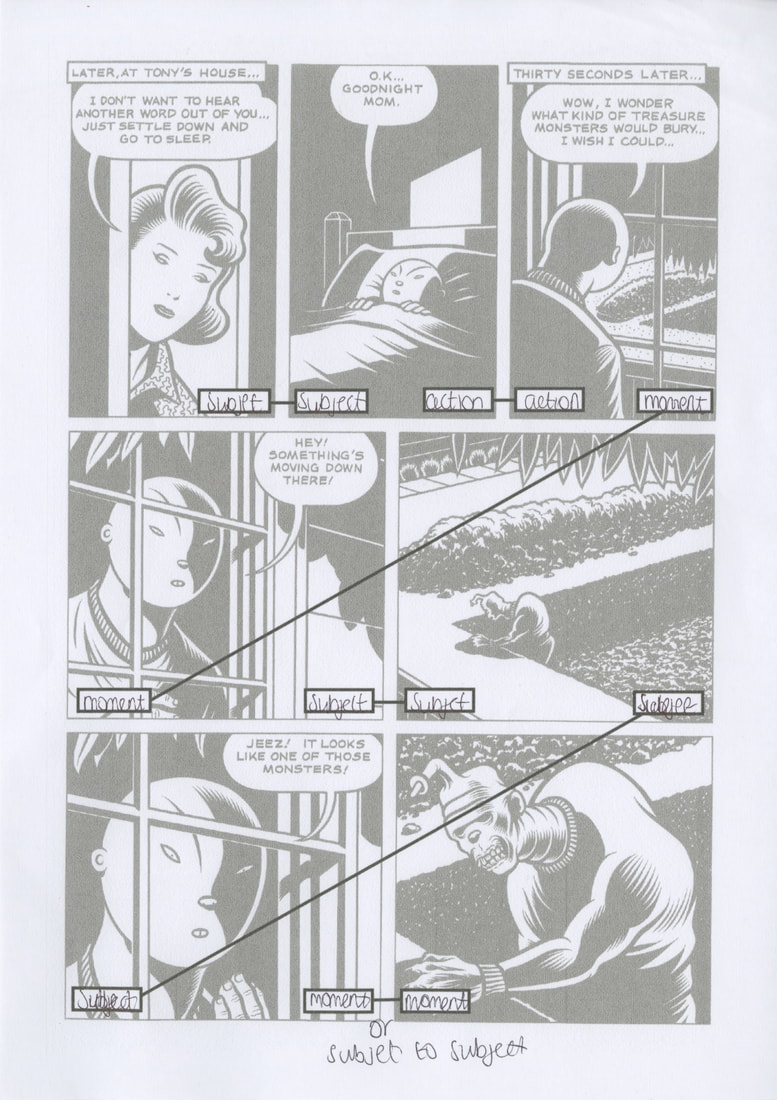
Francis Manapul
Francis Manapul's layouts are known for their smooth, dynamic flow, using non-standard panels to boost motion and storytelling. He blends art and narrative seamlessly, creating visually engaging pages that control pacing and impact.
Examples from The Flash: Volume 1: Move Forward (2013)
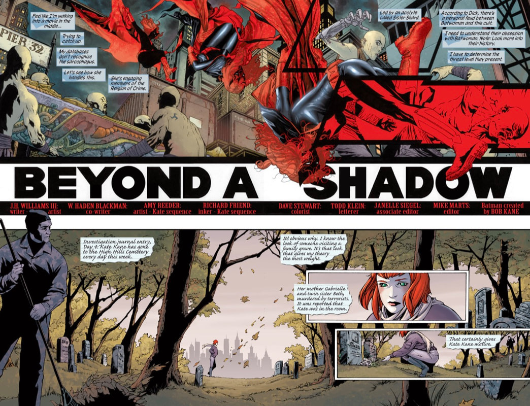
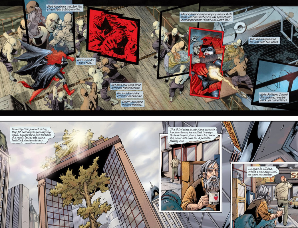
Picture
Picture
Picture
Picture
J.H. Williams III
​J.H. Williams III’s is known for his creative panel designs and bold layouts that really push the storytelling. He blends different styles to create visually striking pages that bring the mood and flow of the story to life.
Examples from Batwoman Vol. 1: Hydrology (2011-2015)
Picture
Picture
Picture
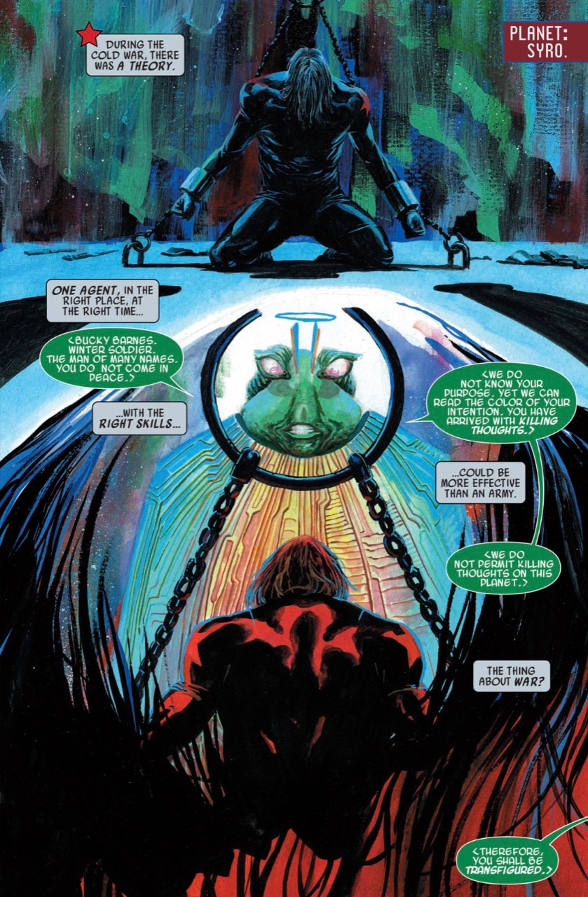
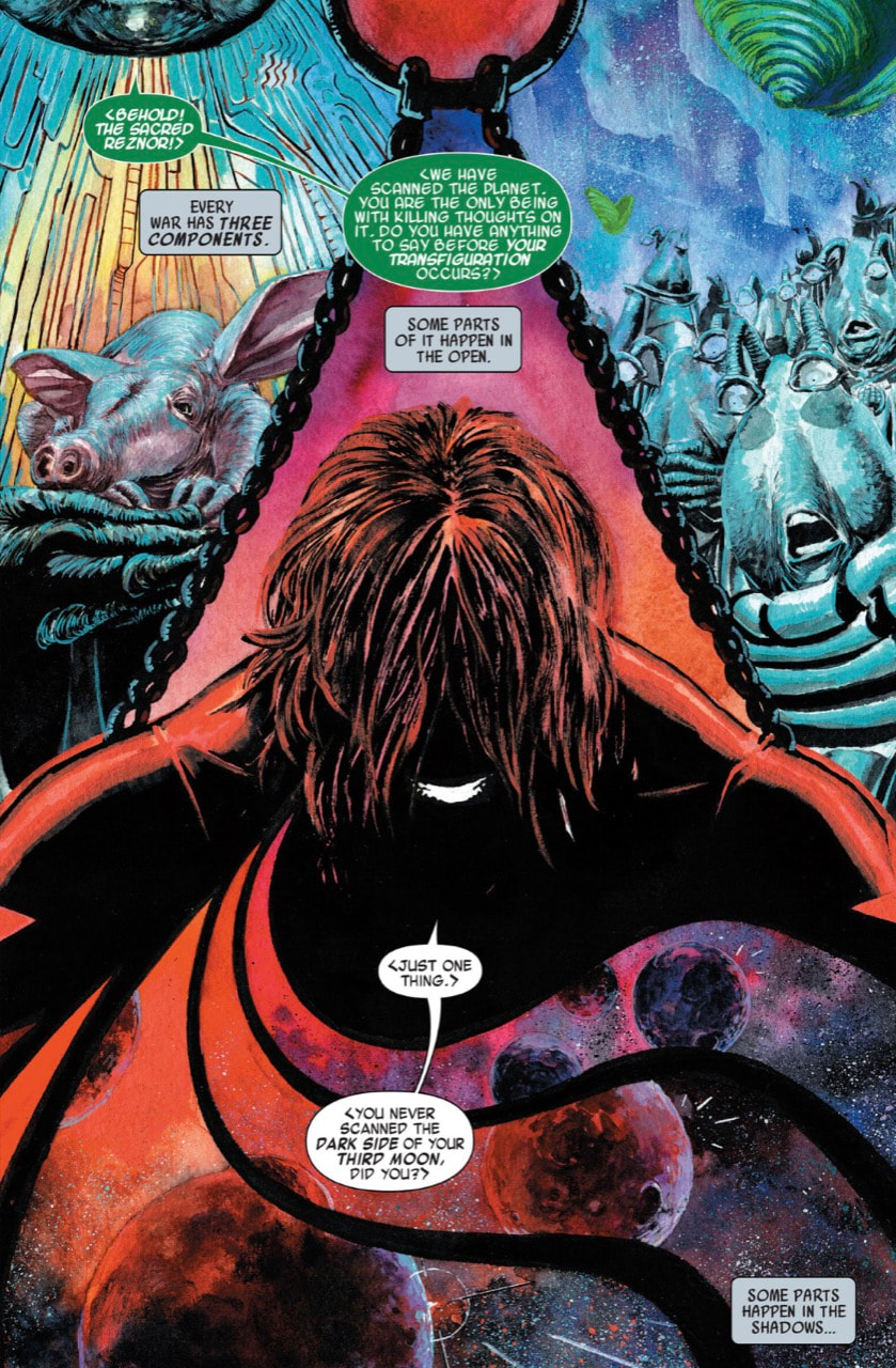
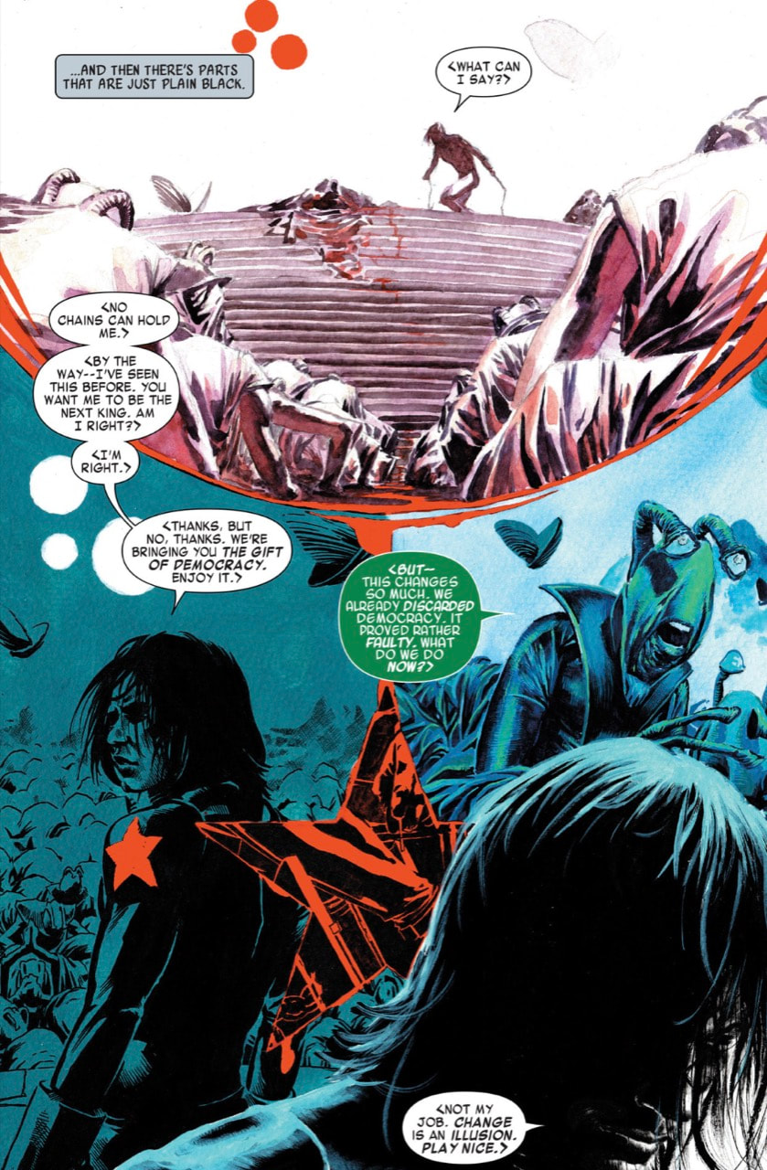
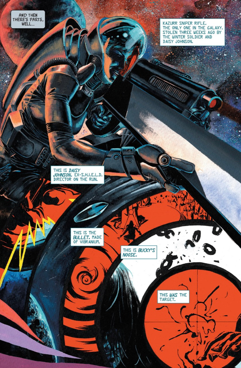
Marco Rudy
Marco Rudy’s layouts are unique, detailed panels that mix surrealism with dream-like visuals. His style blends fluidity and complexity, making every page feel like a piece of art that enhances the story’s atmosphere.
Examples from Bucky Barnes: The Winter Soldier Vol. 1: The Man On The Wall (2014-2015)
Picture
Picture
Picture
Picture
0 Comments

Week 5: Session Notes

26/2/2025

0 Comments

 
Picture
0 Comments

Week 5: Graphic Code of Comics

26/2/2025

0 Comments

 
Picture
Picture
0 Comments

Week 4 ANalysis: Laurent-Perrier Advert

19/2/2025

0 Comments

 
0 Comments

Week 4: Decoding Advertising

19/2/2025

0 Comments

 
Picture
Picture
0 Comments

Week 4: Session Notes

19/2/2025

0 Comments

 
Picture
0 Comments

Week 3: Words & IMages

12/2/2025

0 Comments

 
This is my copy of Barbara Kruger's "I shop therefore I am". Recreated it first in Illustrator to work out dimensions, placement, typeface etc.
Picture
Below are two versions with different slogans, the first a play on "fake it till you make it" and the second a play on the difference between wanting and needing.
Picture
Picture
0 Comments

Week 3: Session Notes

12/2/2025

0 Comments

 
Picture
0 Comments

Week 3: Ceci n'est pas une pipe.

12/2/2025

0 Comments

 
Picture
My lovely vectorised/overlayed textured pipe drawing.
0 Comments

Week 2: "The World of Wrestling"

5/2/2025

0 Comments

 
Your browser does not support viewing this document. Click here to download the document.
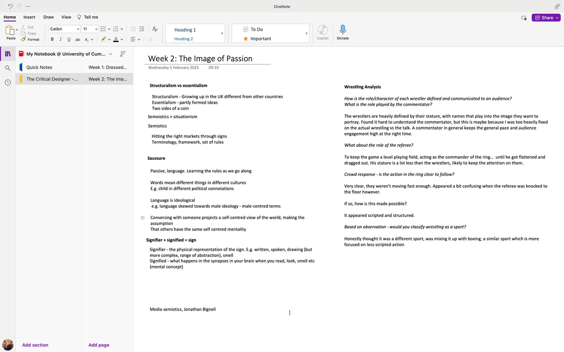
From reading through the text, it's clear that Roland Barthes sees wrestling as a grand spectacle, similar to how theatrical performances are conducted, where every gesture is over the top and full of meaning. This is in contrast to boxing, where the story always revolves around fair competition. Wrestling on the other hand is a series of immediate, symbolic moments. The audience enjoys wrestling for its dramatic display of emotions, where every action is designed to be understood instantly, very much like how live performances work, clearly showing the battle between good and evil.

For me personally, I agree with Barthes analysis of wrestling. After watching an old wrestling match in the lecture, it was clear from the outset that it was staged, and their positions/movements made it easy to predict what would happen next. This is very much in stark contrast to boxing, where it's never clear what will happen next. Barthes is right to not class wrestling as a sport; The outcome of the match is too predictable, and the style is over-dramatised.
0 Comments

Week 2: 'The world of wrestling" theory talk

5/2/2025

0 Comments

 
Found this video online that gives a great explanation of the theory behind "The world of wrestling".
0 Comments

Week 2: Notes

5/2/2025

0 Comments

 
Picture
0 Comments

    Categories

    All
    Analysis
    Decoding Advertising
    Decoding Comics
    Dressed To Kill
    Gender & Representation
    Graphic Code Of Comics
    Lesson Notes
    Subculture & Style
    Tasks
    The Image Of Passion
    Week 1
    Week 2
    Week 3
    Week 4
    Week 5
    Week 6
    Week 7
    Words & Images

    Archives

    March 2025
    February 2025
    January 2025

Site powered by Weebly. Managed by 34SP.com