Project Brief
Set exercise 3
Exploiting the principles of balance and colour and the assets provided, create designs for an iPad App or Web App. This should comprise of a Landing Page and a Product Page for each of the three bikes. One set of designs using symmetrical balance, another using asymmetrical balance. One set using a complimentary colour scheme, the other using contrasting colour scheme.
You can combine the above to create two sets of designs e.g. symmetry + complimentary / asymmetry + contrasting colours
You must use at least three of the images across the two spreads (you can also find your own images too)
You can create more than one set of ‘final’ screens
You can combine the above to create two sets of designs e.g. symmetry + complimentary / asymmetry + contrasting colours
You must use at least three of the images across the two spreads (you can also find your own images too)
You can create more than one set of ‘final’ screens
Jump to final outcomeS
Design guidelines & UI/UX trends
UI/UX Guidelines
Apple developer guidelines:
Android developer UI design
UI/UX Trends
|
Deconstructed hero sections:
|
example: https://www.halo-lab.com/
|
|
Off-white palettes
|
example: https://www.seaharvest.net.au/
|
|
Stop animation scrolling
|
example: https://www.hyperframe.com/
|
|
90s retro nostalgia
|
example: https://rogerjunior.com/
|
COLour & Figma
Finding colours
Found this great tool provided by canva to quickly find complimentary/contrasting colours
Figma tutorial
needed a basic starting point in how to use figma; this tutorial was perfect. It's very similar to illustrator in how things work, and the prototyping is similar to how sketch works (another UI design app).
Development
Initial layouts
Started off replicating the wireframes I'd done, but I didn't feel that they were really what I wanted. Very element heavy (verging on the lines of shopping app style).
Instead, I decided to just try making the menu bar first, and concentrating on the main text copy that was required, seeing what could work.
I prefer this style over the original layouts; it looks better with single imagery vs loads of elements. Not sure if the transparent menu bar is necessary - feel it might still work without this part.
Additional Content
Extra copy
When it came to designing the product pages, it was clear there was a lack of text to use. ChatGPT was handy here; it managed to generate exactly what was needed: a short concise paragraph that sells the bike. The rest of the generated text was discarded for the most part.
Improved bikes
With.a concentration on image heavy elements in the app, I found that the provided assets weren't high res enough to achieve what I wanted, so I found some higher resolution bikes (courtesy of specialized.com).
Continued Development
Played about with just one of the bikes to begin with, to try and get a feel for placement.
With the product pages, I wanted it to have independent horizontal scaling sections for the different filters, so you could browse without having to tap into anything.
Animation testing
Really wanted to crack getting the app to 'work', as it'll make it easier to understand the concept vs describing how something will work. tried with basic delay animations to get the landing page to automatically scroll through the different options.
Workflow in action:
Colour tests
Whilst I like the teal/purple colour combination, it felt a bit limiting for some bits of the design, so I decided to try and find a different colour scheme for this design. Will keep the teal/purple combination for the other design if it fits.
Really wanted the red/green combination to work, however they're too clashy on certain parts, in particular the landing pages with full colour bleeds. it works better where the main colour is white, using those as accents instead.
Settled on pink/purple in the end, with the product pages taking on the colour of the bike, but with a similar colour tone to the pink/purple combination.
Alternate design
For the asymmetrical design, I tried to begin with using the main menu as a vertical option, that would swap out when needed with other elements (possibly pushing off the screen to let new options appear).
Didnt really feel it was working, so decided to use oversized images instead; only one will ever fit on the screen, with others hanging off.
For the product page, I really wanted to try getting just the options moving instead of the whole page, similar to how apple does it when selecting options for a product.

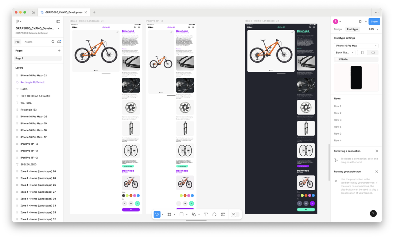
Also tried using a dark theme mode to see what that would look like, but found the darker colour a bit jarring with the light imagery.
The about pages are very much image based in comparison to the rest of the design.
Figma Development Board
FINAL OUTCOMES
|
Design 1
|
Design 2
|
Site powered by Weebly. Managed by 34SP.com


