Project Brief
Using copy provided, choose one of the manifesto texts. Produce 3 different typographic layouts which present the information given in a visually stimulating and attractive way, enabling the reader to understand the nature and theme of the text.
Must include:
• All of the manifesto text
• Type only, no images
Typeface restrictions:
• One typeface in any weight and as many sizes as you see necessary
• Two typefaces, in any weight, each in any size
• One typeface in bold and book/regular, in any size
Must include:
• All of the manifesto text
• Type only, no images
Typeface restrictions:
• One typeface in any weight and as many sizes as you see necessary
• Two typefaces, in any weight, each in any size
• One typeface in bold and book/regular, in any size
Research
From the books
Layout, n. an arrangement of parts etc. according to a plan by Ambrose/Harris

|

|

|
The layout look book by Max Weber

|

|

|

|

|

|
Design School Layout by Richard Poulin

|

|
This book actually contained a lot of information about layout, which will prove helpful. Few images of example pages below:

|

|

|

|
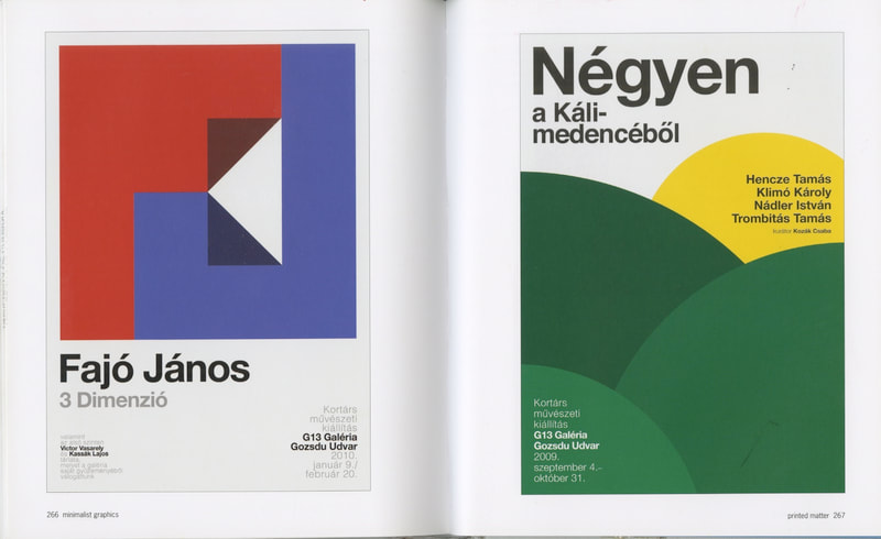
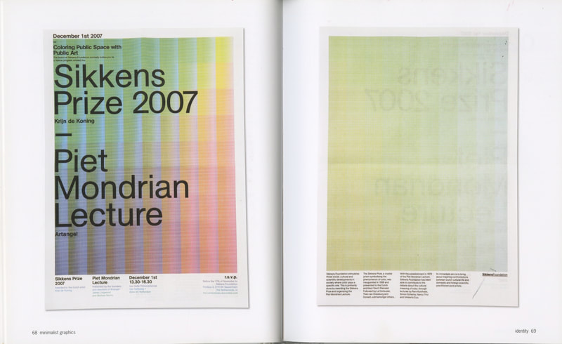
Mini ma list graphics by Julia Schonlau
|
|

|

|

Type tells tales by Steven Heller & Gail Anderson

|
Graphic designers
Armin Hofmann (1920-2020)

Junge Holländische Bildhauer, 1960
|

Good Design, 1954
|
Massimo Vignelli (1931-2014)

Tredicesima Triennale, 1964
|

Knoll International, 1967
|

New York Subway Map, 1970
|

Piccolo Teatro, 1964
|
I like Vignelli's design style in that it's always really clean, relies heavily on geometric shapes, and uses structure throughout.
From the web
Poster design is quite difficult to find online (outside of famous designers). I have however found a few that I like. cotype foundry tend to showcase their font work within mock posters, which is perfect because it's usually just text.
Studio collaborative research
As a collective, we shared our research with each other, using a spare wall to display what we've discovered:

My own contribution (1st column) was a mix of both this project and GRAP5060s Alignment and Hierarchy.
Initial ideas
Found it quite difficult to get going with thumbnails initially. Once the first few were done, a few more ideas began flowing from head to paper.

Out of the above, the strongest visually are thumbnails 3, 4 7 and 8. thumbnail 7 is probably my fave out of them, although I worry it disregards grids a little too much.

Of sheet 2, most of the thumbnails could be strong when created. the 4th thumbnail is supposed to represent text on a path overlaid, something which was really difficult to show in a quick thumbnail. I particularly like the 9th thumbnail; it's lacking any sort of copy however, so would need to figure out how to incorporate the text into the design.
Ideally if time permits, I would like to recreate all of them digitally, as this will be the first indicator of whether they work as an idea or not.
development
For this brief, it mentions to use InDesign. My knowledge of this app isn't great, so gonna need to spend some time figuring out workflows. Hopefully this will benefit going forward in later projects.
Grids and guides has been bit of a sore point for me in the past (have a really bad habit of just disregarding them).
Grids and guides has been bit of a sore point for me in the past (have a really bad habit of just disregarding them).
Design 2

|

|
I deviated slightly from the original thumbnail of this one by pulling the manifesto away from the edge. with it attached to the edge, the page felt a bit unbalanced. May have looked better if the body was also split by size, rather than the first column containing 2 different sizes of type.
Typeface(s) used: Roboto
Design 6

|

|
Everything sits well here, but I wouldn't say it's really that interesting. the paragraph splits in the body is also very apparent here.
Typeface(s) used: Poppins
Design 7

|

|
This has been my favourite so far (probably because of the lack of structure). The columns of text at the bottom even out lack of structure above.
Typeface(s) used: Poppins
Design 8

|

|
This one proved slightly difficult to get the text to sit properly. it still looks a bit too uneven in places, and there's a few random empty areas where the text should have filled. Do like the design however.
Typeface(s) used: Poppins
Design 10

|

|
Probably as standard as a grid layout can go. Feel it would look better if the title text didnt sit flush with the edges however.
Typface(s) used: Roboto
Design 11

|

|
Think more could be done to this design. the starting paragraph in the body doesn't have enough variance in size to the rest of the body, making it look a bit flat. More of Frank Ruhl Libre could have been used in places, for instance the title and the manifesto text.
Typeface(s) used: Frank Ruhl Libre + Poppins
Design 12

|

|
This feels fairly balanced, if not slightly bland. Feel the title and F should have been bigger, with surround text downscaled, for a bit more impact.
Typeface(s) used: Figtree
Design 13

|

|
Had quite high hopes for this one, however the text was hell to get to sit properly. it still doesn't feel as consistent as it should; spacings all off. wanted to make the body slightly bigger, but the paragraphs weren't sitting nicely within the grids on the F, making it look really unbalanced.
Typeface(s) used: Avenir Next
Design 15

|

|
Feel this one probably would have looked better if the text was facing the same direction. looks slightly disjointed with vertical text. Paragraph placement was also difficult; Theres a line at the bottom that should be with it's own paragraph on the left, but I couldn't for love or money make it work without spending hours fiddling with text.
Font(s) used: Avenir
Design 16

|

|
Probably as vanilla as layouts come, however it's very nice and aligned. body text possibly needed to be set to regular font weight rather than medium. The title words at the top possibly need swapped around - didn't realise it reads the other way as well, (reading things first first).
Typeface(s) used: Figtree
Design 17

|

|
Hell of a design to create, however I've learned how to wrap text properly using a margin around the object being wrapped (didn't know how to do this beforehand). Feel it looks better in black than white.
Typeface(s) used: Poppins + Roboto
Design 18

|

|
Noticed that I tend to lean into liking designs with non-conforming text. The lefts not being arranged correctly adds a bit of interest. Missed a trick; manifesto could have been aligned in size to the body text instead of jutting out at the top.
Typeface(s) used: Azo sans + custom (F)
Design 19

|

|
Honestly not sure what to think with this design. It's more of a statement piece over anything else. It does sort of work mind, though perhaps the body of text would of been better below vs on top.
Typeface(s) used: Figtree
Designs to Refine
|
Design A
|
Design B
|
Design C
|
|
Design D
|
Design E
|
Design F

|
If time allows, I would like to develop a few more of the ideas
Further development
Design A
Original + development:
|
|
|
B&W options:

|

|
Adding negative space to this one has helped the F feel more prominent in the design. The body of text in a single column addicted to the tie also looks a lot neater.
Design B
Original + development:
|
|
|
B&W options:

|

|
Wouldn't say this is better or worse than the original; it feels like it's just a different take using a 3d typeface. The original design still feels quite strong, though this one definitely feels less flat.
Wanted to try this in a different colour, just to see what it looks like in a different context

|

|
Design C
Original + development:
|
|
|
B&W options:

|

|
Design D
Original + development:
|
|
|
B&W options:

|

|
I actually noticed while looking at these finished, that I missed a trick. Potential to create an F out of the elements.
Revised:

|

|
Find it quite visually striking when you stand back, as the F becomes more clear at distance.
Design E
Original + development:
|
|
|
B&W options:

|

|
Tried to be a bit more mindful that these are being printed at A1; the text in the original design would have been far too big when displayed properly. Constraining this to the bottom 1/4 and adding a big of negative space should hopefully make it appear more proportioned.
Design F
Original + development:

|
|
B&W options:

|

|
This has ended being a completely different spin on the original, but I think I like it more. the original wasn't inherently clear what the word in the letters was, whereas at least you can make our that there is a title within the one above (in a fashion). The body text still makes it look like a back cover of a magazine however.
FInAL OUTCOMES
Final A3 Designs:
|
|
|
|

|
|
|
|
|
|
|
|
|
|
Framed poster mockups:
A3 Mockups (right 6 posters, wall shared with Jess Higgs):

Feedback & Response
Feedback was good, but there was one design that I discarded early that warranted exploring more.
The idea in question:

Started by applying the same layout from the outline one to the design. Had to remake the letters from scratch (didn't save them originally).

|

|
Also experimented with the letters going full bleed, with cropped letters along the left, right and bottom edge. Not sure on this approach however, as the text above feels separated from the design.

|

|
The previous attempts were with using different letter opacities, so decided to try using blend modes instead. Blending was a bit odd; even though the whole image is in greyscale, it tended to add different grey shades (blue shade, yellow shade), so had to apply greyscale as the document cover format.

|

|
I feel like these work better blended vs using opacity, as you can make the letters out more clearly.
