Brainstorm
Initial brainstorm of thoughts
Research
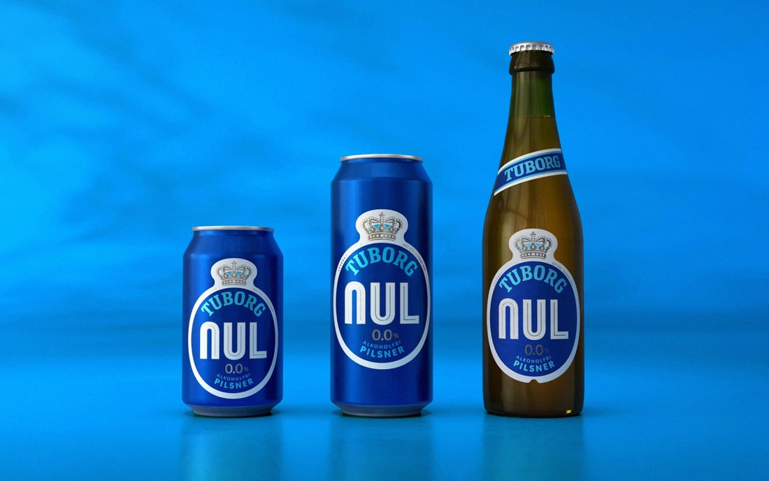
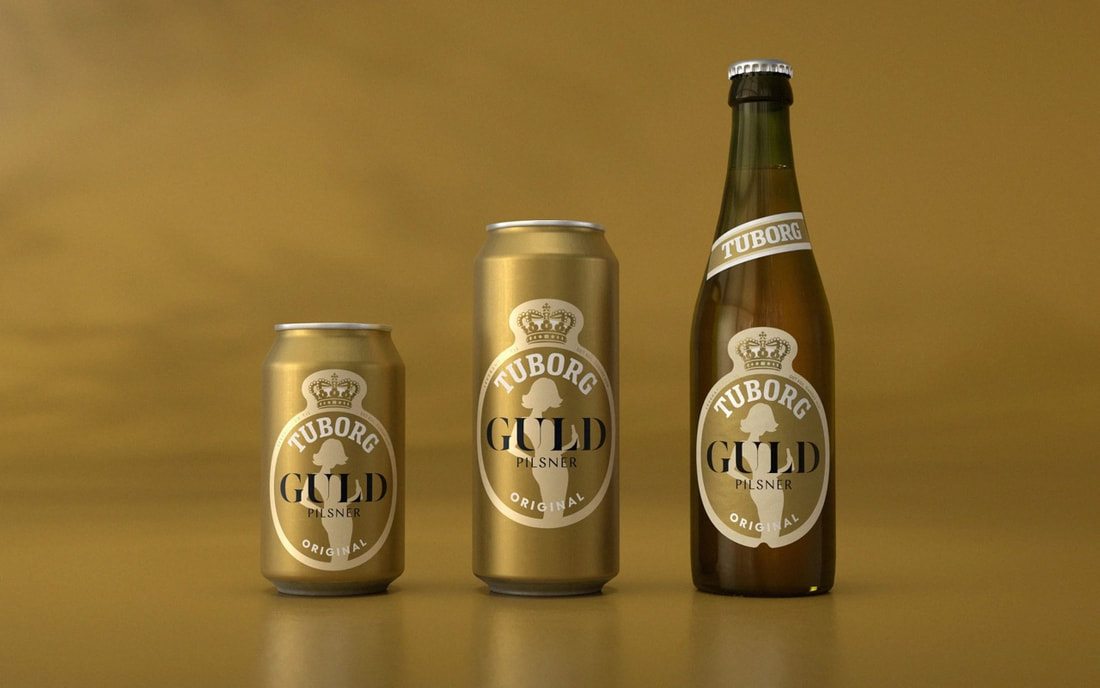
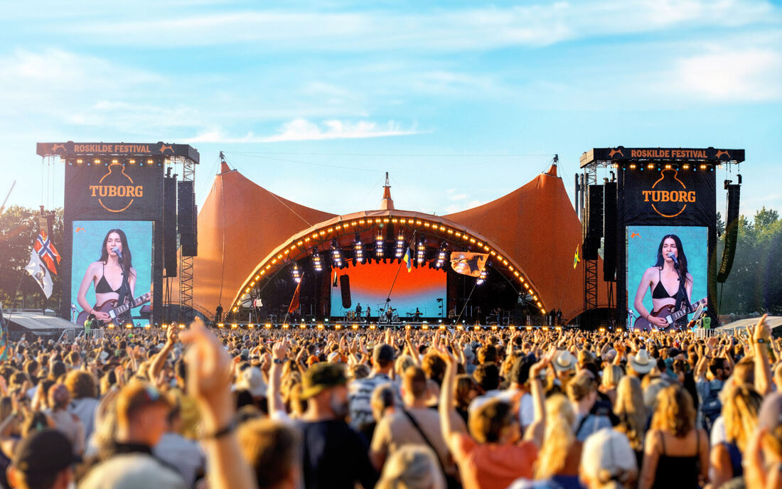
Robot Food's Tuborg branding refresh

|
|

|

|

|

|

|

|

|

|
Successful Campaigns
Coca-cola 'buy the world a coke'
John Smith's 'No nonsense'
Irn Bru 2013 Campaigns
|
|
|
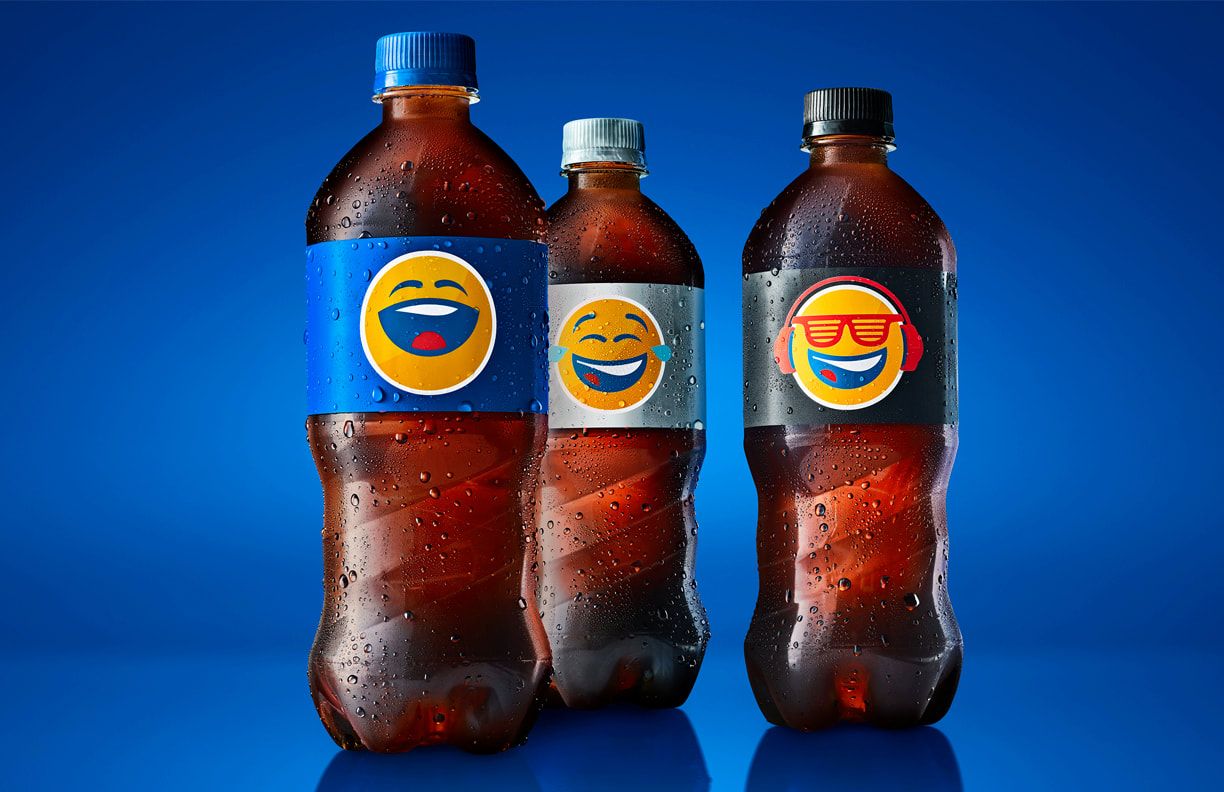
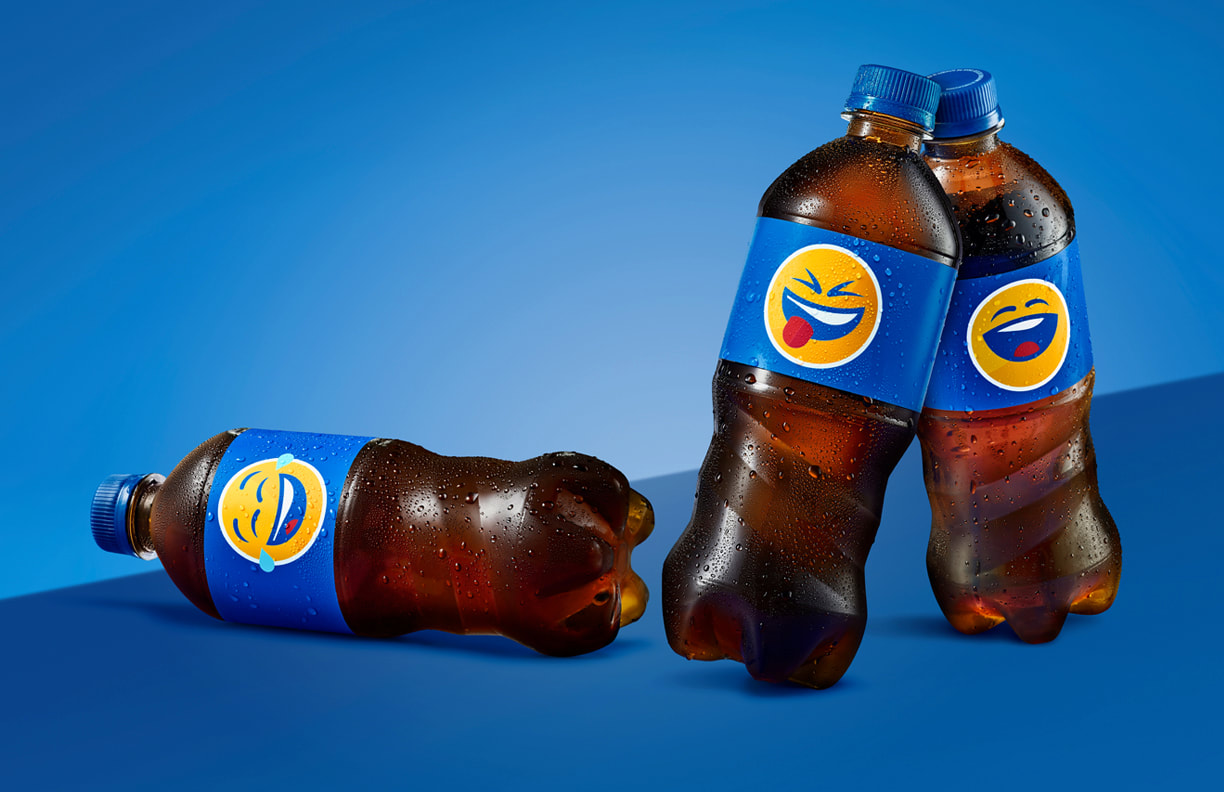
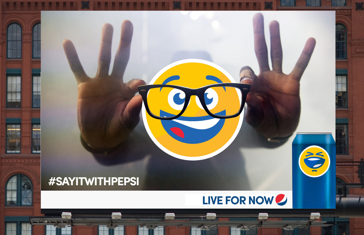
Pepsi's 'Pepsimoji' Campaign
|
|


Heinz 'Draw ketchup' Campaign

Heineken "The Hidden Message for The Boring Mode"
Heineken "TH3 G4M1NG FR1DGE"
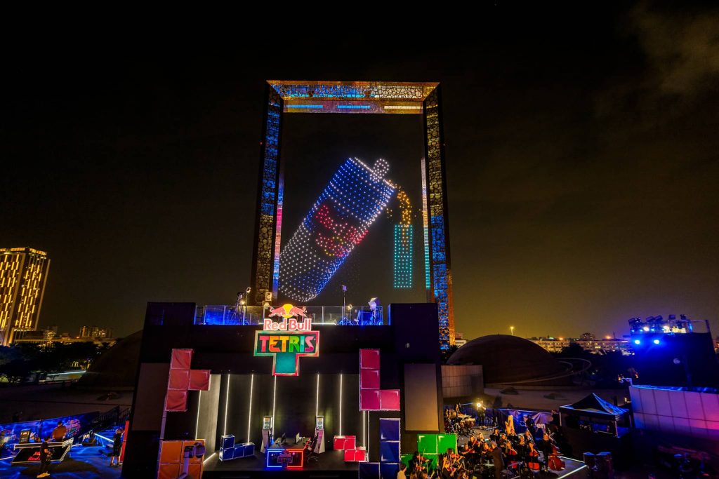
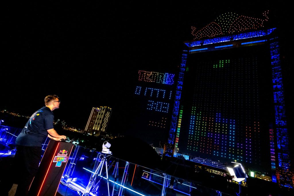
Red Bulls "Tetris in the sky"
|
|
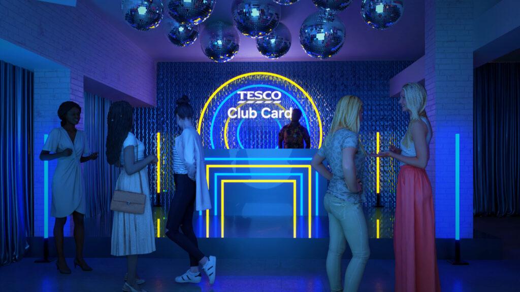
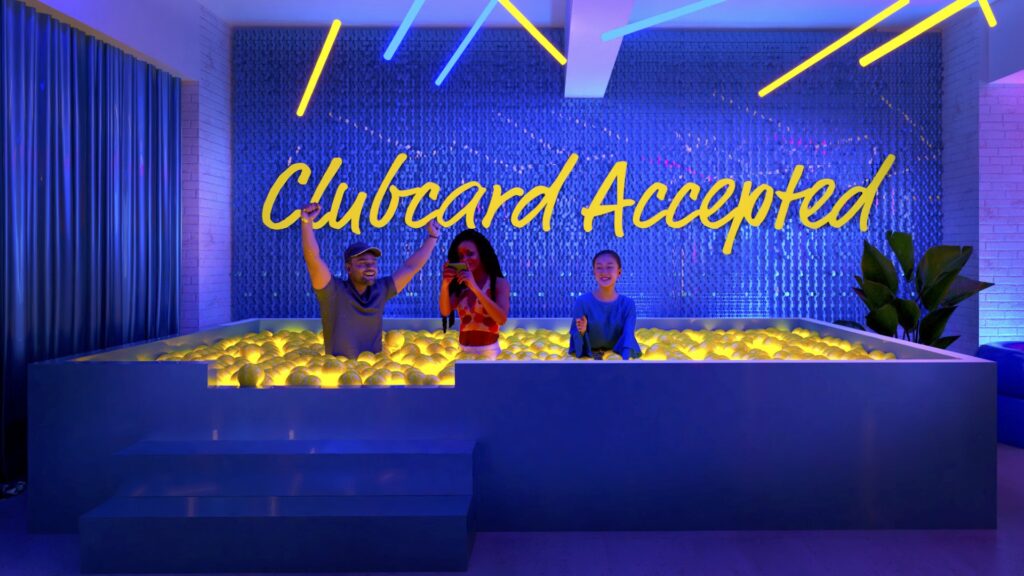
Tescos 'Clubcard 90s Rave party'

|
|
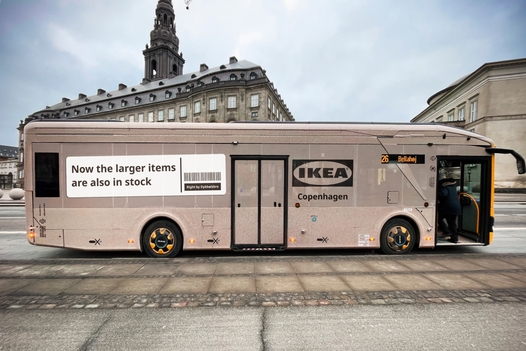
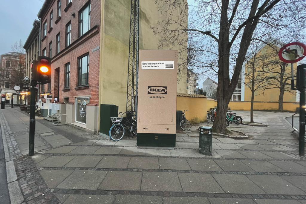
Ikea's 'Flat pack'
|
|
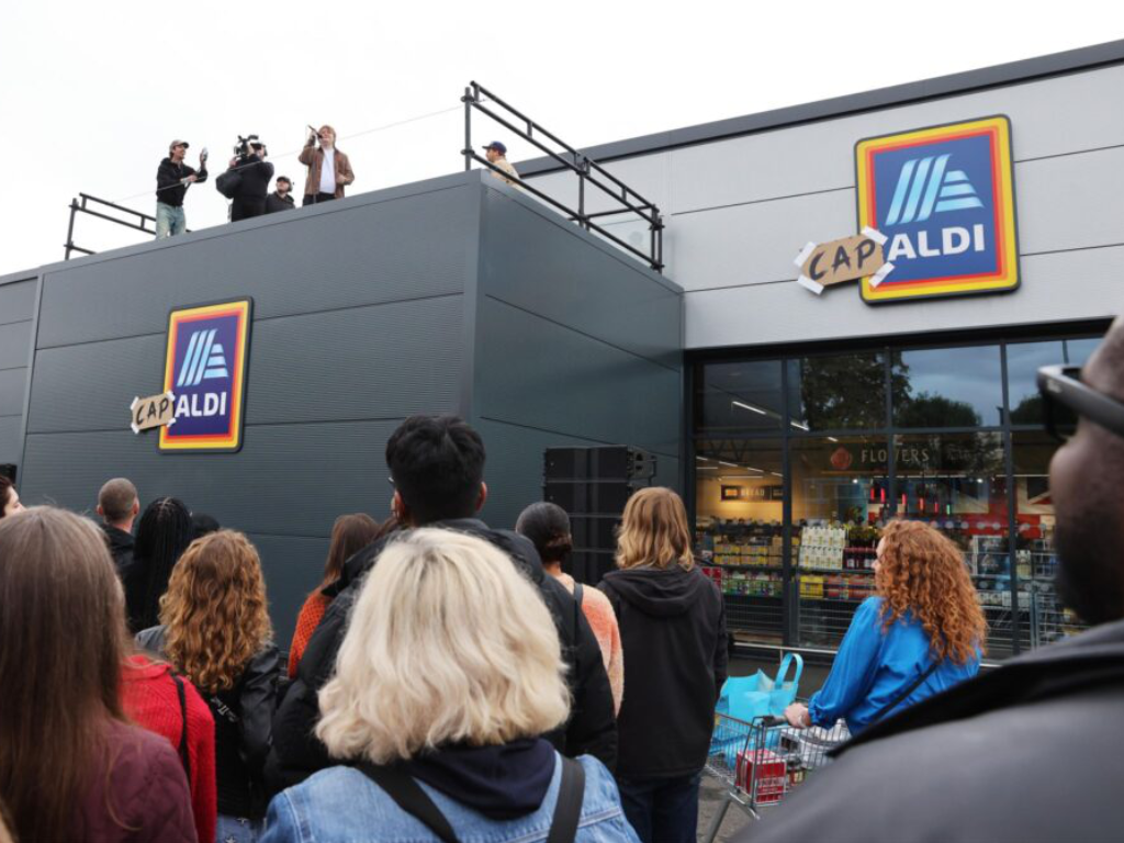
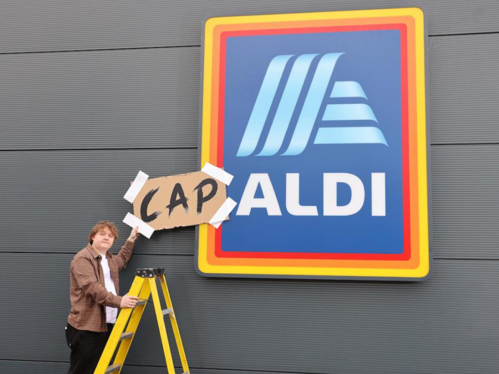
Aldi x Lewis Capaldi Collab
|
|

Apple's "Your tree on Battersea"

|

|
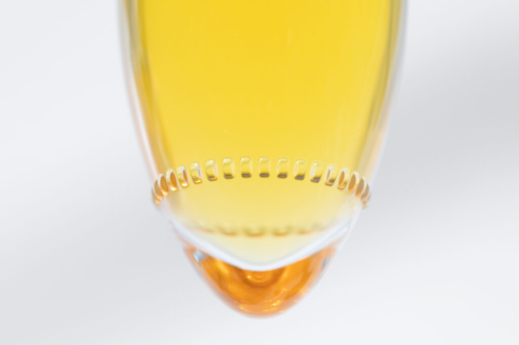
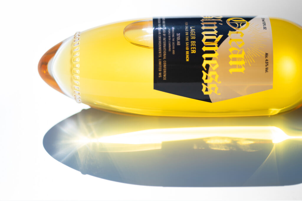
Kenji Abe's beach bottle design

|
|
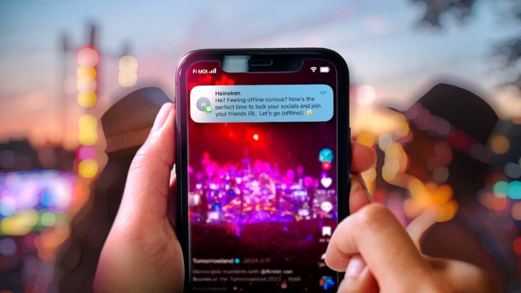
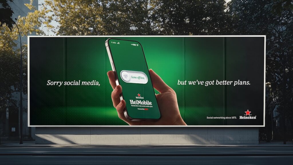
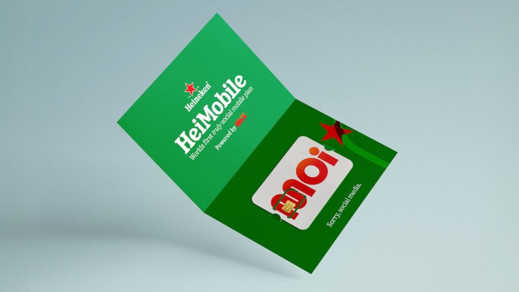
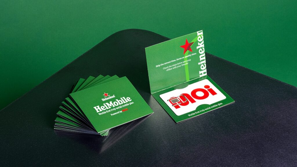
Heineken's mobile plan 'rewards for logging off"
|
|
|
|
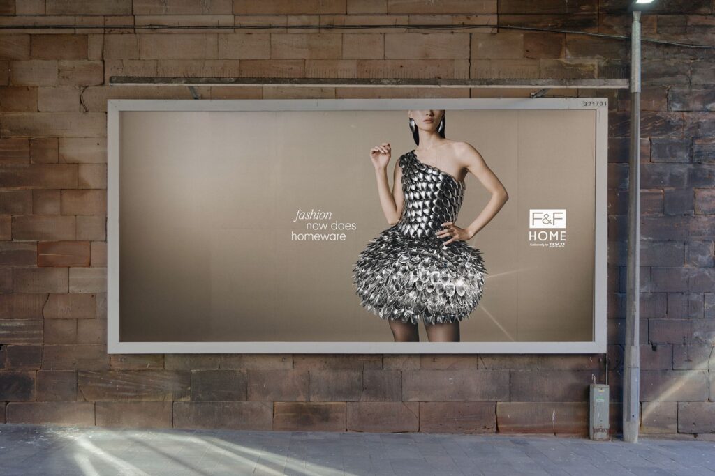
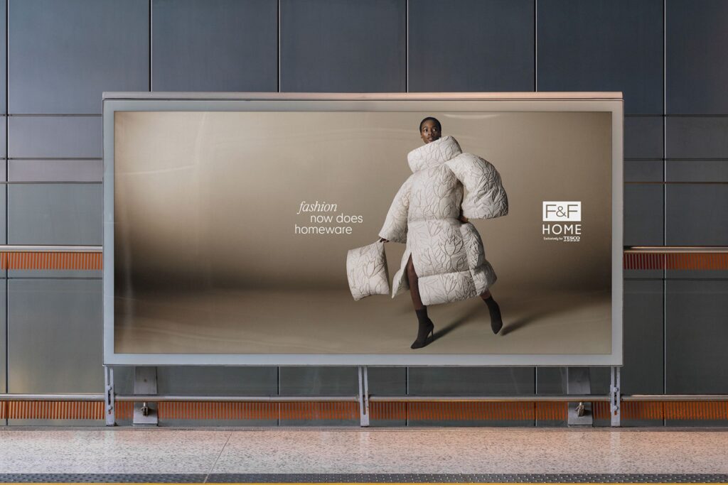
Tesco's fashion home

|
|
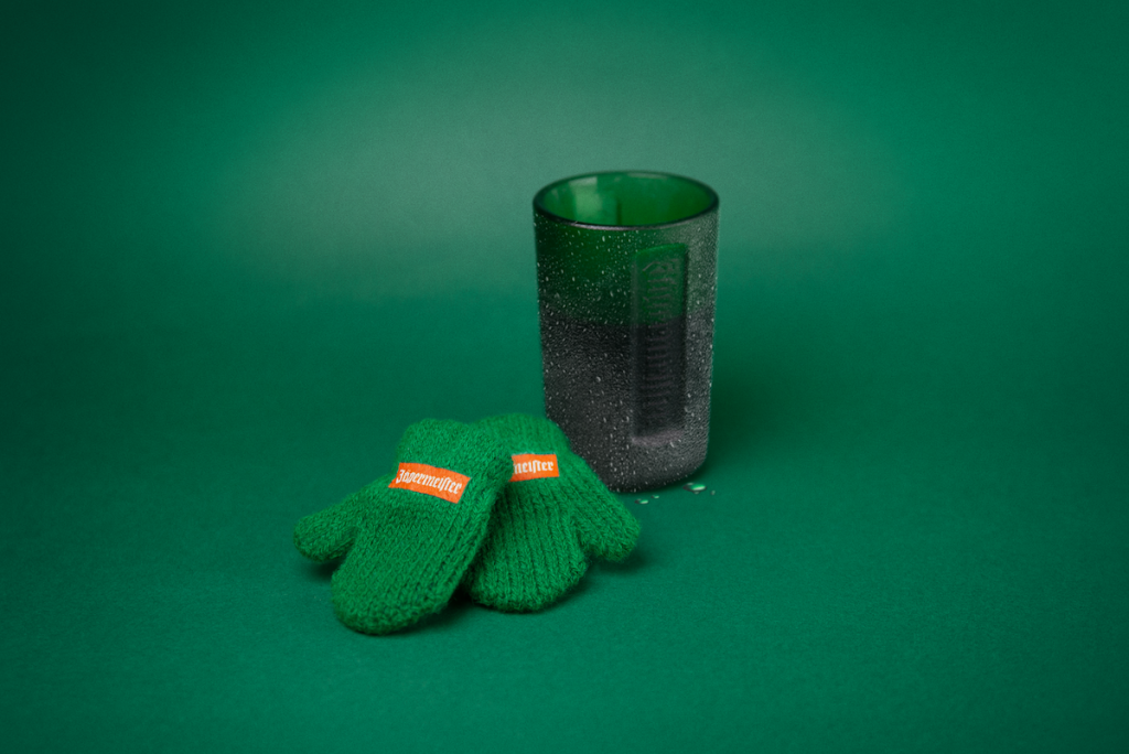
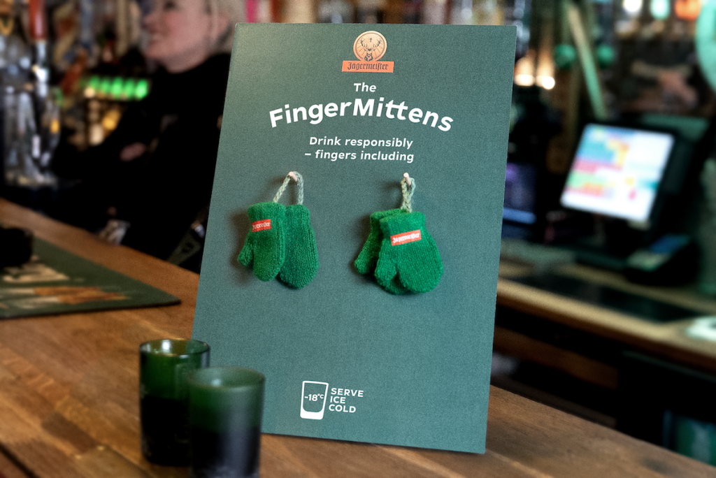
Jägermeister "Lukewarm shots"
|
|
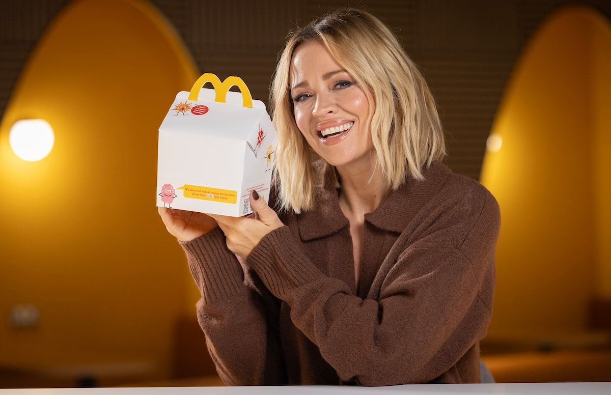
Mcdonald's 'Draw how you feel'


|
|

Sam Jones x Crayola

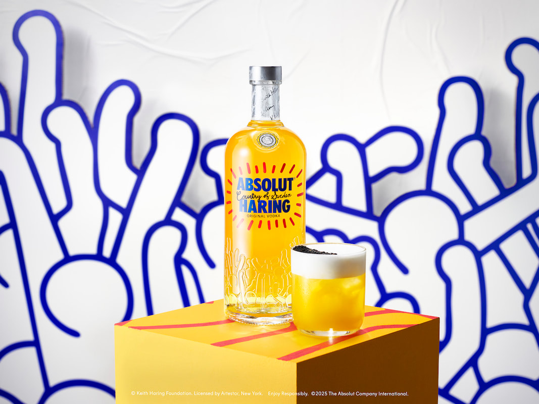
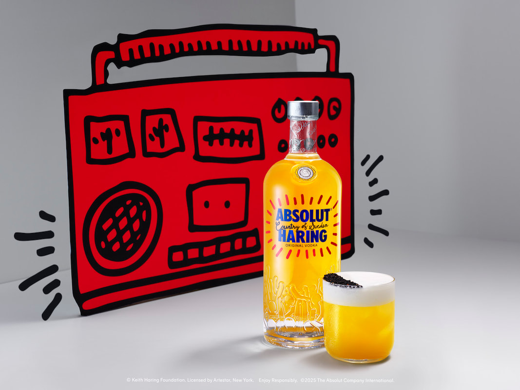
Absolute x Keith Haring
|
|

|

|
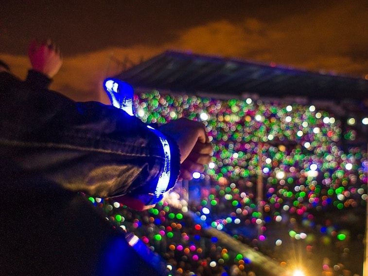
Coldplay's Xyloband

|

|
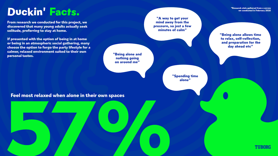
Survey Research
Setup/Design

Feedback from survey
IDEA Formation
Joint rogue idea brainstorming
Ideas Presentation (for tutors)
Ideas Presentation (merged)
Trying to work out ideas with strategy
Tuborg 'Free to____"
Other ideas weren't really working that well, and we couldn't seem to find a way to bond 'Twoborg" and "Brings you back" together into a full campaign, so bombed it all off and had a reset. Will keep certain parts (such as some experience ideas and the twoborg 2 pack bottle idea, but they'll presented differently).
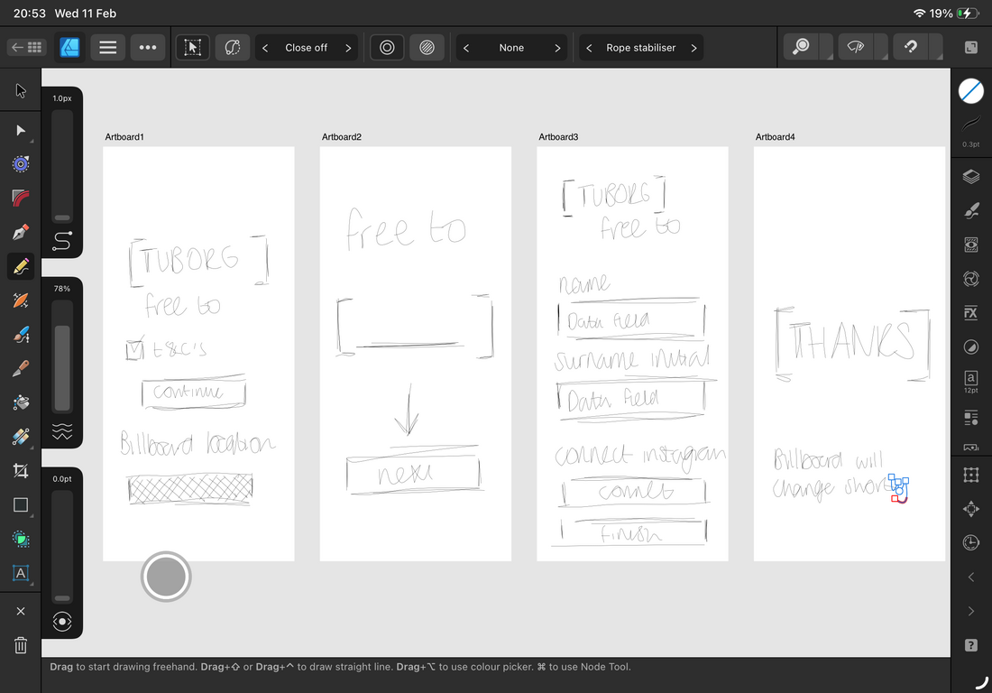
Presenting Tuborg "free to"
Presenting Tuborg "free to"
Tuborg 'free to___', a campaign centres on the ability to be free of your problems through expression, problems of which may feel personal to you, but could also be problems that many others also face. The ability to choose your release through the use of different words or phrases is core in promoting self expression. 'free to' challenges people to ask themselves what would be the one emotion or action that would help them to be in the moment.
Pulling the 'pull tab' of Tuborg is but a physical action, we want to get people pulling the 'pull tab' on mental health, getting all to be open and honest. Spreading positivity through interaction.
Pulling the 'pull tab' of Tuborg is but a physical action, we want to get people pulling the 'pull tab' on mental health, getting all to be open and honest. Spreading positivity through interaction.


v1 iteration:

Typeface wasn't the right vibe. it had grunge which would of fit well but it felt a bit too childish... Tuborg's own type, Tuborg Grotesque also wasnt the right fit... so looked at another option: Gambado Sans.

Wanted a fun and upbeat type that feels lively, bit like the vibe Tuborg aims for with its pulse and music themes. Gambado fits perfectly, whilst still looking clean (but wonky).
v2 iteration:

Work split
With the over arching campaign and slogan sorted, work will be split to avoid doing stuff twice. Aidan will mainly concentrate on packaging elements and 3d, including the reworked 'twoborg', and I'll concentrate on the main branding and some campaign ideas. Will help each other when needed.
Development
Campaign flow
Working out what bit connects to where and who and what and why.

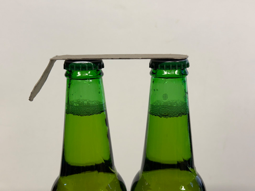
Prototyping
Helped Aidan to work out a basic prototype for what one possible solution would be - having a joint pull cap for the bottles.

|
|
Prototype label (to work out measurements)

|
3D Modelling
Modelled the tuborg bottle to speed things up for the 3D side of things

|

|
alleviateReworked dual-pull cap to aleviate real-life usability issues of the original two prototypes (and make it look less phallic, thanks Vince)
New shape in affinity;

3D Model in blender:

|

|
Billboard

|

|

Website UI
Wireframe Sketches
Figma Board


|

|

|

|

|
Concept Work


Feedback & Changes
Changed the idea, as it was becoming increasingly difficult to tie it all together, and it wasn't very original.
Take 2: Tuborg ESC


Direction change
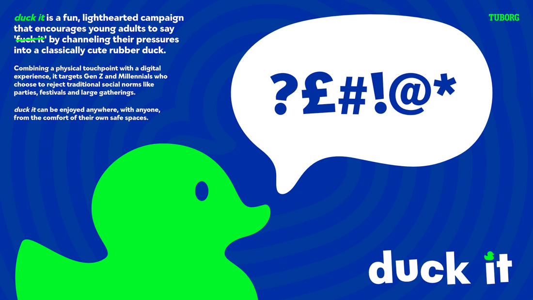
Wasn't getting anywhere with Tuborg ESC, and tbh the whole thing became a chore, but we liked the idea conceptually of targeting the demographic of young adults that forgo the classic drinking locations, who will instead choose to drink within their own safe spaces.
it felt like we were so far away from our original ideas, and nowhere near a finished idea. Both previous attempts were boring and lacked any sort of quirk. Getting gen-z to engage with something requires a certain kind of hook, something pointless, funny, random or whacky without much relevance.
Whole point of this campaign is that it is kind of is pointless? But that's what catches the attention of young adults.
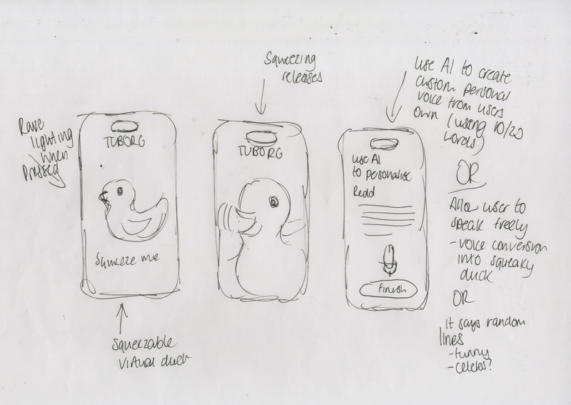
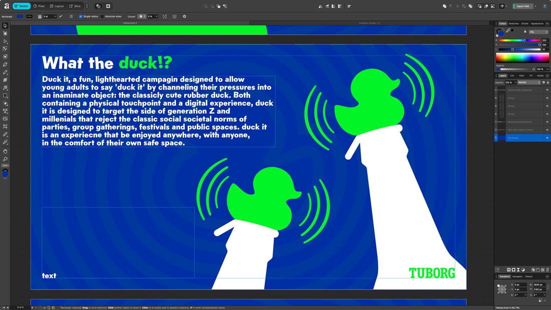
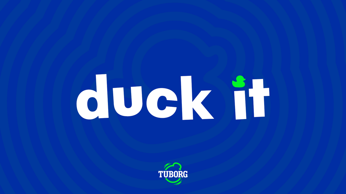
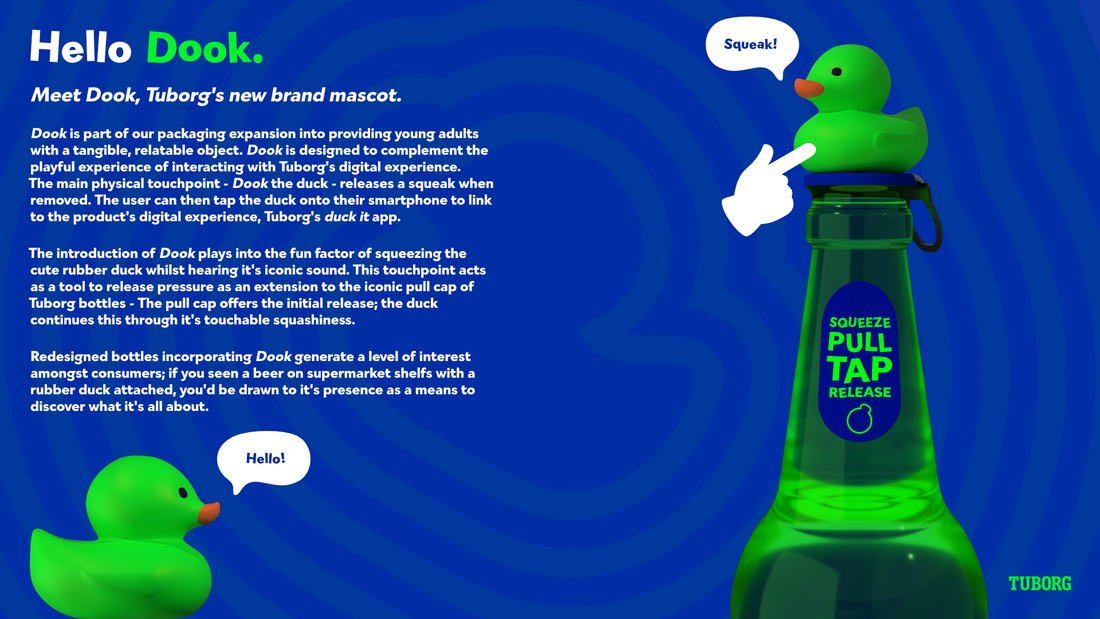
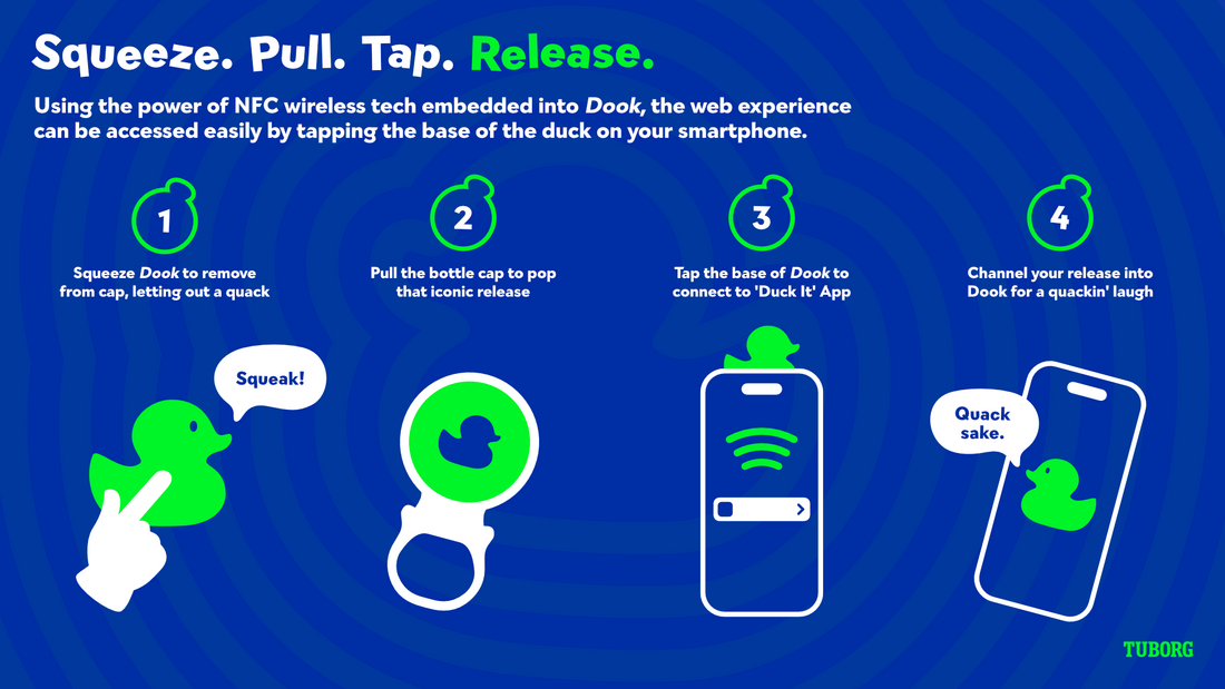
Take 3: Tuborg 'duck it'
After sitting for a bit, and toying with a duck and a beer bottle, we come up with the idea of 'duck it', an evolution of turborg esc. introducing a duck as a mascot, duck it allows young adults to have a physical touchpoint to release stress. pulling the cap gives that pop, but a duck would give a continued sense of pressure release by giving something tangible that could be played with.
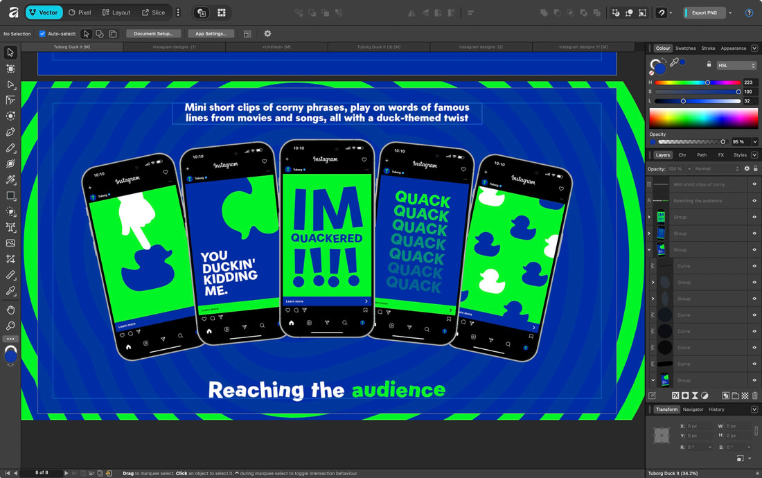
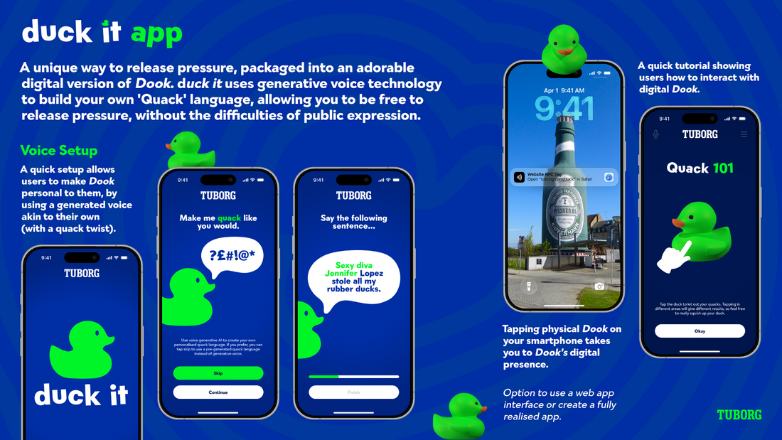
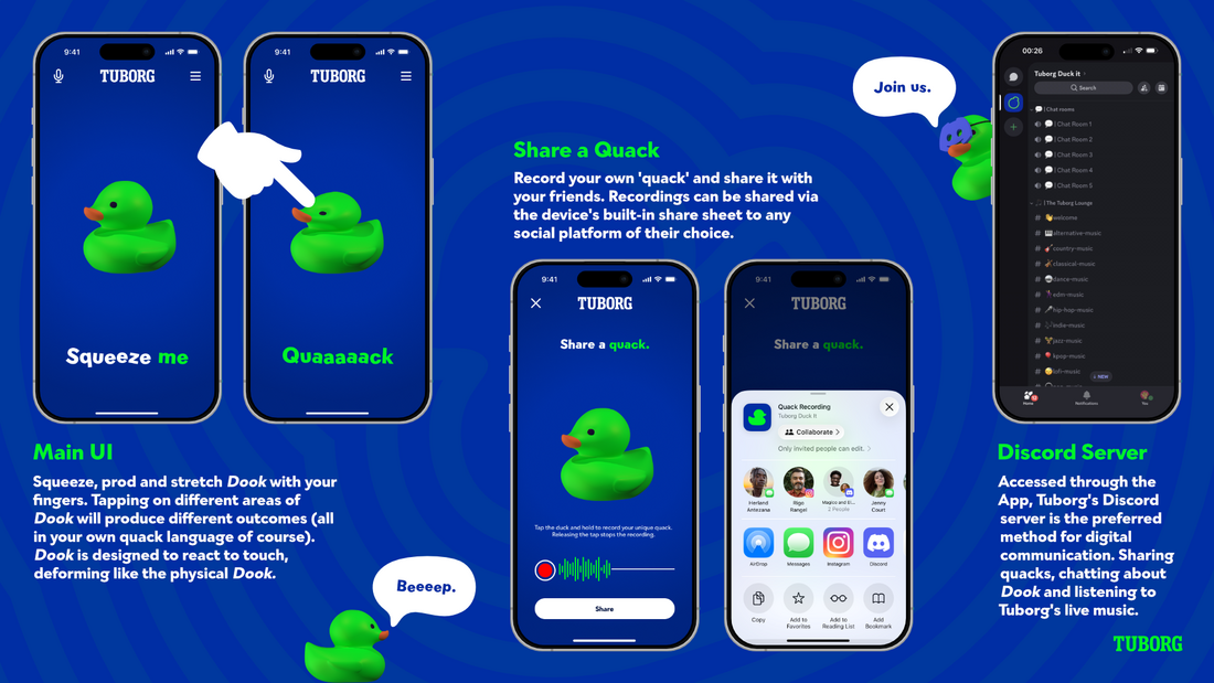
To expand on this, an app would be designed that allows you to play with a digital duck, manipulating it to release different quack sounds, all through the form of custom voice generation that has the user's voice characteristics.
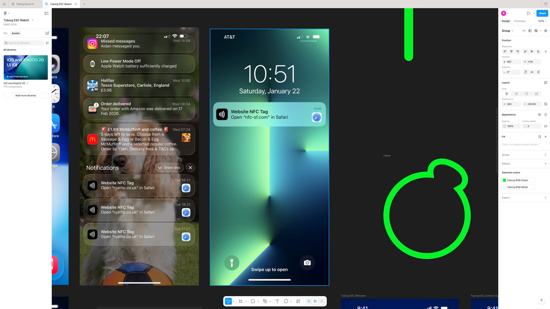
This would be accessed through the physical duck by embedding an NFC chip. tap the duck on your phone, boom link to app. transition of physical to digital.
Duck app reminiscent of early iOS apps, like talking carl, a red character who let out random noises. Ideology to this is channeling the users pressure release through a illegible language (personalised quack).
To expand on this, an app would be designed that allows you to play with a digital duck, manipulating it to release different quack sounds, all through the form of custom voice generation that has the user's voice characteristics.
This would be accessed through the physical duck by embedding an NFC chip. tap the duck on your phone, boom link to app. transition of physical to digital.
Duck app reminiscent of early iOS apps, like talking carl, a red character who let out random noises. Ideology to this is channeling the users pressure release through a illegible language (personalised quack).


Work split
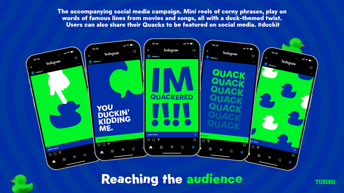
Aidan: social media campaign and 3D visuals
Ryan: UI/UX design and presentation
Ryan: UI/UX design and presentation
In general we've both inputted on all things (we sit together)..., but the above is how we split up the bulk of things.
Logo
Continuing with the same typeface from the previous idea, Gambado Sans. Playful and fun looking.
|
|
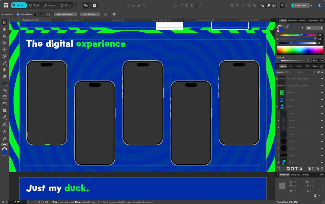
UI/UX Design
Wireframes


Figma board
UI Screens

|

|

|

|

|

|

|

|

|

|
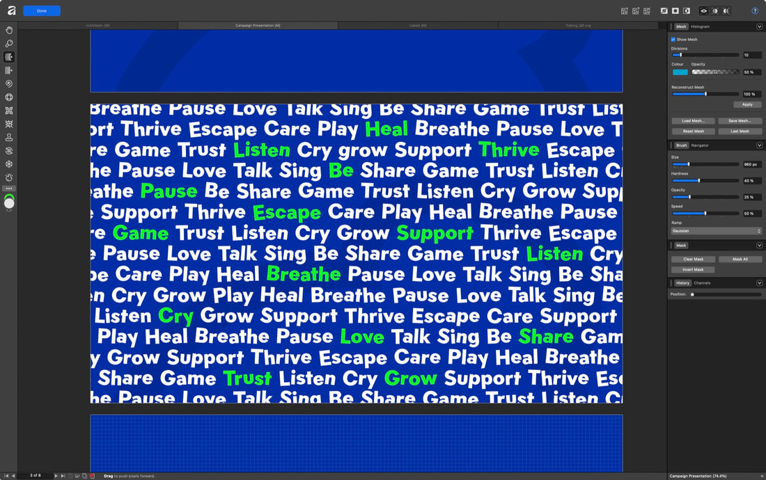
Presentation Design

|

|

|
|

|

|
|
|

|

|
Demonstration videos
Dook's NFC capabilities
Removing Dook from bottle
Outcomes
PDF Presentation
Individual Slides
|
|
|
|
|
|
|
|
Demonstration video