Project Brief
Brief: Typeface Design
Project Overview
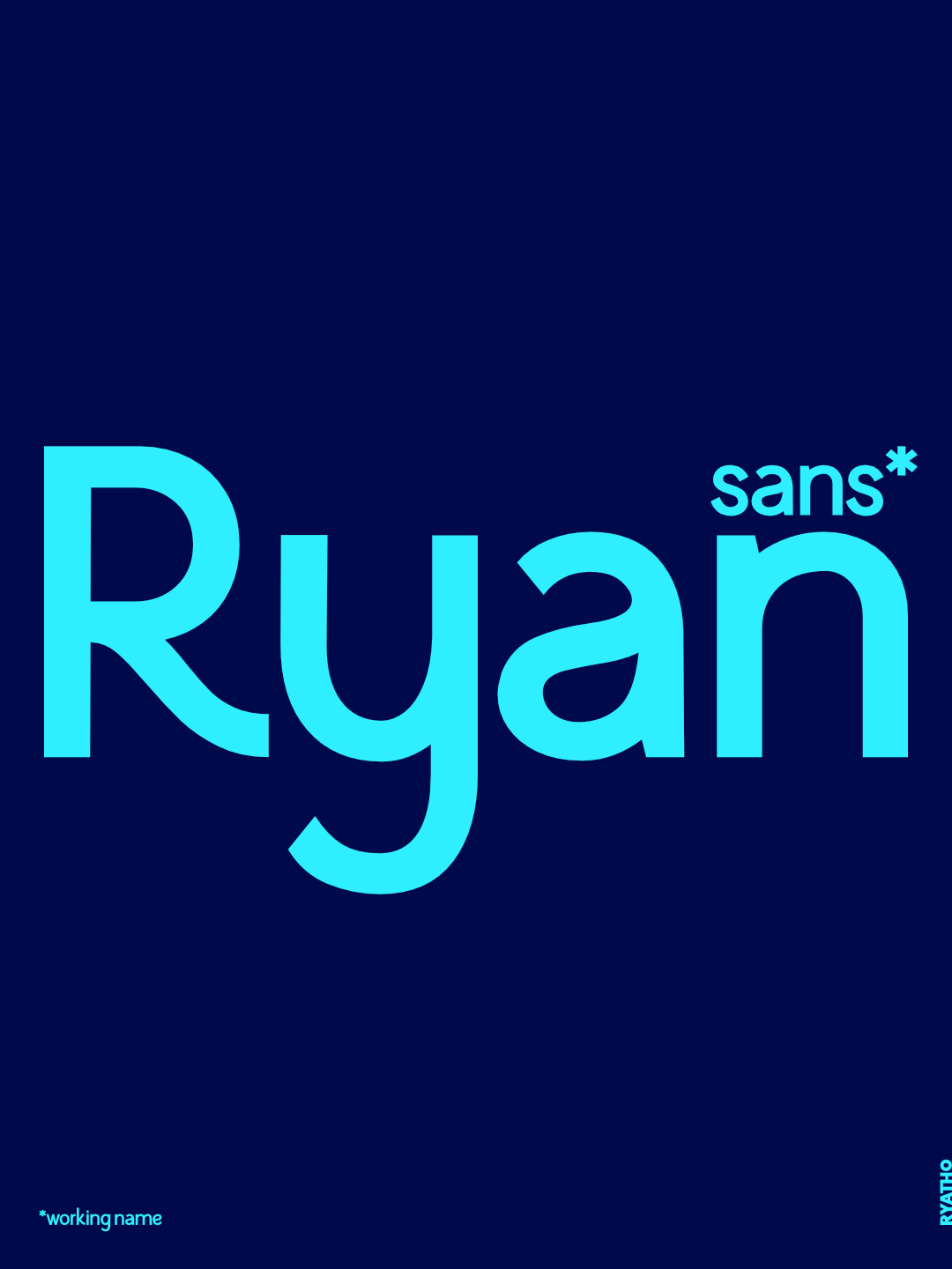
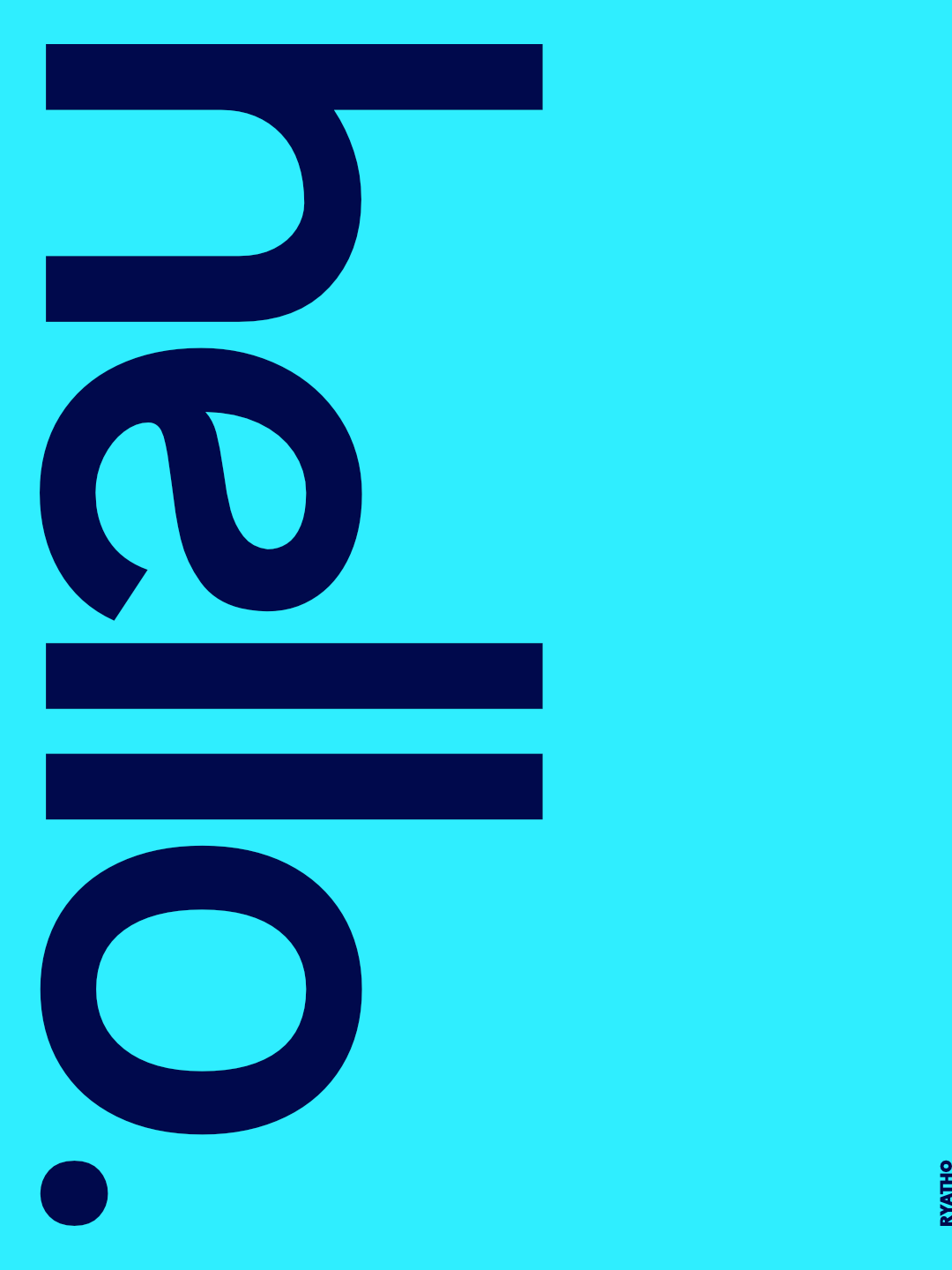
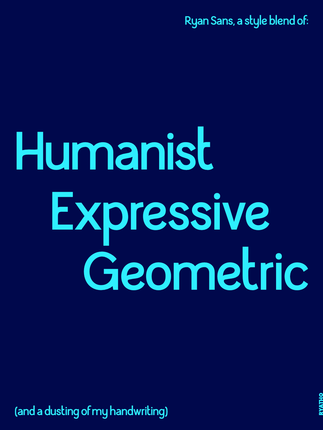
To develop a custom typeface suitable for my own future branding and as a saleable asset for other brands/consumers to use. The purpose of the typeface is to allow me to discover, develop and apply the skills I’ve learnt from previous typographic work into a functional typeface for the typographic market. The Typeface will be a blend between different styles to achieve something unique, imbued with my own personality and style. Eventual use on completion in my own branding, portfolio and website.
Possible stylings:
• Geometric
• Humanist
• Expressive
Example of existing typefaces that i like:
• Avenir
• Azo Sans
• Figtree
• Lemon Sans
• Owners
• Poppins
Target Audience
Me
Foundries
Designers
Typographic Users looking for a blended humanist geometric typeface
Deliverables
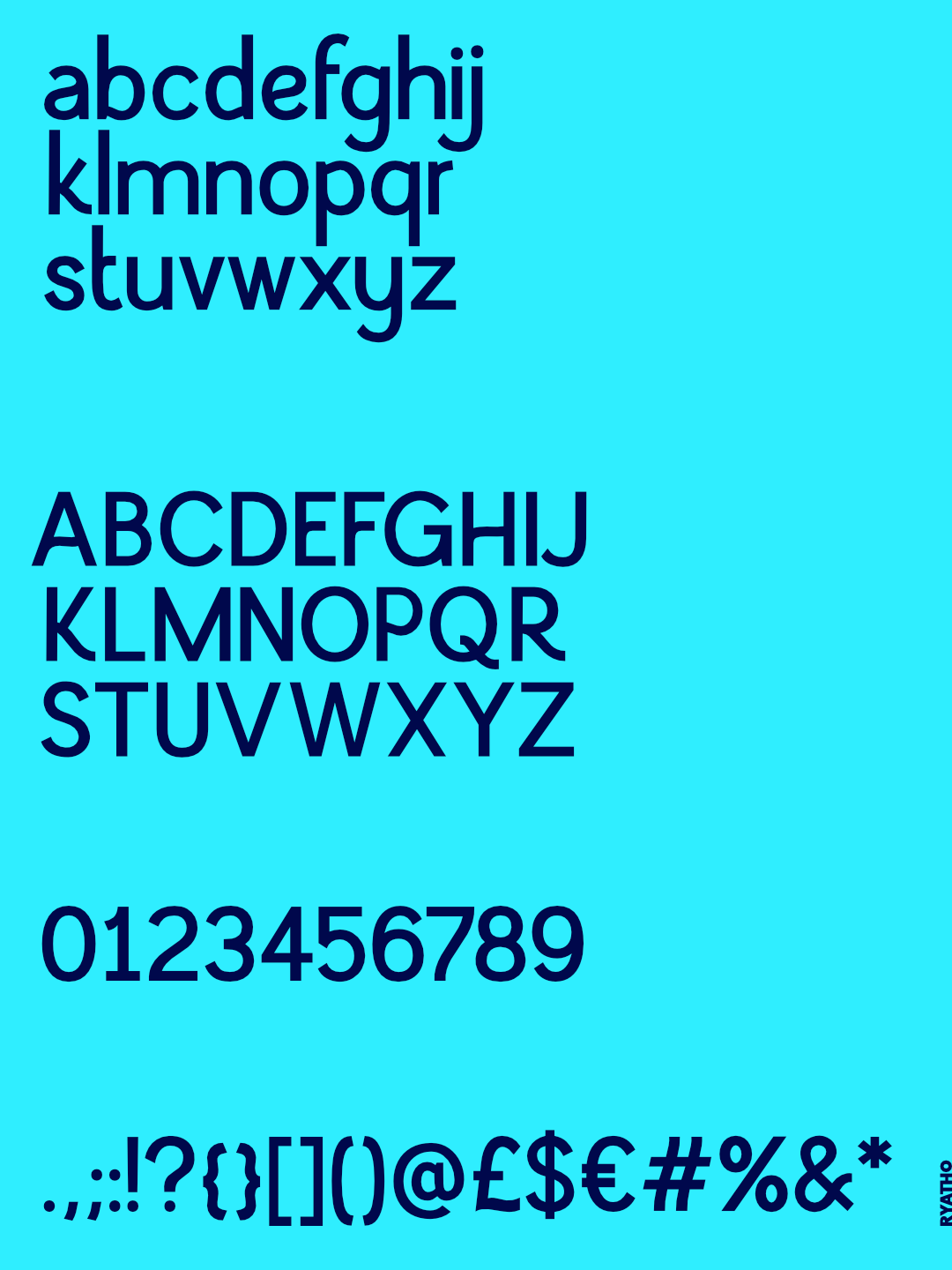
Designed typeface in one weight
Typographic posters showcasing the typeface in action
Finished working font files
Specification
Should be scalable across all sizings of type
Typeface to be assembled using Glyphs 3 (Mac OS app)
Workable files in .OTF or .TTF
Posters displaying the typeface to be A2 format.
Milestones
Week 1: Research existing typefaces and foundries + form styling and begin to visualise the style
Week 2-9: Typeface Development
To develop a custom typeface suitable for my own future branding and as a saleable asset for other brands/consumers to use. The purpose of the typeface is to allow me to discover, develop and apply the skills I’ve learnt from previous typographic work into a functional typeface for the typographic market. The Typeface will be a blend between different styles to achieve something unique, imbued with my own personality and style. Eventual use on completion in my own branding, portfolio and website.
Possible stylings:
• Geometric
• Humanist
• Expressive
Example of existing typefaces that i like:
• Avenir
• Azo Sans
• Figtree
• Lemon Sans
• Owners
• Poppins
Target Audience
Me
Foundries
Designers
Typographic Users looking for a blended humanist geometric typeface
Deliverables
Designed typeface in one weight
Typographic posters showcasing the typeface in action
Finished working font files
Specification
Should be scalable across all sizings of type
Typeface to be assembled using Glyphs 3 (Mac OS app)
Workable files in .OTF or .TTF
Posters displaying the typeface to be A2 format.
Milestones
Week 1: Research existing typefaces and foundries + form styling and begin to visualise the style
Week 2-9: Typeface Development
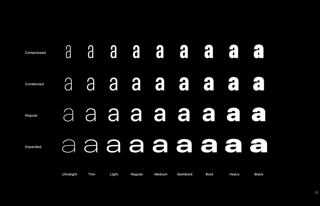
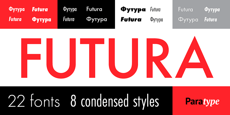
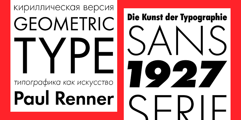
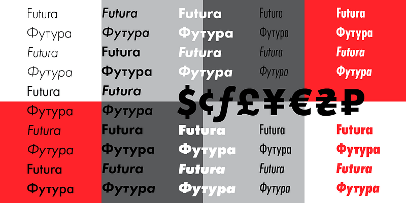
Research
Existing Geometric & Humanist Typefaces
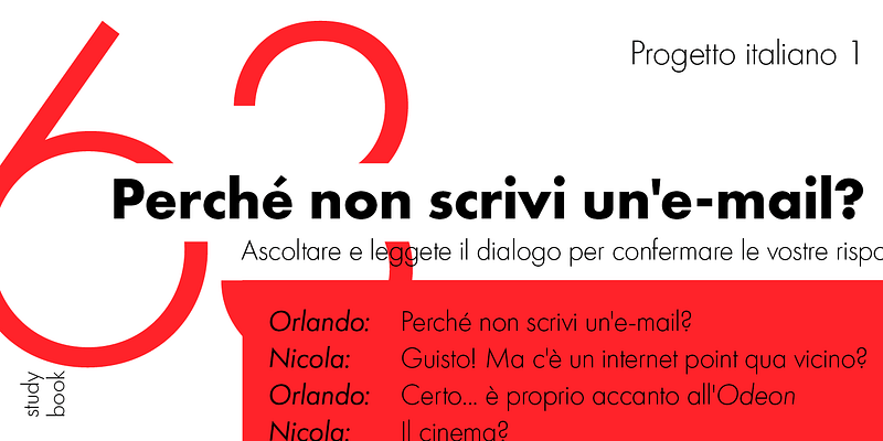
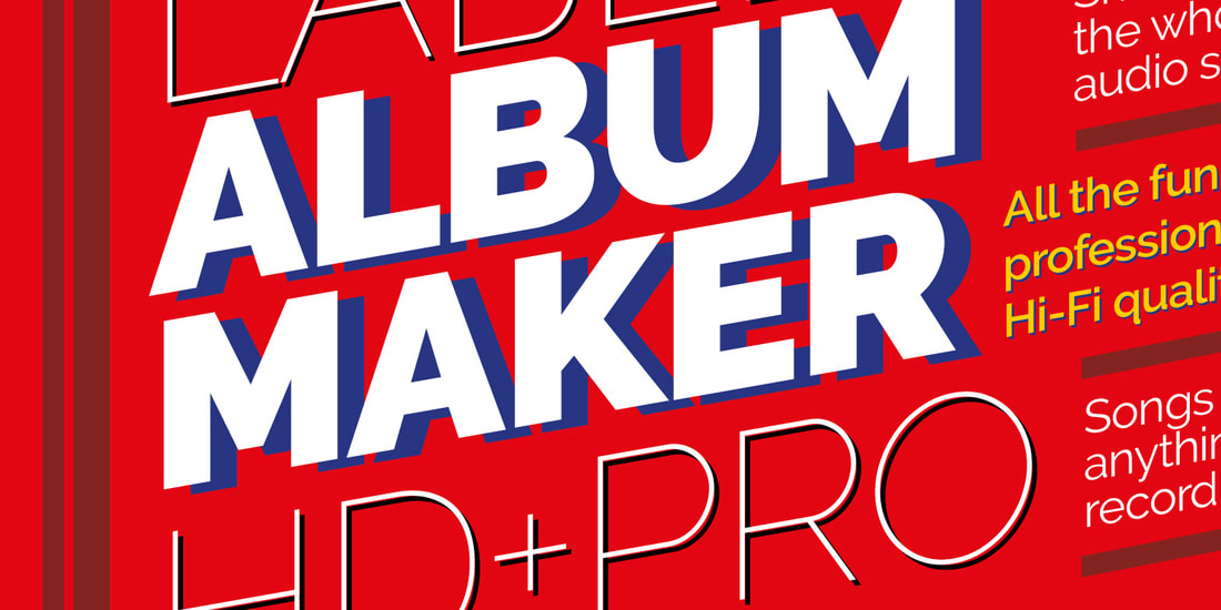
Figtree


|

|

|

|
Full typography

Lemon Sans

|

|

|

|

|

|

|
Full Typography

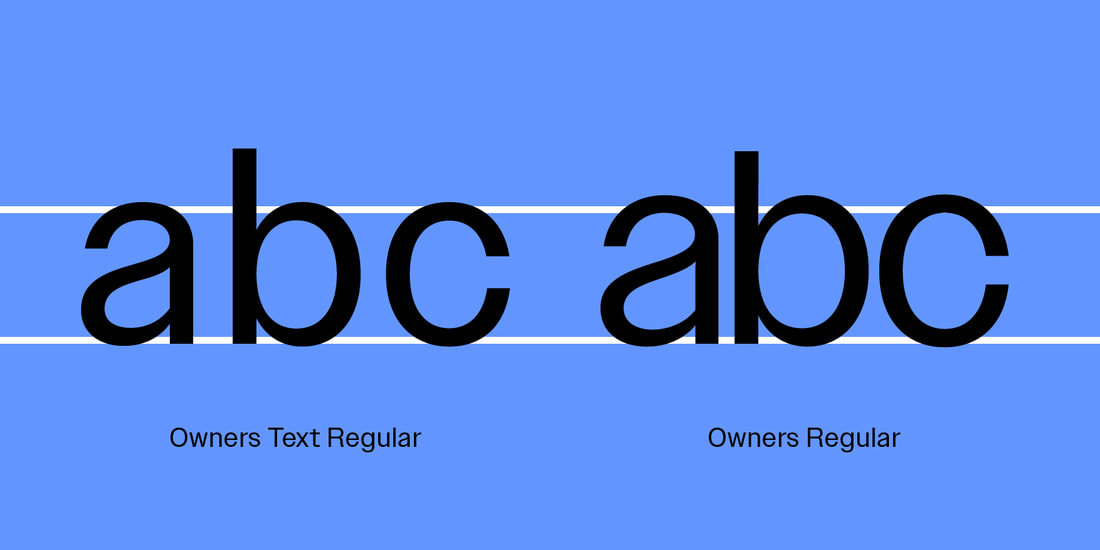
Owners (Wide)


|
|

|
|
Full typography

Azo Sans

|
|

|

|

|

|

|

|
Full typography

Avenir Next
Full typography

Poppins
Full typography

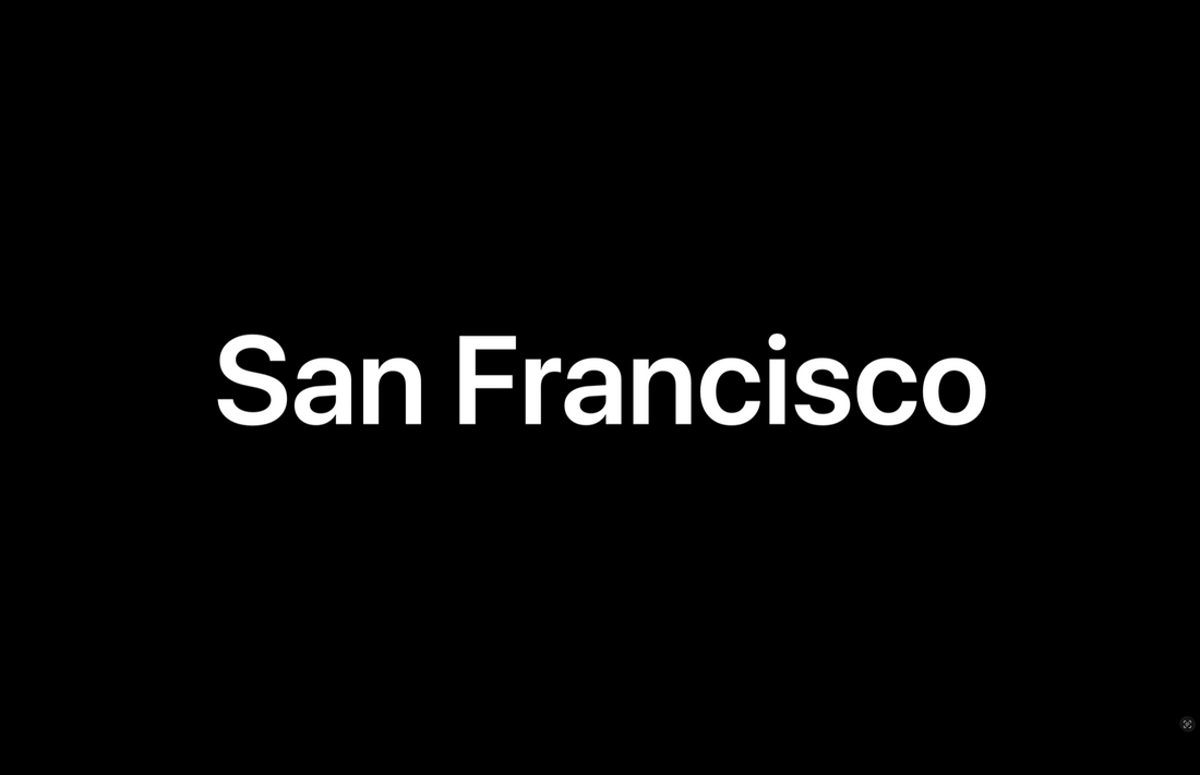
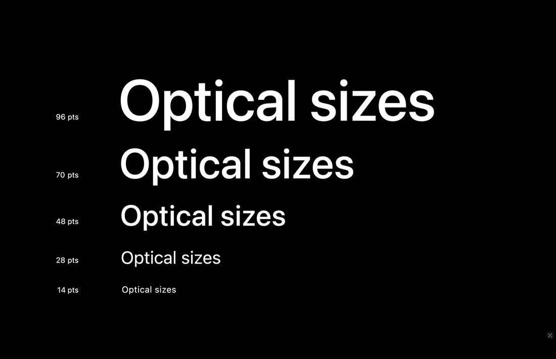
San Francisco (SF Pro)
|
|

|
|
Full typography

Futura
|
|
|
|
|
Full typography

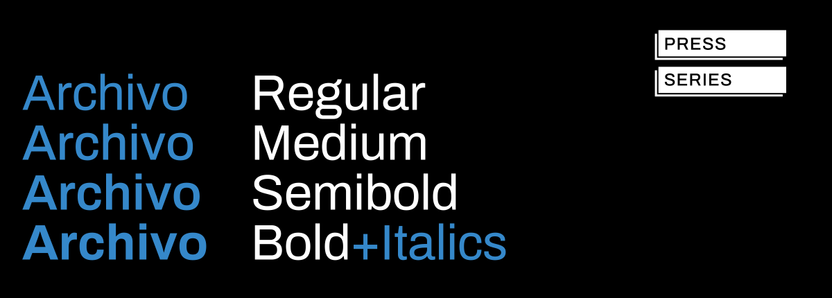
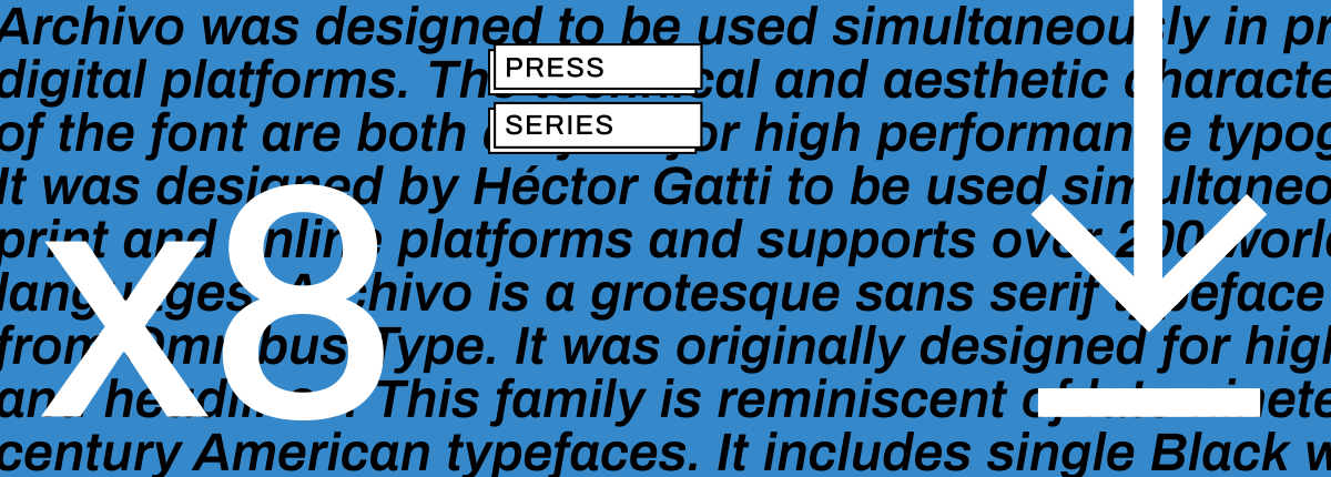
Archivo

|
|
Full typography

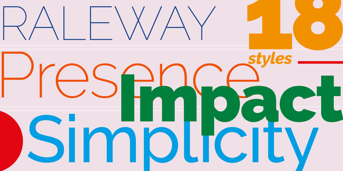
Raleway

|
|

Full typography

Font Foundries
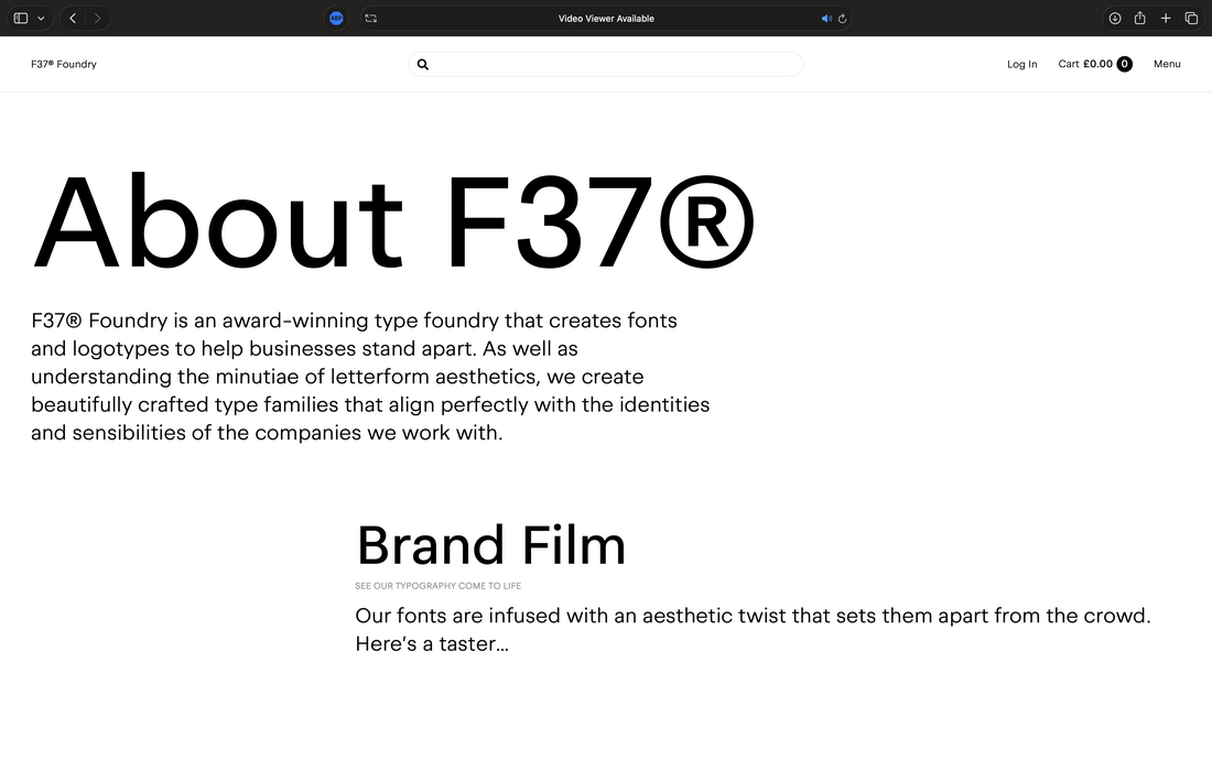
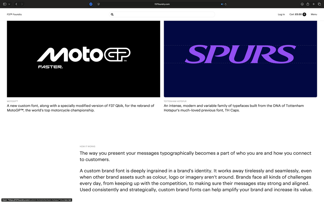
F37 (https://f37foundry.com/)

|
|
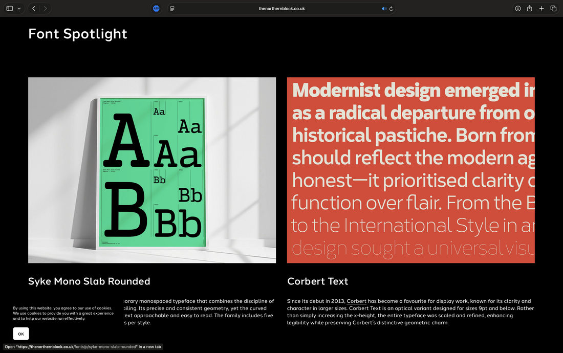
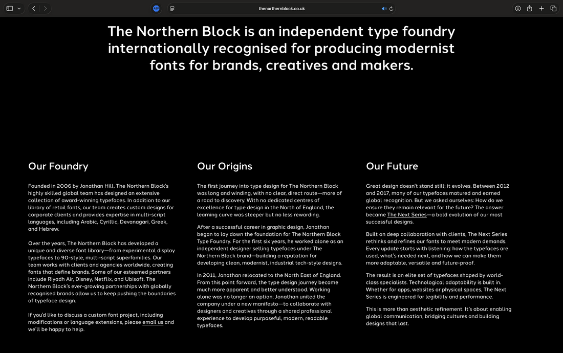
The Northern Block (https://thenorthernblock.co.uk/)

|
|
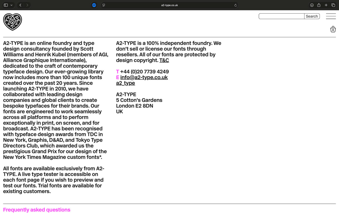
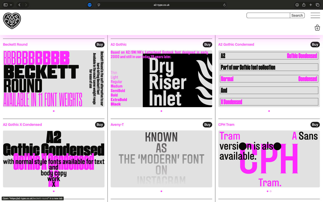
A2-Type (https://a2-type.co.uk/)

|
|
Tutorials
Type Book
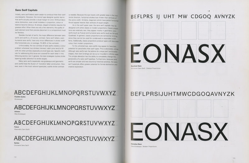
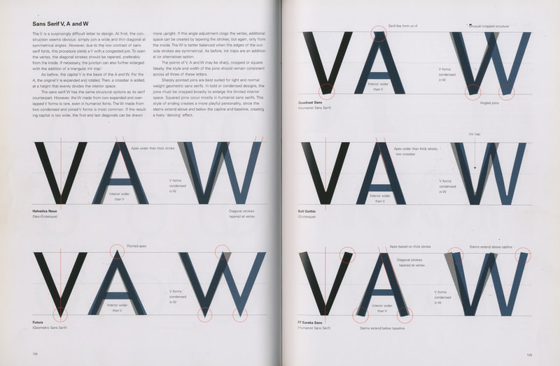
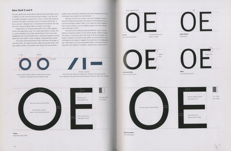
Designing type (Karen Cheng)
|
|
|
|
|
|
|
|
|
Other

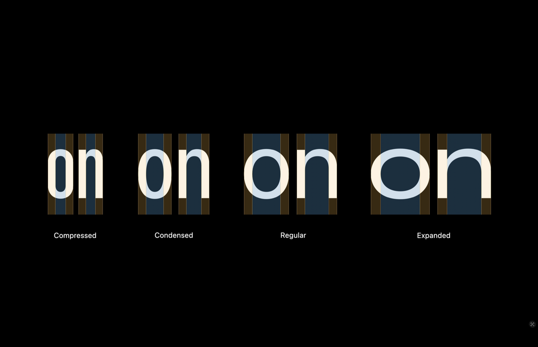
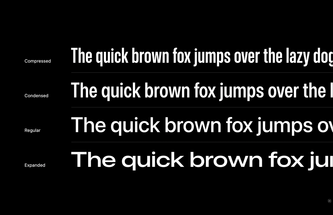
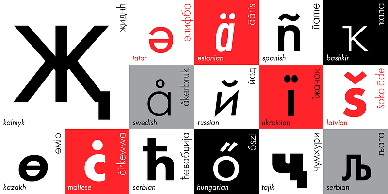
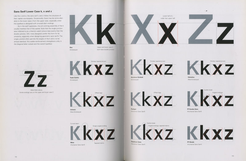
Typeface Analysis

|

|

|

|
Chosen Pangram
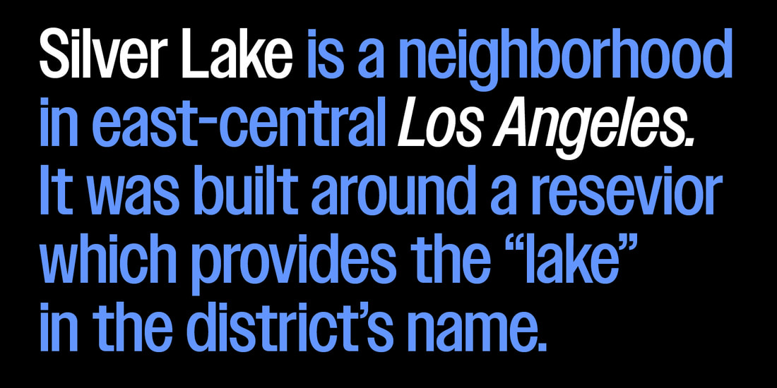
Foxy diva Jennifer Lopez wasn’t baking my quiche.
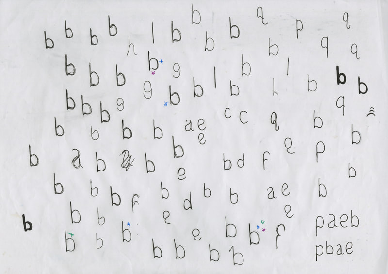
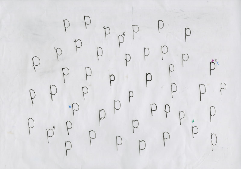
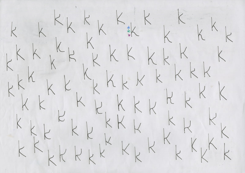
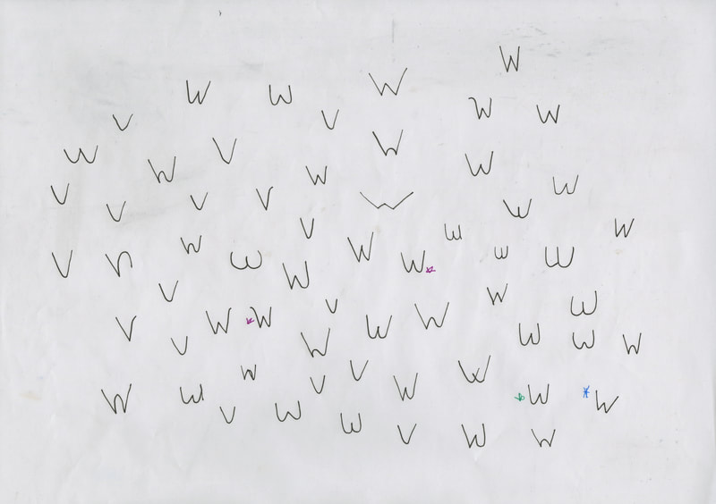
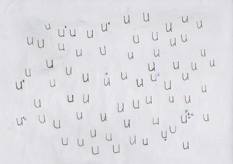
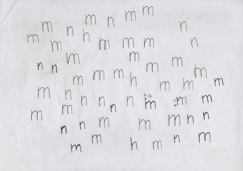
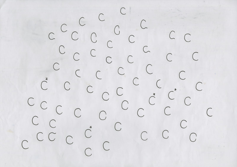
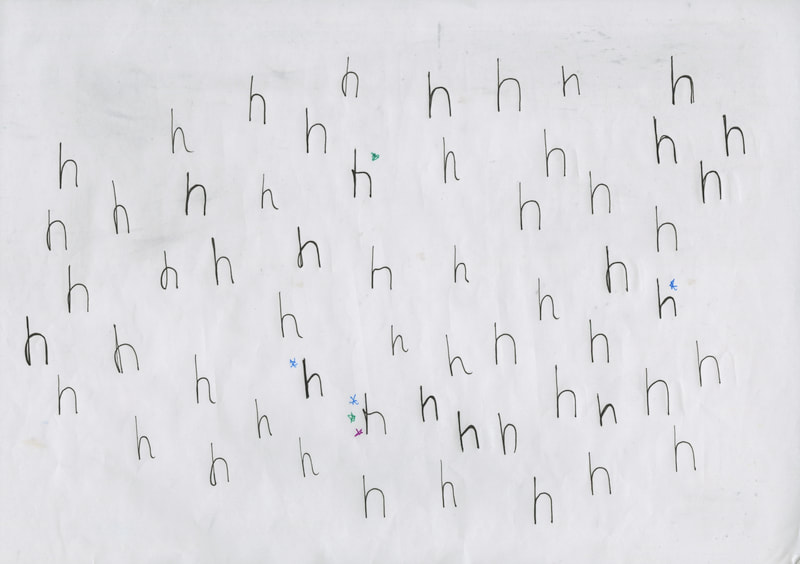
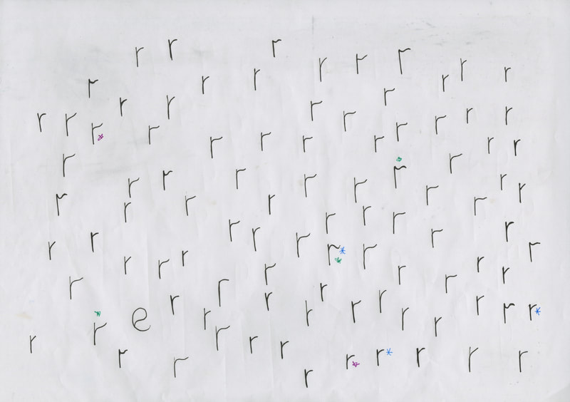
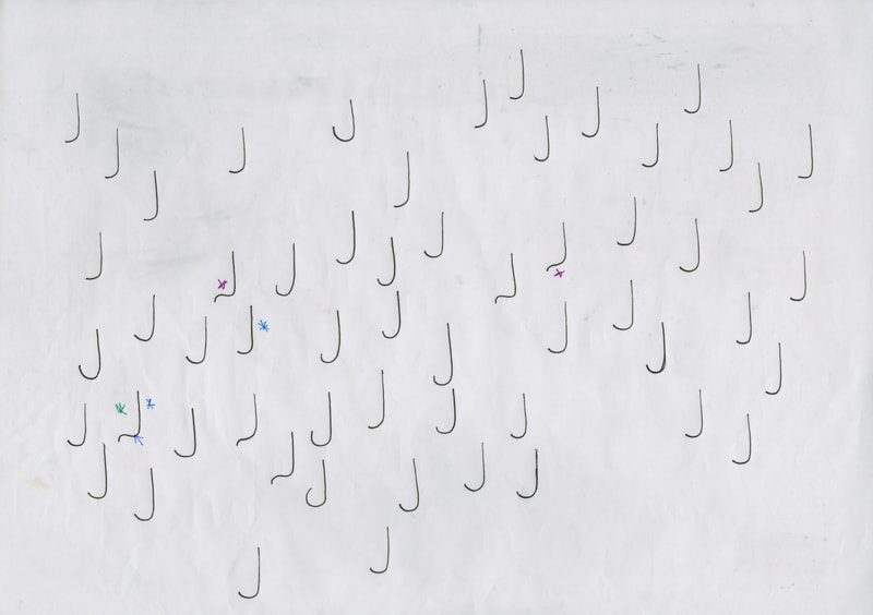
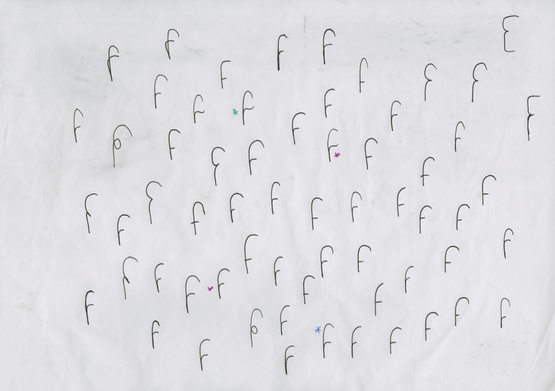
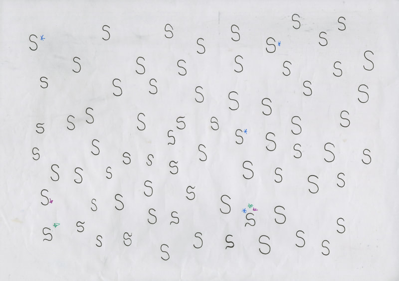
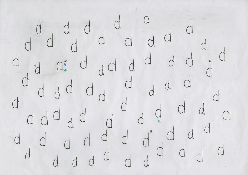
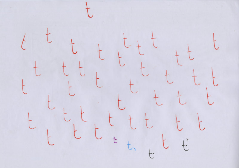
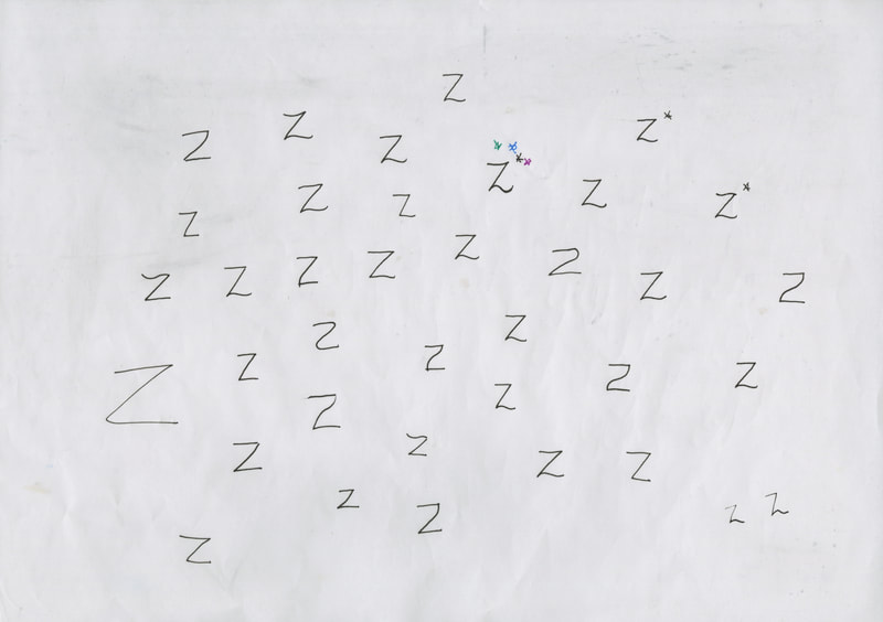
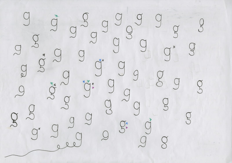
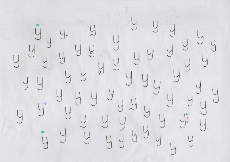
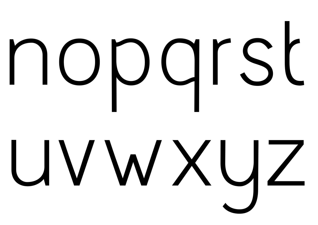
Letter Sketching
Trying to figure out what the typeface could look like

|

|


|

|

|

|

|

|
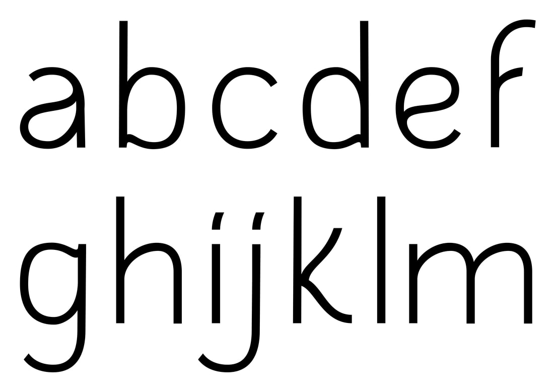
Digitalising initial letterforms


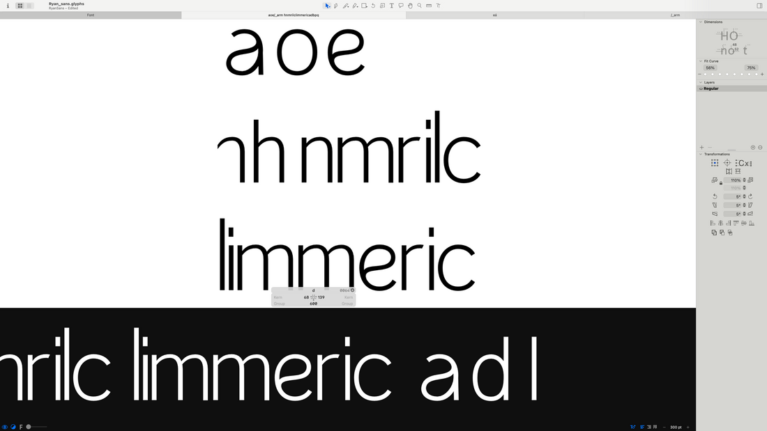


Realised after drawing only certain letters that I needed to draw the full alphabet. The letters were looking a bit stiff and not very unique.
More letterforms
|
|
|
|
|
|
|
|
|
|
|
|
|
|
|
|
|
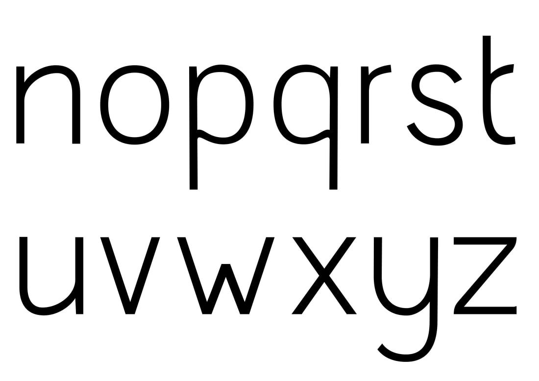
Proposed lettering (if they work)

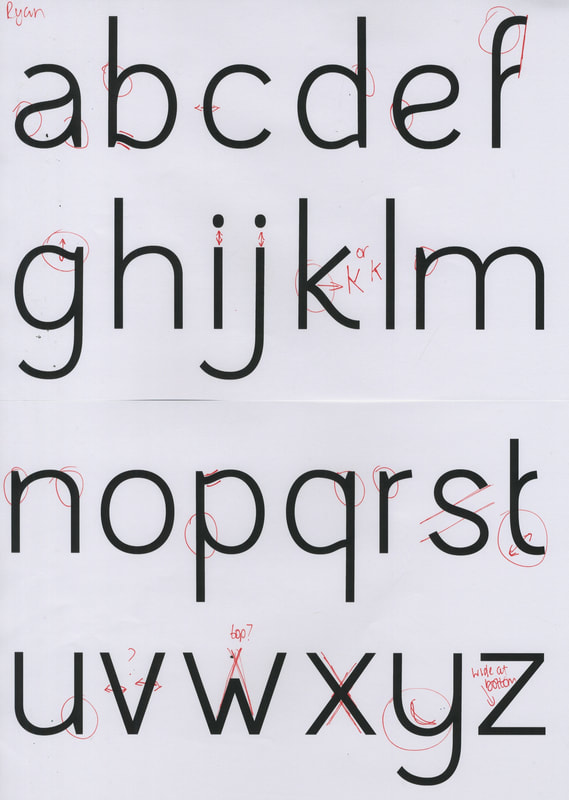
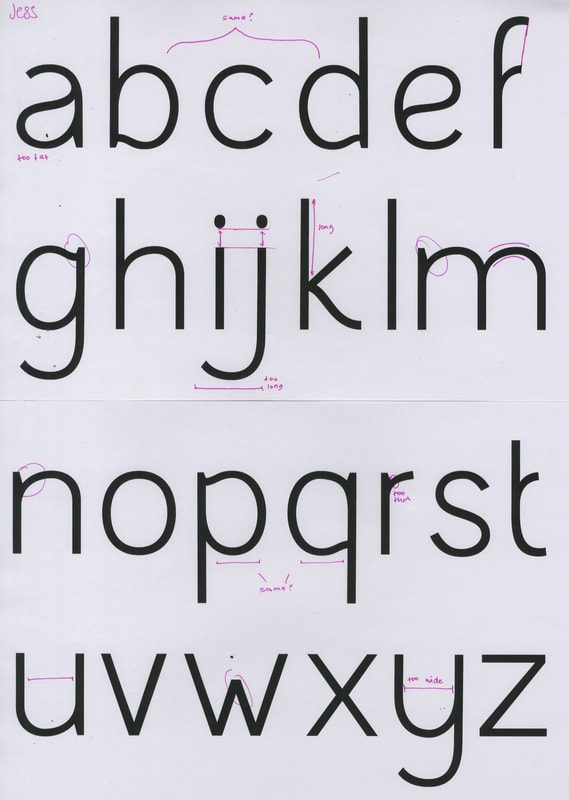
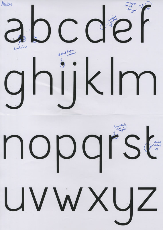
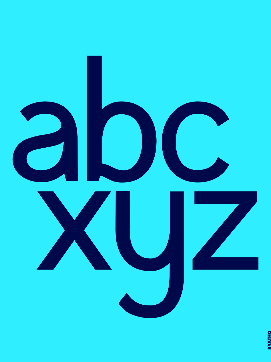
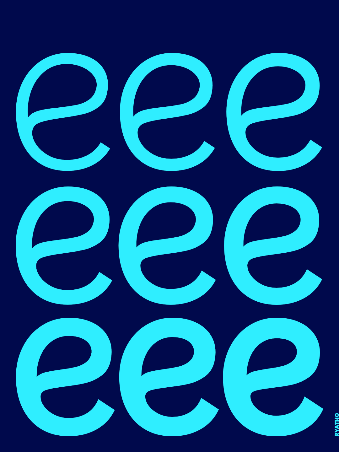
Letter Development
1st Draft

Typography sheets

|
|
Own analysis
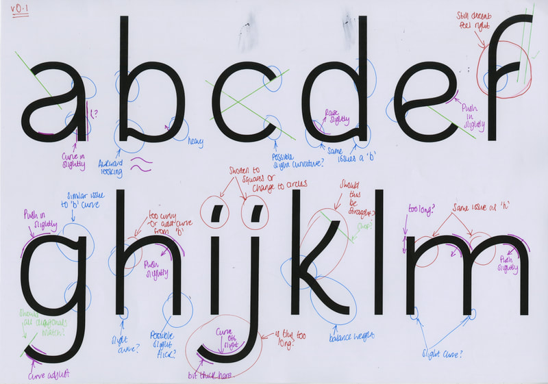
|
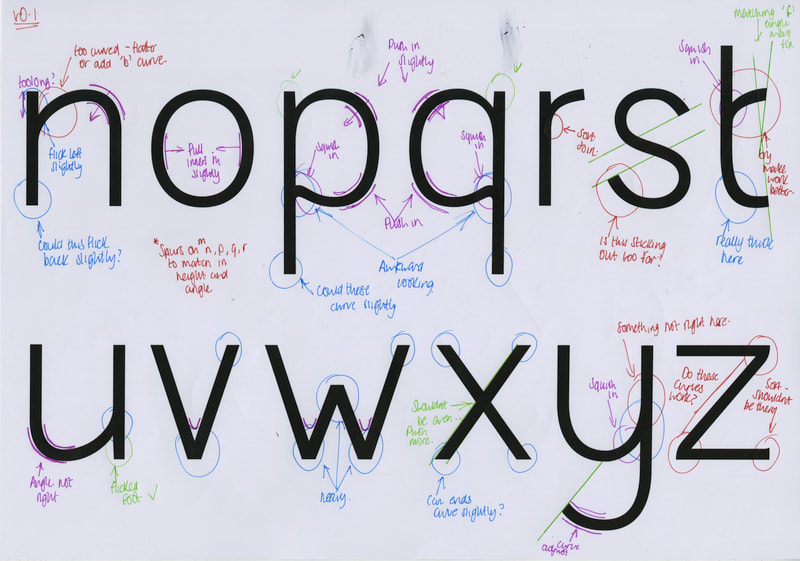
|
v2 Draft


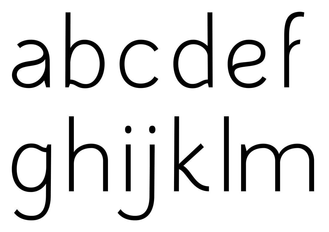
|
|
Peer analysis comparison
|
|
|
v3 Draft

v4 Draft
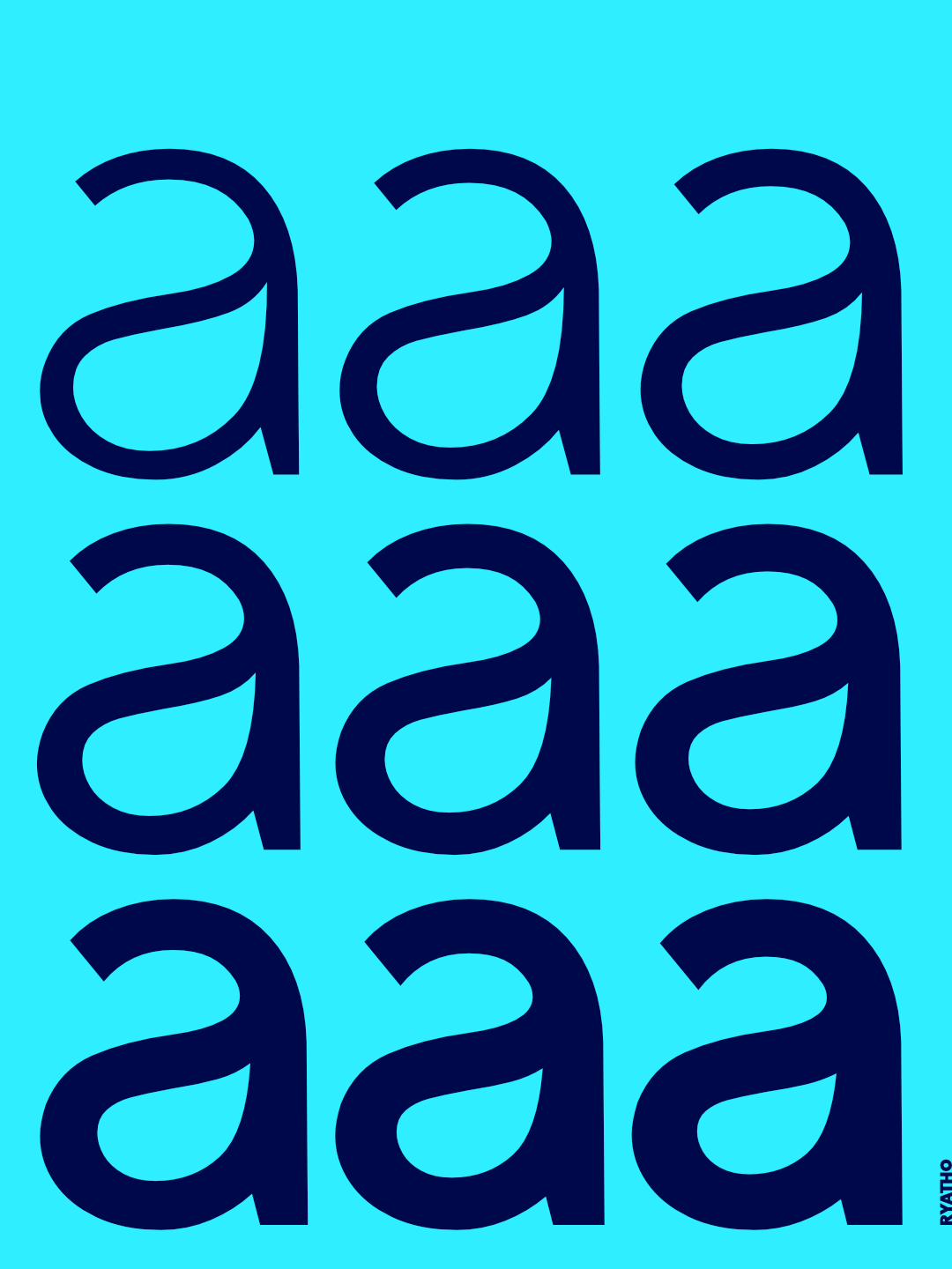
Weight tests
Whilst the direction and look of the type is fine, I don't feel like it's thick enough, which limits its usability. Want to try adding a second weight (and hopefully crack variable fonts to fill in the 'in betweens'
Use Testing
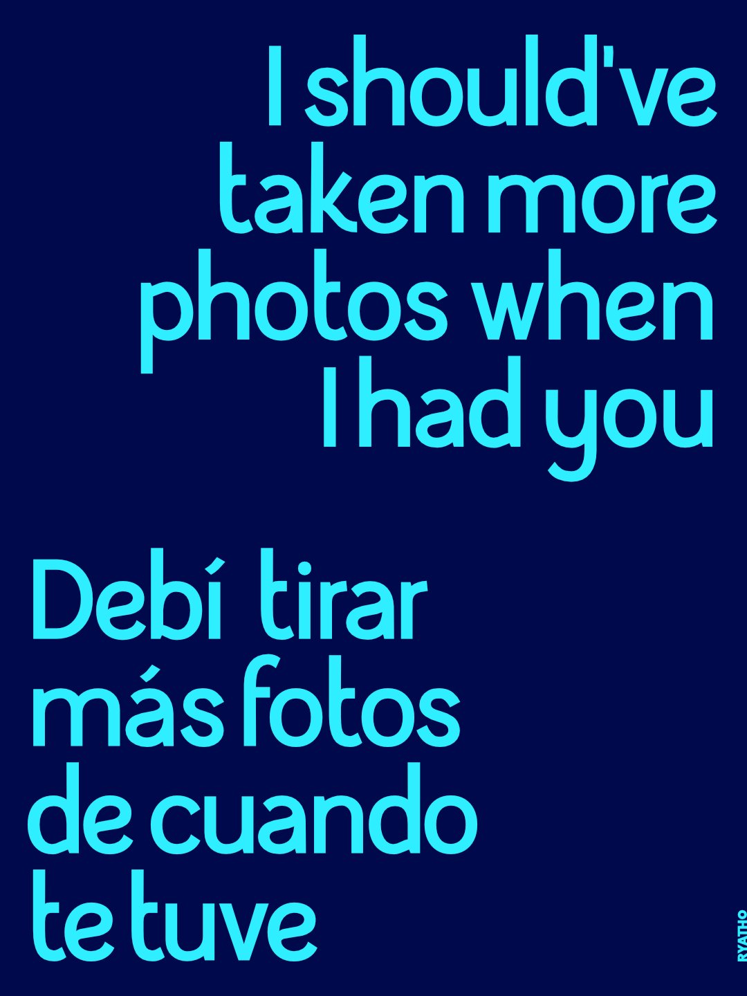
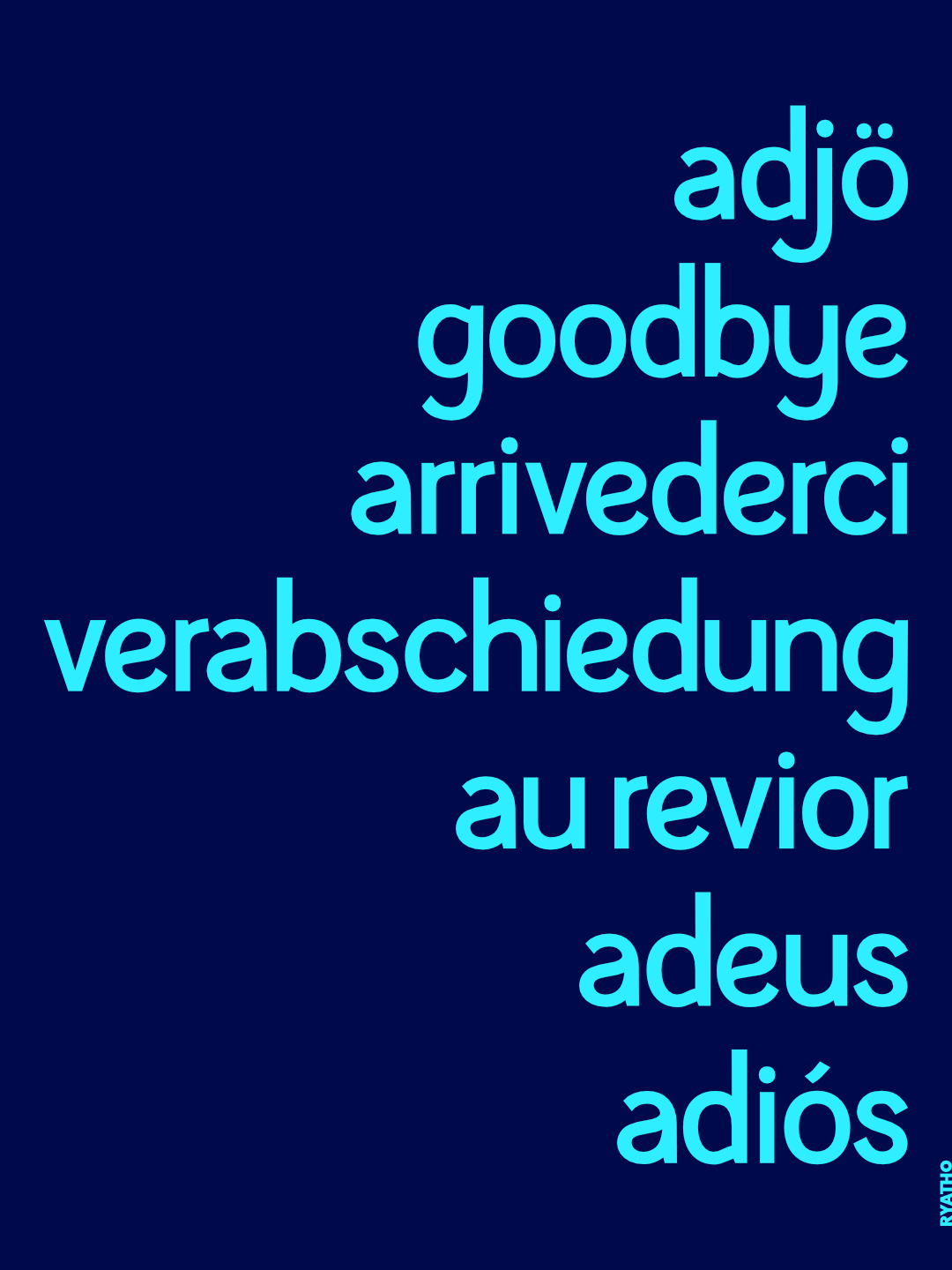
Instagram
Made a carousel of posts to test how it would look online
|
|
|
|
|
|

|
|
|

|
|

|

|
|
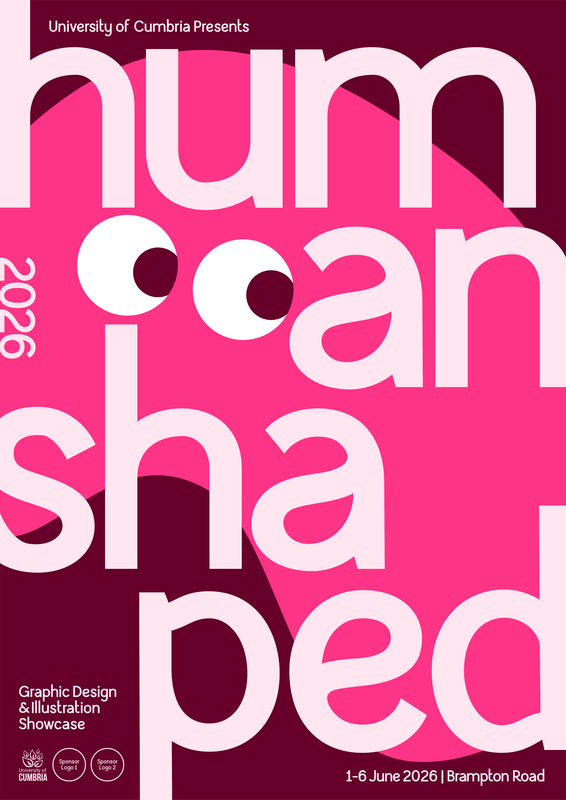
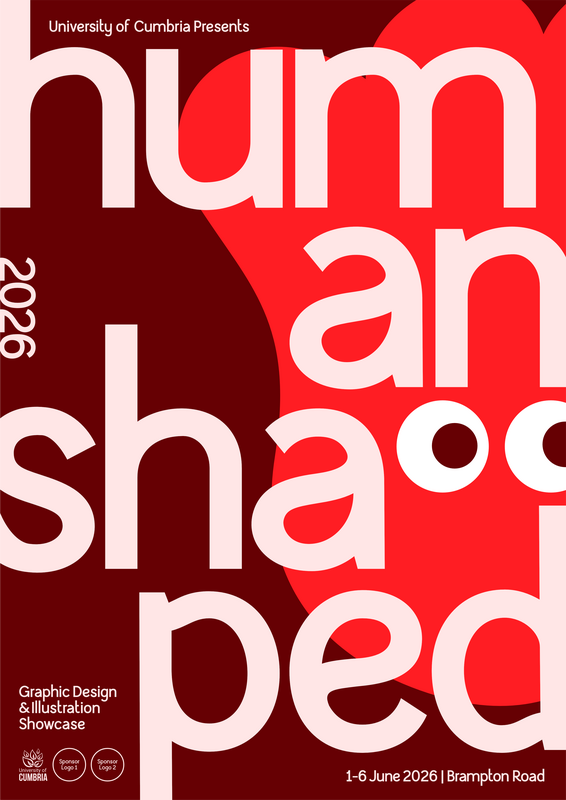
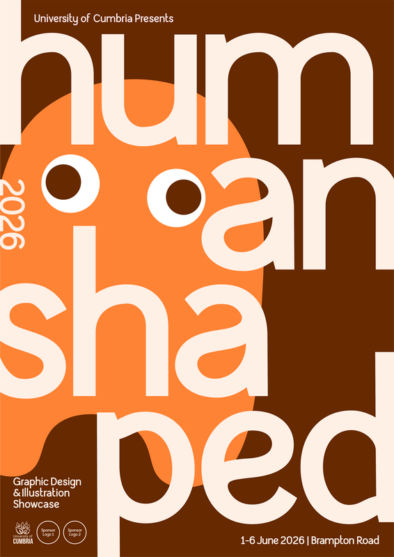
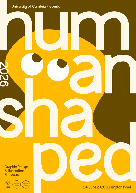
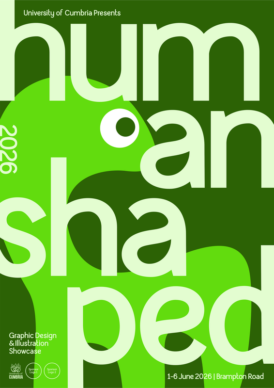
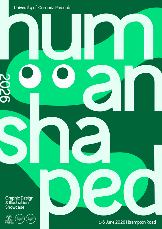
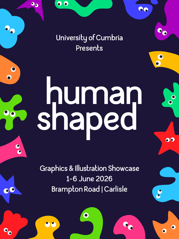
Degree show
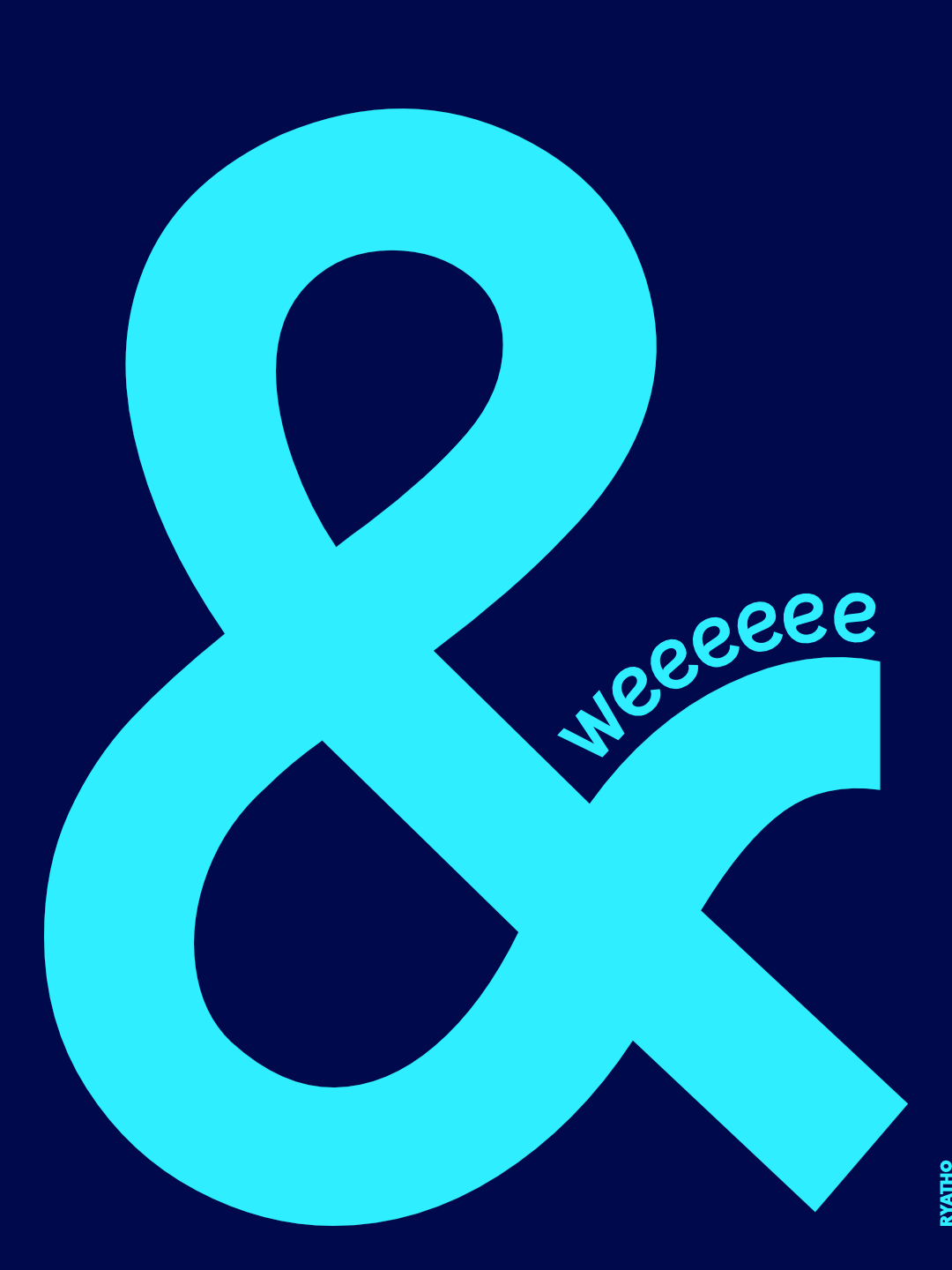
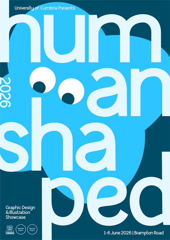
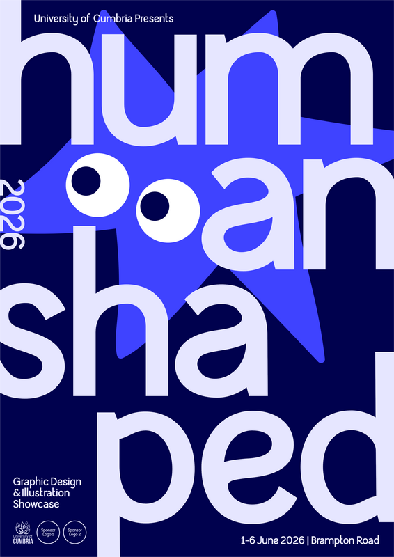
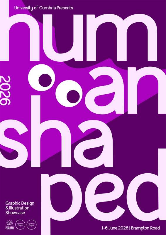
Using my typeface for the degree show has opened up the opportunity to give it a real test run, across different types of marketing. Below is some examples of contrast testing, colour testing, weight testing etc. Only manual kerning is applied (haven't yet tackled kerning yet).
Colour guidelines

NDF leaflet mockups

|

|
|
|
|
|
|
|
|
|
|
Social Media
|

|
Takeaway...
Happy with the overall look of the type, especially in the bolder weights. Kerning is still a big issue, even when manually applied. Some of the letters seem a bit heavier than others - need to sort this.